Friday Face-Off: Summer
Welcome to The Friday Face-Off, a weekly meme created by Books by Proxy! Each Friday, we will pit cover against cover while also taking the opportunity to showcase gorgeous artwork and feature some of our favorite book covers. If you want to join the fun, simply choose a book each Friday that fits that week’s predetermined theme, post and compare two or more different covers available for that book, then name your favorite. A list of future weeks’ themes are available at Lynn’s Book Blog.
This week’s theme is:
“One swallow does not make a summer”
~ a cover that makes you think of SUMMER
Mogsy’s Pick:
Something in the Water by Catherine Steadman
When I think of summer, I think of warm sunshine, pristine beaches, stretches of white sand and the pounding surf. Tropical retreats like the island paradise of Bora Bora. It’s the last place you’d expect trouble to find you, which is why domestic thrillers like Something in the Water can be so effective. Just a few weeks ago, our protagonists Erin, a young up-and-coming documentary filmmaker, and her husband Mark, an investment banker, were celebrating their honeymoon in the South Pacific when their boat suddenly bumped up against something in the water. And what they found in those crystal blue depths changed everything in their lives.
Let’s take a look at some of the covers:
From left to right:
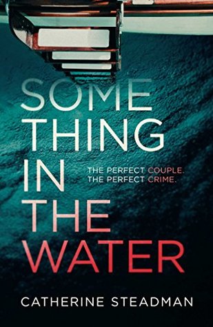
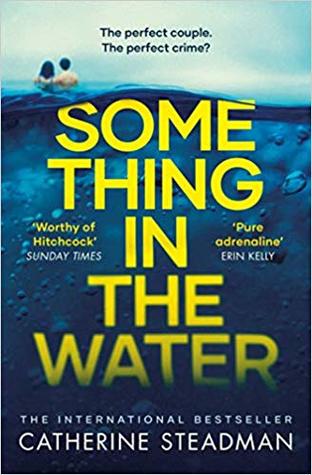
Ballantine (2018) – Simon & Schuster UK Hardcover (2018) – Simon & Schuster UK Paperback (2019)

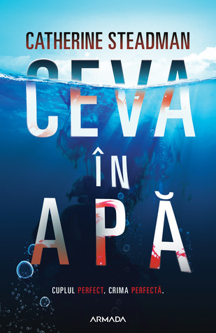
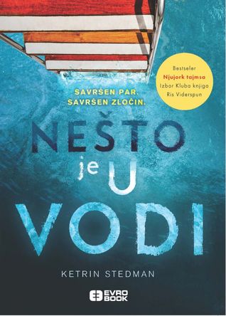
Romanian Edition (2019) – Bulgarian Edition (2018) – Serbian Edition (2018)
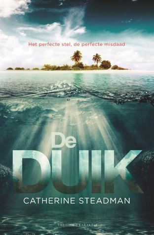
Dutch Edition (2019) – Estonian Edition (2018) – Persian Edition (2018)


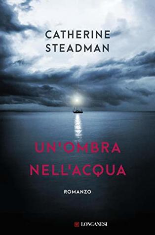
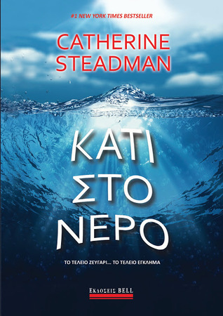
Italian Edition (2019) – Spanish Edition (2018) – Greek Edition (2018)

Winner:
Admit it, several of these covers made you squint extra hard to try and see if you could make out anything in the water which would give you some clues as to what this book is about. Of course, I’ve read it and I know what it was that Erin and Mark found, but I’m not gonna tell, muahahahaha! Anyway, my favorite this week is probably the Dutch edition, which manages to be “summery” and “ominous” at the same time.
But what do you think? Which one is your favorite?


I say Dutch too. Nice depth
LikeLike
That’s one way to look at it 😉
LikeLike
You are evil Mogsy leaving us wondering LOL but I prefer the first cover!
LikeLike
Haha, I’m glad I piqued your interest 🙂
LikeLike
A great choice for the cover. It’s not a book I knew about.
LikeLike
Happy to put it on your radar! 😀
LikeLike
I don’t know, I think the “french maid without an eyeball” one really catches the essence of this book 😉
LikeLike
Haha, that cover is so out of place. I don’t like it at all, but thought I’d include it because it’s just so bizarre.
LikeLiked by 1 person
I can definitely see the summery AND ominous in your pick! I also like the Ballantine one; I personally enjoy 2D graphics more. 😉 Btw, that Persian one is kinda cute…not sure if that fits the vibe though? 😂
LikeLike
The Persian cover actually kind of scares me, but I can see how it might be cute…kinda? LOL! 😀
LikeLiked by 1 person
lol I think the cute might be the pink color. The eye though…definitely scary! 😆
LikeLike
I like the Dutch edition too as well as the Romanian edition. I don’t even know that I’m familiar with this book but I want to check it out. So since you’ve read it, help me here. Please tell me that there isn’t a French Maid poking her eye out with a feather duster hiding in the water. That would be terrifying!
LikeLike
LOL, I can tell you there is no French maid poking her eye out in the book. That cover, I’m just baffled! 😀
LikeLike
I love the first cover and have to read this book. I always need to know what might be lingering in the water! Arrrrr!
x The Captain
LikeLike
Indeed! A wise pirate needs to know these things! 😀
LikeLike
I’m leaning toward the Ballantine edition, but I haven’t read the book so I don’t know if it’s a good representation. But wow, that Persian edition is weird!
LikeLike
Re: the Persian edition, I agree! Gotta wonder at the decision making process behind that particular cover…
LikeLike
Oh yes! The Dutch cover is an ominous one, despite the bright colors and the sun’s rays reflecting in the water… It feels like those scary movies where you know that something terrible is just behind the door… 😀
LikeLike
I agree, there’s something so disconcerting about being out in open water!
LikeLike
This cover makes me think of Dead Island… also de Duik directly translated means The Dive. Your welcome🙂
LikeLike
Thanks, that’s really cool to know! Though I wonder how the publishers decided on that translation, as there wasn’t technically a dive in the novel, lol! 😀
LikeLike
Ooh nice- love the sound of this! I like the first cover a lot, but the second one is awesome too with the ladder descending into the water… that’s a nice touch. 🙂 The Italian one is kinda ominous, and I even like the Greek one a bit.
LikeLike
I really like the ladder perspective too. Makes you nervous wondering what’s lurking in the depths 😀
LikeLike
Oh yes – I think you’ve nailed it with your summertime choice this week, Mogsy – who doesn’t think of lovely sunny seaside days? I love your favourite, but I’m also very drawn to the Ballantine edition, too!
LikeLike
Haha, I actually wonder if I made the right choice. Tropical ocean waves and sunshine are indeed summery, but there was the whole thriller/fright factor that I thought might put a damper on things 😉
LikeLiked by 1 person
Nasty things happen on summer days, too…:)
LikeLike
I love the wave of that first cover 😍
LikeLike
I’ve got the UK paperback cover. I do prefer that Dutch cover though!
LikeLike
These definitely remind me of Summer. There are a few good ones here but I do love the one you picked in the end.
LikeLike