Guest Post: “Under Ordshaw’s Covers” by Phil Williams
As you may have gathered, from our old Cover Lover feature to our participation in the Friday Face-Off meme each week, we love book covers here at the BiblioSanctum–and not just the art itself, but the entire process of planning and designing too–which is why today I am very pleased to welcome author Phil Williams to the blog. If you have been following the coverage of this year’s SPFBO you might recognize his name and novel Under Ordshaw, most notably from Lynn’s Book Blog where it was one of the books she considered when it came to choosing her finalist. But did you know that Phil is also a talented designer who created all the covers for the books in his Ordshaw world? When he reached out to me earlier this month about this series of interconnected urban fantasy thrillers, not only was I intrigued by the stories, I was also immediately fascinated with their colorful covers. Needless to say, I was thrilled when Phil offered to write a guest post providing a glimpse into his cover design process, and as a special treat, we’ll even get to see the finished cover for his upcoming Ordshaw novella, The City Screams, which is set to come out in April! I hope you’ll enjoy it as much as I did, and be sure to check out the books of Ordshaw.
![]()
UNDER ORDSHAW’S COVERS
by Phil Williams
I don’t have the talents of the artists I’ve worked with on book design. But I do have a tight purse, and a dream of producing over a dozen books in the Ordshaw series, so I took a course in cover design. Sadly, my path to simple commercial mimicry was thwarted by the exacting demands of a slightly unconventional series.
In urban fantasy, the predominant cover style sets a sexy woman in (or partially out of) leathers, swimming in bright colours, against urban grunge. Fine for a sexy story of magic, but Ordshaw’s protagonist, Pax, is unfit, dresses in cotton and doesn’t wield balls of light. Her casual urban look is less ‘torn-jeans showing off tight skin’, more ‘can I pretend this food stain just happened?’
It’s not an easy look to capture using stock models.
After extensive searching for my Pax, I gave up in lieu of finding an alternative contemporary fantasy style. Fortunately, there are more minimalist designs in the market: like the Rivers of London series or V.E. Schwab’s books. Unique, and clearly done by branding pros, such styles were unlikely to be easily attainable or commercial for a thrifty unknown author – so I aspired to something fractionally as good using some more common cover design ideas.
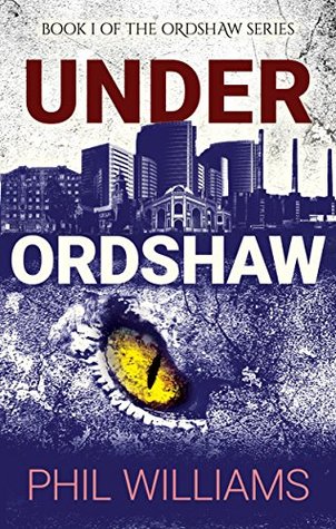
I started by going with the trope of splitting the page with a city skyline; particularly fitting for Under Ordshaw, featuring secrets lurking beneath the city. As a prayer for commerciality, I added a text-style based on the modern thriller genre.
Less straight-forward was how to represent the actual story. I wanted to show so many things, including but not limited to: an ancient book describing unheard-of monsters; actual monsters; creepy tunnels; poker; not magic, but something resembling unnatural energies; guns; fairies?!
At some point I settled on two options: 1) Go abstract with one simple image; or 2) create a specific, silhouetted scene from the book.
I created both. The first option was far simpler: easiest way to say fantasy and danger without luminescent magic? Monsters. What says monster? Evil eyes or claw marks. The eye was born.
The scenic choice was more complex. I recreated a scene from about a quarter of the way into the book; something encountered in a tunnel. I carefully combined tons of images, and after extensive editing was quite proud of the result: it actually resembled how it looked in my head.
I opened the pair of images up to feedback, and everyone preferred the eye. My editor said the scenic image simultaneously left little to the imagination and wasn’t satisfying imagery.
So.
The Ordshaw style was settled, and the cover for Under Ordshaw unleashed upon the world.
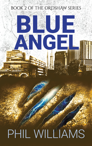
The second book, Blue Angel, was a simpler affair: all it needed was a new cityscape (the biggest task, as the Ordshaw cityscapes are not pre-existing skylines), a new colour scheme and a new image. Having rejected the claw for Book 1, it came naturally to Book 2, but with added electricity, capturing a theme of the book in the abstract.
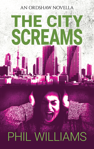
Now I’m onto a third book (not Book 3, but a standalone novella, Ordshaw’s unconventional manners swinging around again). The City Screams, out soon, is set in Tokyo, so the cityscape was simple. I hit a hurdle on other visuals, though, as the threats in The City Screams are unseen. I reluctantly went human – but with the style already settled this proved easier than before. And I wasn’t hunting for a Pax, which made me more forgiving (though the end result is still an edited combination of different people who weren’t quite right).
Three books in, with two more rapidly approaching, I’m really happy with how the series imagery is panning out. I’m not sure it fits the commercial bill, in the end, but, for a series standing somewhere between noir, urban fantasy and horror, I at least think I’ve captured the mood.
![]()
 ABOUT THE AUTHOR
Phil Williams writes contemporary fantasy and dystopian fiction and non-fiction grammar guides. His novels include the interconnected Ordshaw urban fantasy thrillers, the post-apocalyptic Estalia saga and the action-packed Faergrowe series. He also runs the website English Lessons Brighton, and writes reference books to help foreign learners master the nuances of English.
Phil lives with his wife by the coast in Sussex, UK, and now spends a great deal of time walking his impossibly fluffy dog, Herbert.
You can visit him at his website at http://phil-williams.co.uk or on Twitter at @fantasticphil.


Even though I do like the leather women, and at the same time go all come on! I do like when there is a book that is different too 😀
LikeLike
Haha, me too. Not that there’s anything wrong with leather clad women, but whenever I see that I just it’ll be a very conventional UF 🙂
LikeLike
I do like these covers a lot. They make me want to check out the series!
LikeLike
Same here, I love how eye-catching the colors are.
LikeLike
Awesome guest post! I remember back when Lynn revealed all her covers, this was one of my favorites. I loved reading about the design process, and I love seeing the other two covers😁
LikeLike
Same here, I remember seeing the cover reveal of Blue Angel on Lynn’s blog and remarking on the lovely color combo!
LikeLike
It’s always so interesting to see how the covers are done
LikeLike
I agree, I’m always fascinated by the process.
LikeLike
Seeing the behind the scenes on this is pretty interesting!
LikeLike
I think so too! When Phil told me his idea for his guest post, I was thrilled 🙂
LikeLiked by 1 person
This is a great guest post – I love reading about the development of ideas for the book covers.
Lynn 😀
LikeLike
It’s always great to see behind the scenes!
LikeLike
It’s always interesting to learn how the creative process takes place, either in the writing of a novel or the creation of a cover, and this was really quite fascinating 🙂
LikeLike
I agree! The artist side of me finds all this so interesting!
LikeLike
Pingback: Mogsy’s Bookshelf Roundup: Stacking the Shelves & Recent Reads | The BiblioSanctum
One of my current obsessions is cover design (decisions, funding, branding, traditional vs digital art … etc), so this was a fascinating guest post! And I love that first Ordshaw cover – it’s a winner! 🙂
LikeLike