Friday Face-Off: Retro
Welcome to The Friday Face-Off, a weekly meme created by Books by Proxy! Each Friday, we will pit cover against cover while also taking the opportunity to showcase gorgeous artwork and feature some of our favorite book covers. If you want to join the fun, simply choose a book each Friday that fits that week’s predetermined theme, post and compare two or more different covers available for that book, then name your favorite. A list of future weeks’ themes are available at Lynn’s Book Blog.
This week’s theme is:
“Groovy baby”
~ a cover that is RETRO
Mogsy’s Pick:
The Massacre of Mankind by Stephen Baxter
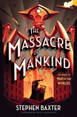
The “retro” style of the covers to The Massacre of Mankind makes sense, since it was written as a sequel to H.G. Wells’ The War of the Worlds. Taking place in 1920, approximately 14 years after the events in the original classic, the story continues through the eyes of Julie Elphinstone who now begins her own account of a second invasion. Yep, the Martians are back, and they’ve learned some lessons from their first go-around. This time, it’ll take more than microbial infections to take them down, and worse, Earth isn’t exactly in its best fighting shape. Still rebuilding from the first Martian assault, places like Britain are still in complete disarray politically, socially, and economically, especially in the wake of this alternate world’s version of World War I.
Only two covers are going head-to-head this week, so let’s take a look at them now:
Gollancz (2017) vs. Crown Publishing (2017)
Winner:
I love the retro “art deco” style of the Crown Publishing edition; it’s just so bold and eye-catching, hence I’m going with it as my winner. But what do you think? Which one is your favorite?


Honestly, equally good
LikeLike
Yeah, both very strong covers imo!
LikeLike
I completely agree with your choice!
LikeLike
Yay!
LikeLike
The Crown cover all the way. I love it.
Lynn 😀
LikeLike
Yes, I just love how the colors stand out!
LikeLike
What a fabulous choice of books for this theme! And a cracking read, too:). And to be honest – while I generally have opinions on EVERYTHING – I honestly cannot decide between them – they are both stunning:). And the short message informing would-be readers that it is a sequel to War of the Worlds is vital – unlike most chat on book covers:).
LikeLike
Yes, and it was actually that “sequel to War of the Worlds” blurb that first drew me in. How could anyone not be curious! 😀
LikeLiked by 1 person
Have you read it? I loved this one:)
LikeLike
Yep! I think it would have made a stronger impression on me if I had remembered most of what happened in War of the Worlds (it’s been a while!) but nonetheless I thought it was a good read 🙂
LikeLiked by 1 person
Yep, definitely the Crown publishing one for me too. Not only do I like the style, but I’m really attracted to the colors as well. In fact, looking down, it seems to be I color coordinated my work outfit to this cover as well today.
LikeLike
I agree, the color scheme is its greatest strength!
LikeLike
This is one of those situations where both covers are really good. I don’t think I can choose!
LikeLike
Yes they’re both quite beautiful!
LikeLike
Yes to the vivid red cover! That is really eyecatching!
LikeLike
I agree, it really pops out at you!
LikeLike
I prefer the red one too, but the other one is pretty good too. It was a hard choice…
LikeLike
It really was quite hard to choose. I think I chose the Crown just because the bold colors gave it the edge 😀
LikeLiked by 1 person
I with Crown too. I love the bold coloring and the way they used shadows to draw our eyes right center! The whole design of it looks like a retro movie poster – except with modern art style 🙂
LikeLike
Yes, I’m glad you mentioned the typeface. It’s pretty awesome 🙂
LikeLike
Crown cover Team for me as well! 🙂
The slight bent on the “legs” of the ship gives it a sense of danger and evil intent that’s far stronger than in the other cover.
LikeLike
Yeah, the tripod does look a lot more menacing in the Crown cover! Thanks for pointing that out! 😀
LikeLike
Ooh cool! I like the first one though, the more “traditional” looking tripods and the bridge, but the Crown one is amazing too. Looks like a fun book.
LikeLike
Yeah, the tripod in the Crown cover is more stylized whereas the one in the UK edition is more “realistic”…it comes down to a matter of taste, I think 🙂
LikeLike
I love the whole retro look of the covers. It piqued my curiosity.
LikeLike
I’m glad I put it on your radar! 😀
LikeLike
Oooh this is hard, both are really cool, but I think I like the other one better. Mostly because I like blue better than red haha
LikeLike
Yeah, I think it came down to color for me too 🙂
LikeLike
Great covers! I agree with your choice on the second one!
HERE’S MY FRIDAY FACE OFF:
https://rabbitearsblog.wordpress.com/2018/02/16/the-friday-face-off-7-retro/
LikeLike
Cool thanks, I checked it out! 😀
LikeLiked by 1 person