Friday Face-Off: Urban Fantasy
Welcome to The Friday Face-Off, a weekly meme created by Books by Proxy! Each Friday, we will pit cover against cover while also taking the opportunity to showcase gorgeous artwork and feature some of our favorite book covers. If you want to join the fun, simply choose a book each Friday that fits that week’s predetermined theme, post and compare two or more different covers available for that book, then name your favorite. A list of future weeks’ themes are available at Lynn’s Book Blog.
This week’s theme is:
~ an URBAN FANTASY cover
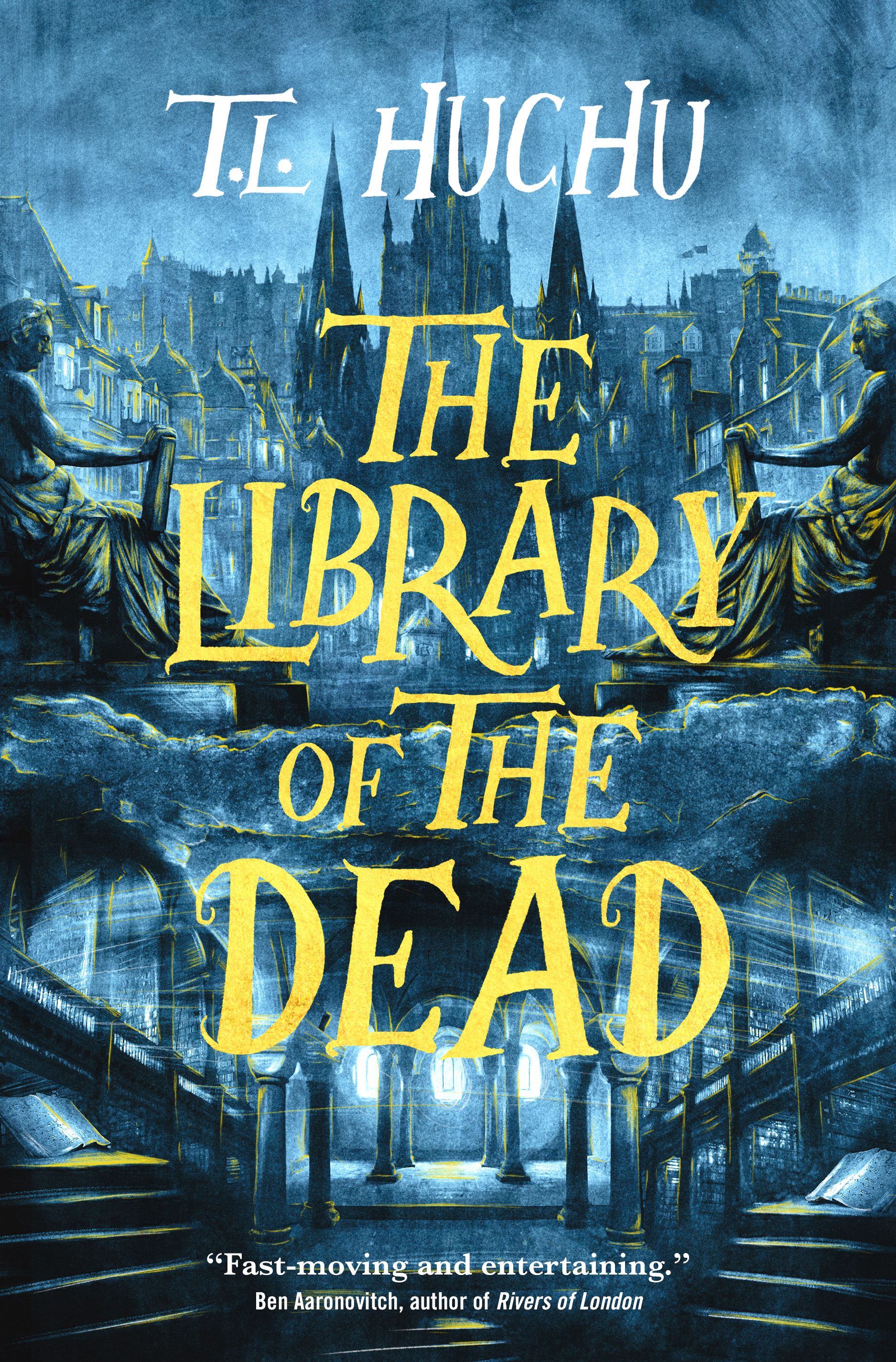
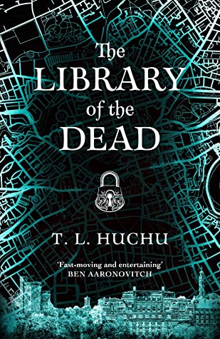
The Library of the Dead by T.L. Huchu
The Library of the Dead opens in Edinburgh, the home of our protagonist, 14-year-old Ropa Moyo. At a young age, she dropped out of school to look after her beloved grandmother and her sister Izwi, scraping out a living as a “ghostalker”—someone who can communicate with the dead. Mostly, this involves getting paid to help folks deliver messages to their dearly departed, but then one night, Ropa encounters a recently deceased spirit who makes her rethink everything she thought she knew.
Let’s check out the covers! Keeping it simple with just a good old-fashioned head-to-head this week.
Tor Books (2021) vs. Pan Macmillan (2021)
Winner:
Tough one this week, I don’t love either one but I don’t dislike them either! The Pan Macmillan UK version did catch my eye though, with its lines radiating radiating out from the center, and it took a closer look to make me realize it’s supposed to be a map of the city. But it’s cool that from a distance they look a lot like tree limbs or veins!
But what do you think? Which one is your favorite?


I’m actually not a big fan of the map lines for some reason..
I’d have to go with Tor. All those stairs, the city, it looks like you could step right through the cover and into a great adventure.
LikeLike
That’s a good point, I do love the depth in the Tor cover!
LikeLiked by 1 person
What do you do when you either like or don’t like all of the options?
LikeLike
I agree, I prefer this one as well
LikeLiked by 1 person
Not much to choose from, so hmm, yes maybe the first
LikeLiked by 1 person
I like the Tor edition as well. The big yellow font works better than the sort of boring white font of the UK cover😁
LikeLike
I think this is one of the few cases where a bright huge font actually kind of works!
LikeLike
I prefer the Tor edition, though I agree, the map aspect of the other is interesting.
LikeLiked by 1 person
The map is a bit too close to the Rivers of London covers I think, so same for me. And I must get round to reading this given it’s set in my home city 🙂
LikeLike
Yes, my mind first went to the Rivers of London covers as well!
LikeLiked by 1 person
It was definitely the Tor cover that piqued my interest for this one.
Lynn 😀
LikeLike
You picked it: the UK version calls to mind a ghostly. I like the other, but it’s almost too sinister.
LikeLike