Friday Face-Off: Recent Read
Welcome to The Friday Face-Off, a weekly meme created by Books by Proxy! Each Friday, we will pit cover against cover while also taking the opportunity to showcase gorgeous artwork and feature some of our favorite book covers. If you want to join the fun, simply choose a book each Friday that fits that week’s predetermined theme, post and compare two or more different covers available for that book, then name your favorite. A list of future weeks’ themes are available at Lynn’s Book Blog.
This week’s theme is:
“The most recent book you’ve read that has covers to compare”
~ a cover of a RECENT READ
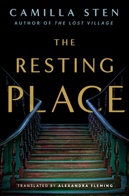
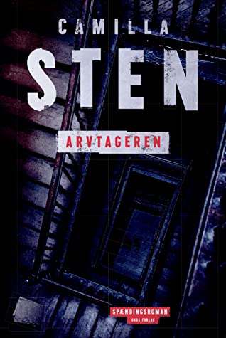
The Resting Place by Camilla Sten
This was a book I just finished, and since the Swedish original was pubbed two years ago, I was able to find a handful of covers to compare as more translated editions are coming out. Let’s take a look at them now:
From left to right:
Minotaur Books (2022) – Swedish Edition (2020)

German Edition (2022) – Danish Edition (2020)

Winner:
All the different art styles and design approaches made it a tough choice this week, but I’m going to have to go with the German edition. It might have drawn my eye because it’s the lightest cover there, but I also like the “sketch” effect and the ominous vibe it brings to the house’s facade. As far as I know, the cut-off text at the top is also intentional, as I’ve seen the author’s other books from this publisher done in the same way. It just further adds to the sensation that something is off-kilter and wrong.
What do you think? Which one is your favorite?


They’re all intriguing
LikeLike
These are all very different! I think the Danish cover is my favorite, I especially love the distressed font.
LikeLike
You know, I’m not sure any of them are my favourite. I like different elements of each but overall I’m not sure any of them grab me as much as the blurb does. I suppose the Swedish edition at least gives me horror vibes, so I think I’ll go with that one.
LikeLike
Ooh spooky! Holy crap that second one !
LikeLike
I’m torn between the Minotaur and Swedish editions. I love the simplicity and darkness of the Minotaur cover, and how the railing goes right through the text. But that Swedish cover is a bit disturbing in a fascinating way. In the end, though, I’d pick the Minotaur edition.
LikeLike
i like the Swedish. The titles all seem to mean different things
LikeLike
I do like your choice this week – something about the sketchlike quality. I also like the first from Minotaur – probably because of the way the stair rails feed through the title.
Lynn 😀
LikeLike