Friday Face-Off: Pink

Welcome to The Friday Face-Off, a weekly meme created by Books by Proxy! Each Friday, we will pit cover against cover while also taking the opportunity to showcase gorgeous artwork and feature some of our favorite book covers. If you want to join the fun, simply choose a book each Friday that fits that week’s predetermined theme, post and compare two or more different covers available for that book, then name your favorite. A list of future weeks’ themes are available at Lynn’s Book Blog.
This week’s theme is:
“As pink as cotton candy”
~ any cover that is PINK
Mogsy’s Pick:
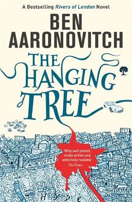
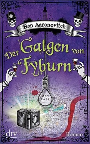
The Hanging Tree by Ben Aaronovitch
The US/UK covers to this series have always been very striking. Add some pink to it though, and they really stand out! Here’s a comparison of all the available covers:
From left to right:
Gollancz (2016)/DAW (2017) – Gollancz Paperback (2017)

German Edition (2017) – Czech Edition (2018)
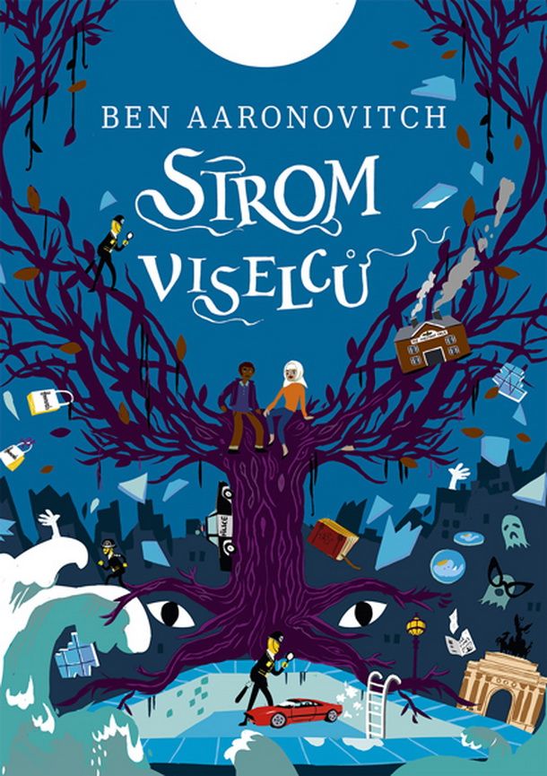
Winner:
I was all set to pick the classic pink Gollancz/DAW “map” cover for my favorite today, but that was before I discovered the Czech versions of this series. And if you actually get a chance to see the Czech editions for the previous books as well, they’re all so cute! Hate to say it, but I’m gonna have to go with the Johnny-come-lately this week, but it was a close one!
But what do you think? Which one is your favorite?


I’m all for the Czech version too! 🙂
LikeLike
It’s the most charming magical one there, imo! 😀
LikeLiked by 1 person
I agree that tbe Czech version is the prettiest Mogsy!
LikeLike
Definitely the prettiest!
LikeLike
I wondered if somebody would choose this one – it’s a series I should really start over and catch up with. I read and enjoyed the first one but then never got any further. Aaronovitch and Pratchett are two authors that I would like to get a little more to grips with.
I love your choice, it is fun and funky.
Lynn 😀
LikeLike
I originally had another book planned, but it being Wyrd and Wonder month I made a last minute change to a fantasy title, so Rivers of London it was! 😛
LikeLike
I think the Czech cover is pretty – but I just love the London landscape and given that it’s such an integral part of the book, my vote is for the pretty pink version. And you’ve reminded me that I’ve fallen behind with this series – it’s one I had been following at the library – so I need to get up to date with it:).
LikeLike
I totally agree – it was a tough choice. I love the “map” covers for this series, I think they just fit so well with the series’ themes of genius loci and spirits of place, acknowledging the setting of London as a living, breathing system and almost like a character in its own right! The maps just give the covers so much personality!
LikeLiked by 1 person
And that’s why I love them so much. There are a whole set of books where the backdrop is, essentially, another character and this is one of those series…
LikeLike
Oh it’s fun, it’s different
LikeLike
Definitely fun and a bit unique!
LikeLike
Oh wow, love the Czech edition! I haven’t read these books yet, does the quirky illustrated cover match the story?
LikeLike
These books can definitely get a bit wild! The author has written for shows like Doctor Who, so you know the kind of humor and quirkiness you can get 🙂
LikeLike
I like the pink one!
LikeLike
It’s definitely eye-catching, and the color combination!
LikeLiked by 1 person
I really like the first and fourth ones.
LikeLike
Those were my two top contenders, I just had to decide between the two 🙂
LikeLike
I think it’s a tie between the pink one and the one you chose. That one has so many fun elements to notice!
LikeLike
Yep, those two were my only real contenders, but I chose the Czech because I loved the imagery and color 🙂
LikeLike
Same, though it does look MG
LikeLike
It does have that “young reader” feel to it.
LikeLike
I like all the covers! They are a lot of fun 🙂 I like the German Edition (2017) best
LikeLike
That one deserves some credit for sure!
LikeLike
I kind of like all of these!
LikeLike
Yep, some are better than others, but I wouldn’t say any of these are bad! 😀
LikeLiked by 1 person