Friday Face-Off: Blue
Welcome to The Friday Face-Off, a weekly meme created by Books by Proxy! Each Friday, we will pit cover against cover while also taking the opportunity to showcase gorgeous artwork and feature some of our favorite book covers. If you want to join the fun, simply choose a book each Friday that fits that week’s predetermined theme, post and compare two or more different covers available for that book, then name your favorite. A list of future weeks’ themes are available at Lynn’s Book Blog.
This week’s theme is:
“How sweet to be a cloud, floating in the blue”
~ a cover that is predominantly BLUE
Mogsy’s Pick:
Shadowblack by Sebastien de Castell
I’ve been crazy busy lately, which made me nervous I wasn’t going to find a book in time for this week’s Friday Face-Off. But things actually turned out okay, because I immediately thought of a book the moment I saw the theme for today. It’s just a simple three-way competition this week, featuring the second book of Spellslinger, a rollicking YA fantasy series by one of my favorite authors.
From left to right:
Hot Key Books (2017) – Orbit (2018) – French Edition (2018)

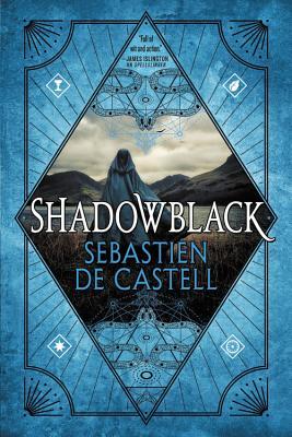

Winner:
Three covers, each with their own unique strengths, but I think I’m going to have to go with the Hot Key Books edition as that’s the that’s always struck me as having the most personality. The other covers are quite beautiful too, but I just love the playing card theme and the fact that we get such a great depiction of the characters. Also–Reichis!
But what do you think? Which one is your favorite?


Second that! This cover rocks, and I immediately want to read what’s inside 🙂
LikeLike
Agreed! These original UK covers were what made me want to read the series!
LikeLiked by 1 person
Yes, def prefer the hotkey one. Its not generic like the others.
LikeLike
Yeah, I love the colors of the others, but their designs are not as unique.
LikeLiked by 1 person
I have to agree, I just love all the Hot Key covers. But the French, which I’ve never seen before, is a close second!
LikeLike
It was the first time I’ve seen the French too, when I was putting this post together!
LikeLike
I love your winner!!! And I love blue covers just after purple ones !
LikeLike
Me too, purple covers are the best, but blue is also a great color for covers 😀
LikeLike
I know a lot of people love this series. I think all three here are pretty strong contenders but I have to agree with you. And I’ve seen the others in the series and think they all look so good together – something important to a lot of us bookworms.
LikeLike
Agreed, I love how both Hot Key and Orbit are keeping their covers for this series consistent!
LikeLike
I love the middle cover: there is something in the combination of color hue and design that speaks “magic” quite loudly… 🙂
LikeLike
It is a very pretty shade of blue, I give it that! The image in the middle almost gets lost in it!
LikeLike
I think the Orbit wins out by a nose, but mostly because i absolutely love that shade of blue. 🙂
LikeLike
I agree, and I love the way the blue gets deeper towards the edges!
LikeLiked by 1 person
I love this series and your choice and it would never have occurred to me to pick it because your favourite is the one I have in mind – so I would never even imagine that blue cover existed.
Lynn 😀
LikeLike
Haha, that’s funny! But yeah, I think for the most part the Orbit editions tried to match the border colors of the Hot Key editions.
LikeLike
I think I like the second one the most. Something about the blue and the character against that backdrop.
LikeLike
I had to really look to notice the character in the middle, but I have to agree with you on the blue – it’s such a pretty shade.
LikeLike
Yes that is certainly the best cover. I like that playing card feel to it.
LikeLike
It’s a very clever and artistic design!
LikeLike
Not much to choose from, so hot key
LikeLike
Yeah, this week I went with a book with fewer choices, lol. No time 😛
LikeLike
Definitely agree this cover has the most personality!
LikeLike
Yup, for me it’s the most eye-catching!
LikeLike
Agreed. I love how the sides of the Hot Key ones are colored to match the cover! Dunno if the other ones do that, but I’d assume not.
LikeLike
Yes, I believe they are – and all the books of the series (for both Hot Key and Orbit) look amazing together! 😀
LikeLike
Yep, I love your pick the most. The card theme (and the character in the forefront) surely does bring the most personality to the table. 😉
LikeLike
I remember loving the playing card theme the first time I saw the cover for book 1. I’m so glad they kept the theme going forward!
LikeLiked by 1 person
I would legit read this series for the covers alone haha! 😀
LikeLike
Nice pick! I really love the covers for this series. So much fun.
LikeLike
I agree! I also think the Hot Key editions reflect the series so well.
LikeLiked by 1 person
I love the Hot Key editions of this series, it was one of the reasons why I picked up Spellslinger in the first place! I love the card illustrations, it works really well with the flash of colour. Still have to pick up book 2 actually!
LikeLike