Friday Face-Off: Abandoned Buildings
Welcome to The Friday Face-Off, a weekly meme created by Books by Proxy! Each Friday, we will pit cover against cover while also taking the opportunity to showcase gorgeous artwork and feature some of our favorite book covers. If you want to join the fun, simply choose a book each Friday that fits that week’s predetermined theme, post and compare two or more different covers available for that book, then name your favorite. A list of future weeks’ themes are available at Lynn’s Book Blog.
This week’s theme is:
“Woe, destruction, ruin, and decay; the worst is death and death will have his day.”
~ a cover featuring ABANDONED BUILDINGS
Mogsy’s Pick:
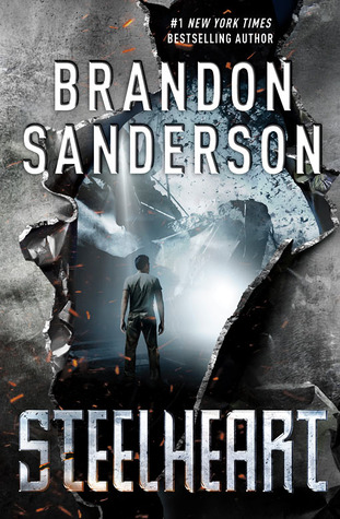
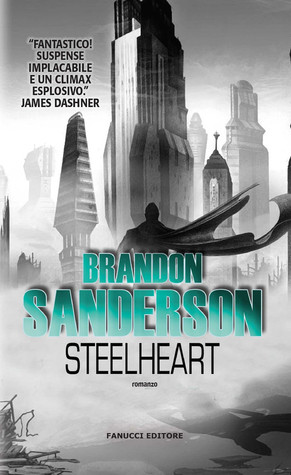
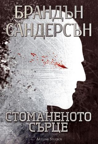
Steelheart by Brandon Sanderson
Behold Newcago – the setting of Steelheart, the first book of Brandon Sanderson’s YA superhero trilogy. Built upon the metallic ruins of the city formerly known as Chicago, what’s left is a landscape made up of completely solid steel after a High Epic named Steelheart went bonkers and transformed everything around him with his superpowers. And just as I expected, this post-apocalyptic dystopian’s covers are rife with imagery depicting abandoned buildings and other defunct structures. Let’s check them out now:
From left to right, top to bottom:
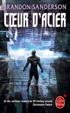
Delacorte Press (2013) – Orion Books (2013) – Ember (2014)


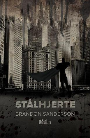
French Edition (2015) – Danish Edition (2015) – German Edition (2016)

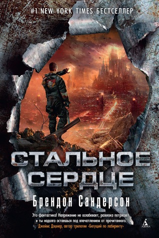
Polish Edition (2015) – Portuguese Edition (2016) – Russian Edition (2015)
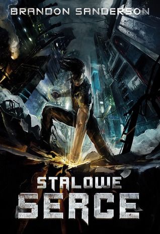

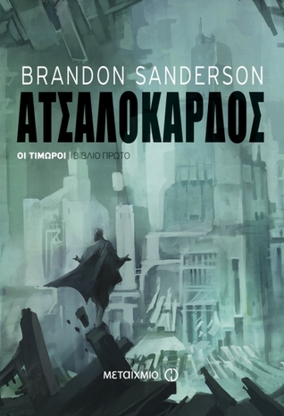
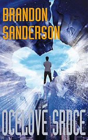
Slovak Edition (2014) – Greek Edition (2016) – Czech Edition (2015)
Italian Edition (2014) –Dutch Edition (2016) – Thai Edition (2015)


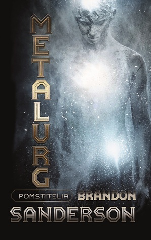
Chinese Edition (2014) – Bulgarian Edition (2013) – Indonesian Edition (2016)


Winner:
So many covers, and representing such a wide range of styles and themes! Many of them aren’t half bad either, making it very difficult to choose my favorite this week. But maybe it’s my current mood, or just the cold, grey and drab weather outside right now, but I find myself repeatedly drawn back to the dark, moody atmosphere of the 2015 Danish edition. I also love the simple yet powerful effect of the sepia tones and just the stark drama of the crumbling ruins captured in this image.
But what do you think? Which one is your favorite?


I like the Dutch edition 2014
LikeLike
I like it too, though it really doesn’t fit the book and I suspect this one is actually the Dutch edition of Alloy of Law and someone might have mistakenly filed it under Steelheart, lol!
Edit: After some googling, it appears that I may have been right. I’ve removed and replaced that version with something else!
LikeLike
I like the original Delacorte 2013 cover for the artsy look, and I like the Thai version because it’s simple but conveys strength.
LikeLike
I also like the Danish one the best. Can’t say I don’t like the Dutch 2014 version at all 🙈 it is also a really weird translation of the title… kinda glad we got a redo.
LikeLike
It is! I have no idea how they translated it like that haha 😂
LikeLiked by 1 person
You guys might be on to something! While I may have found the Dutch 2014 edition under the Steelheart page in Goodreads, I wonder if someone might have done it as a mistake. I think this should have been Alloy of Law. It makes more sense translation-wise, and also the cover fits the style of AoL a lot more.
Edit: After some googling, I think this is exactly the case. I’ve removed the cover and replaced it with another edition!
LikeLiked by 1 person
Yeah I think that makes sense!
LikeLike
Wow I didn’t know this book had so many covers hahah
(Www.evelynreads.com)
LikeLike
It does! I’m always surprised at how many I find whenever I do this feature!
LikeLiked by 1 person
I *love* this! You have done a fantastic job -collecting all these must have not been easy! I must say my favourite is the Greek one 🙂
LikeLike
Actually, it wasn’t that bad! Goodreads usually has a data base of all the versions available for a book, so I just had to look on Steelheart’s page and tell it to show all editions 😀
LikeLiked by 1 person
Many thanks for that! I had no idea, and I am sure going to use it in future, too 🙂
LikeLike
I was also trying to find a post apocalyptic/zombie type story this week. I like your choice best and I also like the Greek and the Indonesian covers.
Lynn 😀
LikeLike
Yup. I just looked under my post-apocalyptic/apocalyptic Goodreads shelf and bingo! 😀
LikeLike
A lot of interesting covers! Some of them are ruined by the words covering the best part of the designs! I like the Russian cover!
LikeLike
I agree! Annoying text, argh!
LikeLike
Like a lot of people, I kind of like the Dutch edition. I do recognize the Orion edition as belonging to the style of books by him people order from Book Depository because they like the covers better. I actually think that one would come in second for me. Who knew this book had so many covers?
LikeLike
The Dutch edition is really cool, it’s got this old school super hero feel! And yes, the Orion edition is the UK version – and all their Brandon Sanderson covers “match”/are done in the same style!
LikeLike
Whoa, so many cool covers! This is tough, but I love both the Polish and Dutch editions 😁
LikeLike
Yeah, I was shocked to find so many, but in retrospect I probably shouldn’t have been surprised…it’s Sanderson after all 😀
LikeLike
Well this week I would choose Orion (I love the font!) or the Slovak edition!
LikeLike
The Orion covers for Sanderson’s books are always popular! They make great covers of his books!
LikeLike
I think the Danish one you chose is the clear winner, though I do like the Polish one!
LikeLike
Yes, I love the dynamism of the Polish edition, I almost gave that one a special mention because it’s so eye-catching!
LikeLiked by 1 person
I like the Dutch edition. The super hero cape in tatters works well in this one.
LikeLike
Yes, agreed! It’s very dramatic!
LikeLike
It’s amazing to see how many covers were created for this book! I like your choice, both for the sepia-toned color and for the way the buildings are depicted, as if their upper stories were blowing away in the wind… 🙂
LikeLike
Agreed that is a really cool effect! Along with the sepia tone, it almost makes the cover look like an old-timey photo. Very throwback 😀
LikeLike
Ooh a bunch of nice covers! I think I like the Orion Books edition maybe the best, and for some reason the greek edition also appeals to me a little. The Thai edition is interesting.
LikeLike
Yeah, the Orion edition is very pretty. And if you look at all their other Sanderson books they publisher (all the UK editions) they all are done in this beautiful, ethereal looking style!
LikeLike
I think I have to go Russian, but I did like the Polish too
LikeLike
I like the Russian one too, it borrows from the main theme but does its own thing too!
LikeLike
I LOVE this idea!! Great picks!
Erica | Erica Robyn Reads
LikeLike
Thank you! You should join in the Friday Face-Off fun if you can 😀
LikeLike
I really like a lot of these! The one you picked is kind of stark, like that look here.
LikeLike
Ooh that is a really cool, artistic cover! Love your pick!
LikeLike