Friday Face-Off: Tudor Period
Welcome to The Friday Face-Off, a weekly meme created by Books by Proxy! Each Friday, we will pit cover against cover while also taking the opportunity to showcase gorgeous artwork and feature some of our favorite book covers. If you want to join the fun, simply choose a book each Friday that fits that week’s predetermined theme, post and compare two or more different covers available for that book, then name your favorite. A list of future weeks’ themes are available at Lynn’s Book Blog.
This week’s theme is:
“I know I have the body of a weak and feeble woman, but I have the heart and stomach of a king”
~ a cover of a novel set in the TUDOR PERIOD
Mogsy’s Pick:
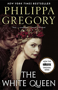
The White Queen by Philippa Gregory
For this week’s topic, I turned straight to Philippa Gregory, a historical fiction writer probably best known for her Tudor-related novels. The White Queen was quite an interesting book, but that’s probably not too surprising, given its subject matter, the War of the Roses. The story follows Elizabeth Woodville, who was married to King Edward IV from 1464 until his death in 1483. She was also the mother of the two “Princes in the Tower”, Edward V and Richard, who were 12 and 9 years old respectively when they disappeared after being locked up in the Tower of London by their uncle.
Now it’s time to look at the covers. Many of the ones I dug up were boring and repeated a lot of the same themes and imagery, so I decided to only feature the more interesting and noteworthy editions.
From left to right:
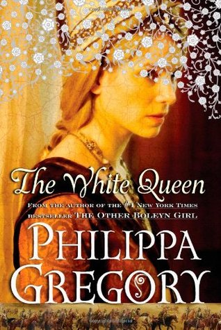
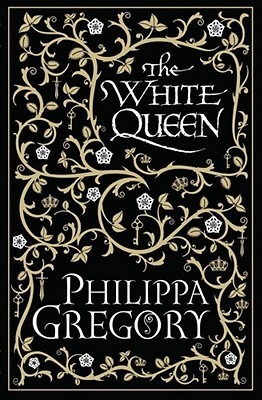
Touchstone (2009) – Simon & Schuster (2009) – Simon & Schuster Limited Edition (2009)

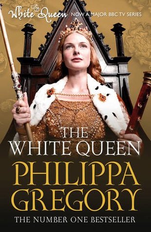
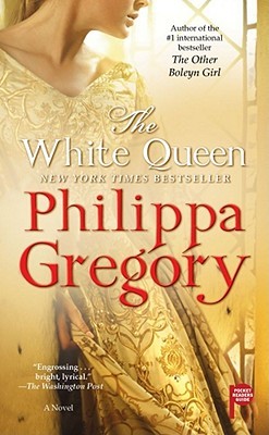
Simon & Schuster UK (2009) – Pocket Star (2010) – Touchstone Paperback (2013)
Serbian Edition (2010) – Danish Edition (2009) – German Edition (2011)


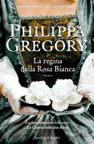
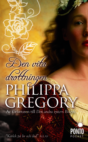
Italian Edition (2011) – Indonesian Edition (2011) – Swedish Edition (2011)

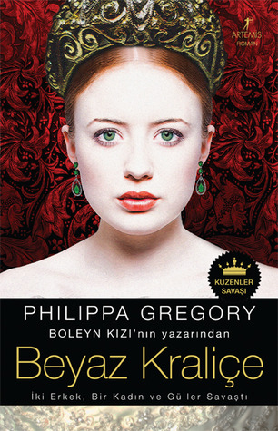
Czech Edition (2010) – Spanish Edition (2011) – Turkish Edition (2010)


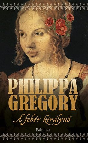
Lithuanian Edition (2009) – Latvian Edition (2011) – Hungarian Edition (2010)


Winner:
Today’s post is cover heaven if you like pretty dresses, and admittedly I’m quite attracted to the Danish and Indonesian editions because of that. However, this week I’m going to break with my usual preference for “people covers” and choose the Simon & Schuster limited edition as my favorite. With the many different versions here featuring the character’s awkward expressions and poses, I just feel like the simpler the better in this particular case
But what do you think? Which one is your favorite?


Oooh, I love this topic! Great pick, I keep meaning to read more of her stuff, I have a bunch of her books in my tbr pile. LOVE the cover you picked. As much as I love a portrait type in period dress, that cover is gorgeous.
LikeLike
She’s a good go-to author whenever I’m in the mood for historical fiction!
LikeLiked by 1 person
The cover I had for the White Queen isn’t here but it is similar to the first one but without the stuff over her face, Not greatly exciting! I prefer the second one featured. If I was replacing my books I’d go for that one!
LikeLike
Ah, I think I know the edition you’re talking about. I didn’t include it because the art was so similar to the first one, and there were so many covers for this book I had to cut some out!
LikeLike
I immediately knew that I would be picking the same one. That limited edition is gorgeous and I tend to shy away from giant faces on the covers. I don’t think I’ve read any books from this genre so I’d be at a complete loss on what to feature this week.
LikeLike
Yeah the weird thing is, I tend to go for the face covers! That this one attracted me so much speaks volumes about its aesthetics.
LikeLike
The Italian and Indonesian editions are really speaking to me! Great choice, Philippa Gregory immediately came to my mind as well😁
LikeLike
I love the dresses on the Indonesian and Italian editions!
LikeLike
The German edition is lovely 😀
LikeLike
That one has some really nice shades of pink and rose 🙂
LikeLike
Wow, but that’s a lot of covers. And yes, after looking at them all, I kind of like the one you chose over all, for its simplicity.
LikeLike
Yeah, sometimes less is more, and I definitely feel this is the case with this cover!
LikeLike
I’ve read this too and enjoyed it – in fact I’ve read a few books by this author and so did consider her this week. Wow, some of these covers are gorgeous but my favourite is your choice. I absolutely love that design which just feels so ‘Tudor’ – it practically screams Tudor at me. No doubt whatsoever for me this week.
Lynn :d
LikeLike
I agree, I think the simple design works for the book and the historical period!
LikeLike
The Spanish edition is the one that caught my eye more than the others: it looks like a period portrait and the fact that it shows only a part of that portrait enhances its impact.
🙂
LikeLike
Yes, of the “painted” covers, the Spanish one is quite beautiful. I also like the Serbian cover for similar reasons 🙂
LikeLike
I completely agree with you!!!!
LikeLike
Awesome, thanks for checking out the face-off! 😀
LikeLike
The Simon and Schuster is my favorite too, by a country mile. It’s very striking. I like the Danish one too. 🙂
LikeLike
The Danish one is very pretty, I love the color of her outfit 😀
LikeLike
I love the Simon & Schuster version of the White Queen with Elizabeth Woodville’s portrait on the front with the blue background! 🙂
LikeLike
That one is really cool! While I might not have chosen it as my favorite, the history buff in me approves 🙂
LikeLiked by 1 person
Great pick! I love that specific cover.
LikeLike
Yeah it seems I chose a popular one this week! Yay! 😀
LikeLike
Definitely agree with your pick!
LikeLike
For once I think a lot of people like the one I chose lol 😀
LikeLiked by 1 person