Friday Face-Off: Creeping Vines
Welcome to The Friday Face-Off, a weekly meme created by Books by Proxy! Each Friday, we will pit cover against cover while also taking the opportunity to showcase gorgeous artwork and feature some of our favorite book covers. If you want to join the fun, simply choose a book each Friday that fits that week’s predetermined theme, post and compare two or more different covers available for that book, then name your favorite. A list of future weeks’ themes are available at Lynn’s Book Blog.
This week’s theme is:
“Clinging and invasive”
~ a cover featuring CREEPING VINES
Mogsy’s Pick:
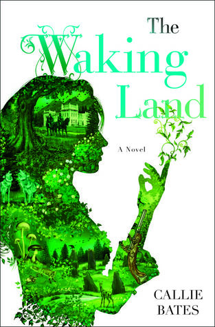
The Waking Land by Callie Bates
his book has been on my mind a lot lately, considering the sequel is about to come out very soon. The Waking Land follows Elanna Valtai, who was only five years old when she saw her nurse murdered right before her very eyes. Moments later, she was seized by the guards of King Antoine, the greatest enemy of her rebel parents. After her mother and father were exiled back to their ancestral lands, Elanna herself was taken hostage to ensure that there will be no more uprisings.
Subsequently, Elanna spends the next fourteen years growing up at King Antoine’s court. Despite being an outsider and the daughter of a known traitor, she is treated fairly well by the king and is even given a chance to study as a botanist. But then one day, Antoine sickens and dies and suddenly all bets are off. His heir Princess Loyce blames Elanna for killing her father with her knowledge of plant poisons, forcing our protagonist to flee to her homeland, where she reunites with her estranged blood kin. It is there where she finally discovers the truth about her birthright and the powerful earth magic that she always knew she had.
It’s going to be a simple head-to-head this week, but that’s okay because I think both covers in this match-up are very strong:
Del Rey (2017) vs. Hodder & Stoughton (2017)
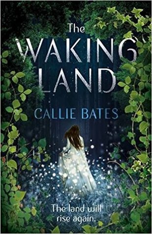
Winner:
The first images to pop into my head when I saw this topic were vine-covered Gothic buildings and overgrown gardens – eerie and ominous scenes, in other words. So I was a bit surprised when I came across creeping, trailing vines done in a very beautiful and magical way for both versions of this book. It’s a really tough choice this week because I love them both. However, the Del Rey edition has a little too much white space for my liking, so in the end, I think I’ll have to go with the Hodder & Stoughton.
But what do you think? Which one is your favorite?


Good call!
I hadn’t noticed the white space issue, but once you mentioned it and I looked at them again, that was ALL I could see. So much wasted, empty cover 😦
LikeLike
Yes, once you see the white expanse of space, you can’t really unsee it!
LikeLiked by 1 person
I’m not the biggest fan of either but I find the first cover more interesting to look at.
LikeLike
I do like the images in the silhouette on the first one, just a pity is has so much white space in the background.
LikeLike
I actually really like the contrast between the white background and the green silhouette so I’m going to have to go with the first. Both are pretty though.
LikeLike
That’s true! I am not as fond as the white space, but I do agree that it really makes the image pop! 🙂
LikeLike
I think I like the Del Ray version better but I agree, they could have done something more with the white. I received this in a subscription box some time back. I think the second is already out too (or coming out soon).
LikeLike
Yep, the sequel comes out this week! I hope you enjoy the first book 🙂
LikeLike
I love your choice, I had not seen that cover yet!
LikeLike
Yeah, I think it’s gorgeous! Usually for most books I find UK editions to be “plainer” but not in this case!
LikeLike
I am not in love with either, but Del Rey looks cool so I am going with that one
LikeLike
The silhouette effect does look cool, I give it that 🙂
LikeLike
I like your choice: for some reason it reminds me a little of the cover for Marillier’s Dreamer’s Pool, and for that reason alone it would get my vote 😉
LikeLike
It does to me too! I know what you mean, I love those ethereal “fairy tale” inspired covers.
LikeLike
I like this cover🤘🏻
LikeLike
It’s very pretty!
LikeLiked by 1 person
That’s one I want to try. but I think I prefer the other one
LikeLike
I hope you get a chance to check out the book!
LikeLike
I actually like all the white space on the first cover, but I don’t like the neon green. Its too bright and would look better with darker greens. So I agree with your choice, but for different reasons 😀
LikeLike
I think a darker green would be an improvement too. I do like the darker shades of forest green, maybe that’s why I was drawn to the other cover 🙂
LikeLiked by 1 person
I like that cover. The Del Rey one is interesting in its own way, I like the green, but the Hodder & Stoughton is my fave too.
LikeLike
Yeah, I like the style of the H&S, it looks like a painting (that I would happily hang on my own walls).
LikeLike
Definitely agree with your pick. Hodder & Stoughton (2017) edition nailed the mood. The first one has wayyyyyy too much white and the colour of the title font is… bad hahah
LikeLike
Haha, I didn’t even notice the font in the Del Rey version until you mentioned it – yeeeeah, you’re right, it’s not the best!
LikeLiked by 1 person
Yeah, I’m with you, there’s something about all that white space – it almost feels like it hurts my eyes – which is s bit strange I realise, but true.
Lynn 😀
LikeLike
I also think it makes the cover too “bright”. Maybe darker greens would have helped offset it.
LikeLike
I agree with you. I love both covers, but the excessive white makes me choose the other cover as well. 😉
LikeLike
Yeah, I love the details in the Del Rey edition, but I had to go with the richer, darker colors of the H&S 🙂
LikeLiked by 1 person