Friday Face-Off: Plane
Welcome to The Friday Face-Off, a weekly meme created by Books by Proxy! Each Friday, we will pit cover against cover while also taking the opportunity to showcase gorgeous artwork and feature some of our favorite book covers. If you want to join the fun, simply choose a book each Friday that fits that week’s predetermined theme, post and compare two or more different covers available for that book, then name your favorite. A list of future weeks’ themes are available at Lynn’s Book Blog.
This week’s theme is:
“When everything seem to be going against you, remember that the airplane takes off against the wind, not with it ….”
~ a cover featuring a PLANE
Mogsy’s Pick:
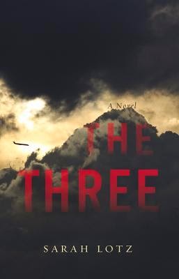
The Three by Sarah Lotz
There were several books I could have gone with this week, and almost every one of them featured a plane crash on the cover, making this a very stressful topic for me as an aviophobe. But even if I hadn’t already had a fear of flying, this novel would have instilled it in me. The Three is a horror/thriller about four plane crashes that changed the world. They all happened within hours, on the same day, on four different continents. Terrorism, environmental factors, equipment failure and human error were all ruled out, leaving aviation experts baffled as to what could have brought the planes down. Strangely though, in three out of the four crashes, a single child survivor is found amidst the wreckage.
It should have been impossible. No one could have survived those horrific crashes, but somehow, these children did. Dubbed “The Three”, some people claim that they are a miracle, while others are calling the mysterious plane crashes a sign heralding the End of Days, claiming that the children represent three out of the four horsemen of the apocalypse (but then where is the fourth? Might there be another child out there, waiting to be found?) Certainly, rumors of the disturbing things happening around the child survivors aren’t helping matters….
Okay. Deep breath, Mogsy. You can do this. Let’s take a look at the different covers I could find.
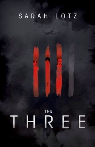
From left to right, top to bottom: Little, Brown and Company (2014) – Hodder and Stoughton (2014)
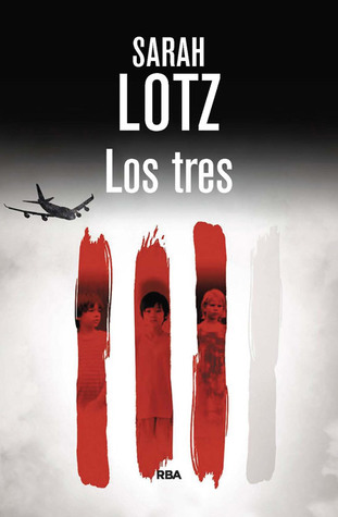
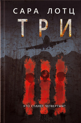
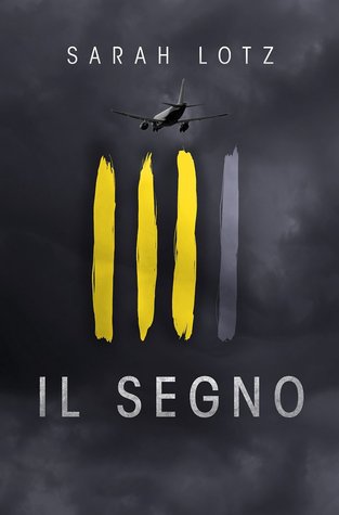
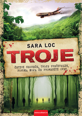
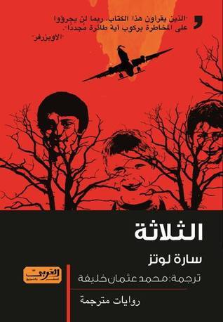
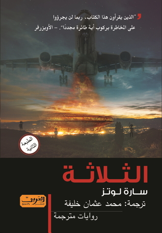
Spanish (2015) – Russian (2014) – Italian (2015) – Serbian (2014) – Arabic (2015) – Arabic
Winner:
I used to love the Hodder and Stoughton cover because of the subtle symbolism of the faded out “fourth tally”, but I have to admit, setting up this post and seeing the same motif used again and again on so many covers has somewhat dampened my fondness for it. I could have posted many more language editions, but they all pretty much this same image. So I’m going to go with the Little, Brown and Company edition this time, for its foreboding atmosphere. I like how the plane is so understated that you almost don’t even see it.
What do you think? Which one is your favorite?


Ooh nice. I like the Hodder & Stoughton one because the clouds are so dark, you can see the plane but it’s sort of obscured, and I like the font. But the one you picked out is nice too. The Serbian one I like the bottom part of the cover image but not the top as much.
LikeLike
Oh yes, I’m just now looking at it and I’m thinking the bottom part of the Serbian cover might be a nod to a creepy part in the book about a certain forest – if indeed that is the case, then I’m kinda liking the cover a little more than before 🙂
LikeLike
Pingback: The Friday Face-Off: Don’t Use The Phone – Books by Proxy
I like the design of the Serbian one best…great colours and vivid images!
LikeLike
It also has that “old school” feel which really makes it stand out!
LikeLike
Hmmm, first or second, but I will go for second
LikeLike
Yes, when the book came out I really liked that one.
LikeLike
The idea for the cover of your initial choice, I like that. But the actual execution, of 3 lines? I’m glad you chose another one 🙂
LikeLike
Yeah, initially I thought the “three lines” idea was really boring until I read the book and realized what it was symbolizing! And I had missed the faded “fourth line” at first glance, so once I spotted it, I appreciated the cover even more. But it’s just so…overused!
LikeLiked by 1 person
That’s a mountain that the plane is heading toward in the Little, Brown and Company cover, right? *shudders* I think I’ll go with that one, too, just because of the reaction it gave me when I looked at it.
Also: You’re OK, Mogsy. You made it through this. 😉
LikeLike
It’s hard to tell. At first I thought that maybe it’s a very big and stormy cloud that’s meant to look like a mountain…which is even more shudder-worthy to me, to be honest! I hate flying, and I haaaate turbulence. Flying into a cloud like THAT looks like a rough ride indeed… *hyperventilates* 😛
LikeLiked by 1 person
I like your choice! What makes it more interesting is the *suggestion* of images, rather than precise ones: the mountain and the clouds almost seem a reflection of each other, and the plane little more than a smudge – sometimes, imagining what’s to come is much more terrifying than seeing it in sharp detail…
🙂
LikeLike
I totally know what you mean by “suggestion”! Like in my comment above, I can’t really tell if that’s a mountain covered with clouds, or a huuuuuge cloud that looks like a mountain. Either way, not a good image!
LikeLike
I like the Italian one – possibly because it uses a different colour than all the others!
LikeLike
Agreed! Of the “three lines” covers, that’s the one that stands out to me because of the yellow!
LikeLike
Wow, all powerful covers. I can’t choose! 🤔
LikeLike
Some pretty striking ones this week 🙂
LikeLiked by 1 person
Book twins – this was such a good choice though and I do love the ominous, almost oppressive feeling of the winner – plus such a great read. Lotz is on my list now for sure.
Lynn 😀
LikeLike
Agreed on all counts! And Sarah Lotz is also on my list of must-read authors 🙂
LikeLike
I really love the covers for this book (and yet another one on my tbr pile!) and I definitely think you’re right. I was fond of the tally covers until I saw it replicated so many times. I’d have to agree with your choice – it’s so atmospheric! I love those clouds and the silhouette of the plane against the glowing light! 😀
LikeLike
Yeah, I love the idea for the tally covers, but that design does show up an awful lot! 🙂
LikeLiked by 1 person
I actually really like the Russian cover, because of the scratchy quality and the three lines, as well as the shape of the plane… but the Little Brown one is nicely understated as you say. I don’t think this would be a book for me though: I am also quite an aviophobe!!
LikeLike
Good eye, I didn’t really look at the three lines on the Russian cover but you’re right, they look slightly different from the other tally covers and sometimes it’s those little differences that count! The scratchy quality you described makes me think of spreading blood stains, for some reason!
LikeLiked by 1 person
Yes that quality together with the red makes me think of blood stains too… I guess it adds to the overall sense of ominous foreboding!
LikeLike