Friday Face-Off: Beach/Seaside
Welcome to The Friday Face-Off, a weekly meme created by Books by Proxy! Each Friday, we will pit cover against cover while also taking the opportunity to showcase gorgeous artwork and feature some of our favorite book covers. If you want to join the fun, simply choose a book each Friday that fits that week’s predetermined theme, post and compare two or more different covers available for that book, then name your favorite. A list of future weeks’ themes are available at Lynn’s Book Blog.
This week’s theme is:
”Oh I do like to be beside the seaside!”
~ a cover featuring the BEACH/SEASIDE
Mogsy’s Pick:
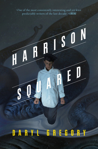
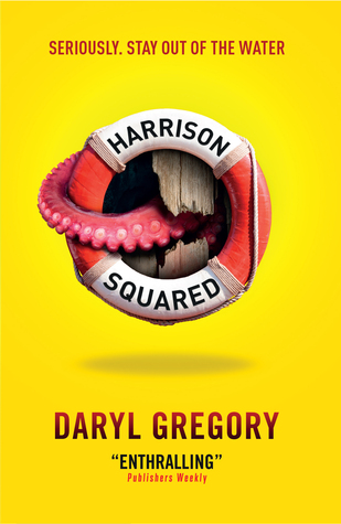
Harrison Squared by Daryl Gregory
Folks don’t usually associate sunny beaches and seashores with tentacles…unless you are an avid reader of Lovecraft-inspired horror featuring creepy little New England towns perched on the rocky coasts of the North Atlantic, of course. My pick for this week’s topic is a book set in fictional Dunnsmouth, a classic Lovecraftian town where strange things happen in the darkness of night and monstrous creatures lurk beneath the cold, merciless waves. Harrison Squared is a dark fantasy adventure following the tale of a teenage boy who lost his leg in a boating accident when he was a toddler. Harrison still remembers the sight of the giant tentacled sea monster that capsized his family’s boat and claimed his father’s life. Now years later, he searches for his marine biologist mother, unwilling to believe she is dead after she fails to return home from her latest research trip out to sea.
Only two covers available for this one, but they are both pretty striking:
Tor Books (2015) vs. Titan Books (2015)
Winner:
I’m going to go with the Titan Books edition for this one. Even though it gives off a vague sense that this is a fun, wacky book (it’s really not, in spite of its “adventurous” description and its quirky moments – the overall tone is actually kind of dark which probably makes the Tor cover more appropriate), the bright yellow is simply too eye-catching to ignore. I do love both covers, but the Titan one is especially well designed and constructed. If I passed by it on a shelf, I think it’d immediately leap out at me, before drawing my gaze to the single insidious tentacle reaching out from the life-preserver.
Well, that was my thought process anyway! What do you think? Which one is your favorite?


Ooh strange things under the water. Yes please. And I totally agree- the Tor cover is darker but the bright yellow just jumps off the shelf (or would, I imagine). I think I need to get this!
Oh and that tagline kills me. lol
LikeLike
Haha, yes, that quirky yellow cover has an awesome tagline to match 🙂
LikeLike
Titan for sure, I do not get the tor one
LikeLike
It’s a bit dark for sure – like, literally. The first time I saw it, I even missed the tentacles.
LikeLike
I agree…the yellow cover is very striking!
LikeLike
It’s very cool 🙂
LikeLike
From how you described it, I know I would feel very mislead by the yellow cover. Looking at it, I see a light creature feature book. Not Lovecraftian horror 🙂
I would probably end up writing a post about how publishers are destroying books with their insidious plans to lie to us, the readers and buyers.
LikeLike
Haha, and in that post, you should also mention how annoying those “It’s Harry Potter meets The Hunger Games!” or “Perfect for fans of Game of Thrones and Divergent!” blurbs are. The worst part is, they’re never anywhere close to accurate!
LikeLiked by 1 person
Oh, you are 100% correct there! I’ve learned to stay away from books that get compared to other books right on the cover. It usually means they’re not good enough to succeed on their own.
LikeLike
True, the Tor cover is more suited to the overall story, but the Titan cover is perfect because it’s… sneaky 😀 It promises you some light-hearted fun, but then there is that tentacle peeking out of the lifebelt, and the yellow expanse does not make you notice immediately that the tentacle broke the wooden plank to come out… As I said, sssssneaky!
LikeLiked by 1 person
It’s a very clever cover, I’ll give it that! And it’s true that it is sneaky, though probably not in the way the book intended to be 🙂
LikeLiked by 1 person
Maybe the monster picked the yellow background so it could sneak up on readers, like it does to the characters…:D Sneaky indeed!
LikeLike
And speaking of sneaky, if I recall correctly, the book’s ending sure was! Actually, I think it was a bit upsetting too 😛
LikeLiked by 1 person
Gah, sneaky on multiple levels Lol.
LikeLike
I have to say I like the Tor cover better, I think it fits with the overall feeling of dark, dank grayness that I felt while reading the book. The yellow cover makes it look like a comedy!
LikeLike
Exactly!
LikeLike
The yellow one does almost look like it’s going to be a fun book but I think that’s part of why it wins – because you then notice the life saver which has been invaded by a huge, boat shattering tentacle. A light hearted cover at first glance that is actually a lot more menacing on second look.
Lynn 😀
LikeLike
Haha, until someone picks it up thinking it will be a fun, humorous beach read and then all of a sudden, OMG!
LikeLike