Friday Face-Off: A Cover That Annoyed Me
Welcome to The Friday Face-Off, a weekly meme created by Books by Proxy! Each Friday, we will pit cover against cover while also taking the opportunity to showcase gorgeous artwork and feature some of our favorite book covers. If you want to join the fun, simply choose a book each Friday that fits that week’s predetermined theme, post and compare two or more different covers available for that book, then name your favorite. A list of future weeks’ themes are available at Lynn’s Book Blog.
This week’s theme is:
~ a cover that ANNOYED YOU and WHY
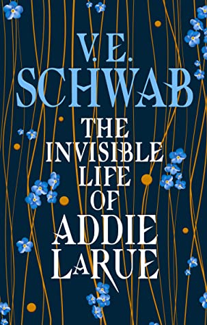
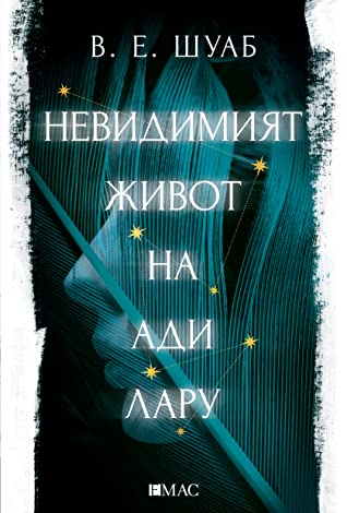
The Invisible Life of Addie LaRue by V.E. Schwab
I don’t typically get annoyed with book covers, though sometimes I do scratch my head and think, “Why?” or “What a shame such an amazing book got such a boring, nondescript cover.” Not to knock text-only covers because sometimes they can be very well designed, but for me, they are usually the most disappointing since they almost always fail to say anything valuable about the story or to convey its awesomeness. This was how I felt last year after reading The Invisible Life of Addie LaRue which I thought was a work of art and a masterpiece. With that said, I guess it’s no surprise that none of the covers I’ve seen for the book have managed to match my expectations.
From left to right:
Tor Books (2020) – Titan Books (2020)

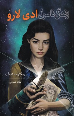
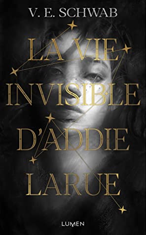
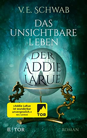
Persian Edition (2021) – French Edition (2021) – German Edition (2021)
Bulgarian Edition (2021) – Dutch Edition (2021)

Winner:
As hard as I am on text-only covers, I can’t say I’m crazy for the alternatives either. In fact, I think I will go with the Titan edition this week because at least I love the colors and the design.
But what do you think? Which one is your favorite?


For the most part, only movie covers on books annoy me. It REALLY annoys me though 😦
LikeLiked by 1 person
Me too, Bookstooge. I’d be searching for an original.
LikeLiked by 1 person
Same – it just screams “look at me, you should care now because a movie was made!”
LikeLiked by 1 person
Indeed the alternatives to the text-only covers were not that outstanding, and I like your choice: that shade of blue in the flowers and the author’s name is very lovely 🙂
LikeLiked by 1 person
Yes ,not a big fan of text covers still, but the blue is so beautiful and calming!
LikeLike
Agreed. The blue is lovely.
LikeLiked by 1 person
And the flowers are such a nice touch!
LikeLike
I quite understand your annoyance! That Tor cover, in particular, is downright dreary and doesn’t begin to hint at the fabulous writing and lovely premise. I have rather fallen in love with the Bulgarian cover, though. That ethereal face in blue that is half disappearing gives a nice nod to the story and is beautiful. Thank you for this selection, Mogsy:)).
LikeLike
Yes! So dreary and boring! The UK cover at least conveys the beauty and lovely nature of the story 🙂
LikeLiked by 1 person
When I first saw the Tor cover I thought it was a place holder, lol. I was shocked to find out it was the final cover!
LikeLike
I know, I was so disappointed! It just seemed so bland and low effort!
LikeLike
Every time I see that Tor Books cover I think it’s the anniversary edition of Catcher in the Rye that I have and it messes with me, to the point that I’ve not even looked twice at the book. Cover designers really need to think their choices through, for sure. Thankfully it has V.E. Schwabb’s name to it, which helps… but I’m definitely on team French/German/Bulgarian/Dutch for this one.
LikeLike
Haha, yep, pretty much anything but the Tor cover!
LikeLiked by 1 person
Titan books is indeed my favorite.
LikeLike
Artistically at least, it is very well done! 🙂
LikeLike
I wonder if the simpler covers with mostly just text were supposed to represent to the invisibleness of Addie, how no one could remember her face? 🙂
LikeLike
Hmm, now you’ve got me wondering! Symbolically, I think it makes perfect sense! But from a marketing perspective? Maybe not so much, haha! 😀
LikeLike
A good choice, this is such a good book and the covers feel so nondescript. I like the comment above that maybe the lack of anything really stand out maybe is somehow related to Addie’s inability to make an impression?
That would be an interesting idea but also maybe a strange marketing ploy.
Lynn 😀
LikeLike
Maybe German, but something is not quite right
LikeLike