Friday Face-Off: A Picture Within A Picture
Welcome to The Friday Face-Off, a weekly meme created by Books by Proxy! Each Friday, we will pit cover against cover while also taking the opportunity to showcase gorgeous artwork and feature some of our favorite book covers. If you want to join the fun, simply choose a book each Friday that fits that week’s predetermined theme, post and compare two or more different covers available for that book, then name your favorite. A list of future weeks’ themes are available at Lynn’s Book Blog.
This week’s theme is:
~ a cover featuring A PICTURE WITHIN A PICTURE
Mogsy’s Pick:
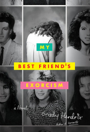
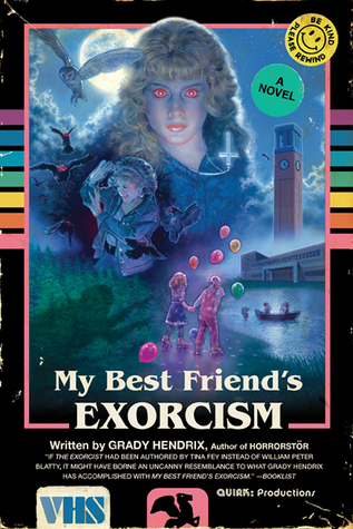
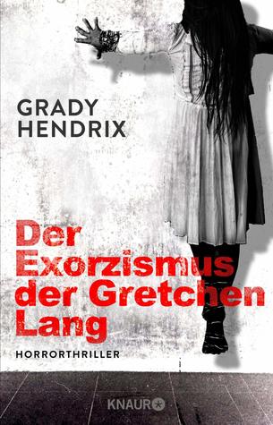
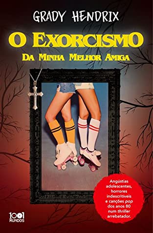
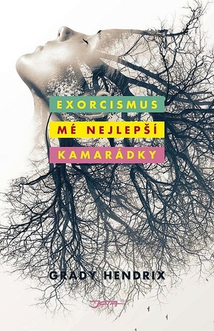
My Best Friend’s Exorcism by Grady Hendrix
My goodness, this week’s topic was hard! My pick probably barely qualifies, but oh well – it was a book I enjoyed and it has some great covers, so check them out!
From left to right:
Quick Books Hardcover (2016) – Quirk Books Paperback (2017) – Russian Edition (2020)
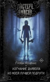
German Edition (2019) – Portuguese Edition (2019) – Czech Edition (2018)
Winner:
Like a lot of Grady Hendrix’s stories, this novel was a bit offbeat, and I think that calls for an offbeat cover. The Quirk paperback edition mimicking a VHS sleeve for an old-school campy horror movie might be come off as kind of gimmicky, but hey you just gotta love it!
But what do you think? Which one is your favorite?


„Be Kind Please Rewind“
That cover has so many layers of awesomeness!
LikeLiked by 1 person
I know, I’m a sucker for the retro look!
LikeLiked by 1 person
Speaking of that, I even remember how to rewind audio tapes manually 💪😎 A feat absolutely necessary for an 80s kid (it’s faster than letting the Walkman do it for you)
LikeLike
Oh they’re all really different
LikeLiked by 1 person
The 2016 cover was kinda fun, it projected the theme and all that, but “old school paperback” 2017 cover brought the vibe, the cheese, the horror, the exaggeration, the awesome- everything that Grady Hendrix books are. I really love it.
LikeLike
Exactly! You said it better than I ever could 😀
LikeLike
I like your choice! It reminds me a little of the posters for Stranger Things 😉
LikeLiked by 1 person
Yep, gotta love the whole 80s vibe!
LikeLiked by 1 person
Pretty much echo’ing what Andreas and Maddalena wrote…..
LikeLike
Yeah, the retro style design is a stroke of genius!
LikeLiked by 1 person
Yes, the Quirk paperback is my favorite too! So campy but it works with the story😁
LikeLike
Definitely campy, but you’re right, it’s so perfect for the book!
LikeLike
I have 2 picks, the Quirk VHS edition for the reasons you said, and the Czech edition because I love the differenet visuals.
LikeLike
Hmm, I didn’t even really look at the Czech edition until you mentioned it! I have a much deeper appreciation for it now.
LikeLike
Hmm I can’t say I much like any of them but the one you picked does at least have colour interest!
LikeLike
Haha yes, it’s so campy but it definitely catches your eye! 😀
LikeLike
Yeh, that cover is so cheesy that it’s just excellent and it really does look like an old VHS sleeve.
Lynn 😀
LikeLike
Yes, whoever came up with the design was brilliant!
LikeLike
I like the first one, though she should look a bit creepier turned back
LikeLike