#SciFiMonth Friday Face-Off: Words Only

Welcome to The Friday Face-Off, a weekly meme created by Books by Proxy! Each Friday, we will pit cover against cover while also taking the opportunity to showcase gorgeous artwork and feature some of our favorite book covers. If you want to join the fun, simply choose a book each Friday that fits that week’s predetermined theme, post and compare two or more different covers available for that book, then name your favorite. A list of future weeks’ themes are available at Lynn’s Book Blog.
This week’s theme is:
“Words are pale shadows of forgotten names. As names have power, words have power. Words can light fires in the minds of men. Words can wring tears from the hardest hearts.”
~ a cover that has WORDS ONLY
Mogsy’s Pick:
Invictus by Ryan Graudin
This week, we have a YA time travel story starring a protagonist with a very unique background. Conceived in 95AD, the result of a tryst between a time-traveling Recorder and a Roman gladiator, Farway Gaius McCarthy was born just as his mother Empra and her crew were in the middle of jumping back to their own year of 2354. While the entire truth behind the circumstances of his birth was kept a secret (and not just because of the whopping number of time laws Empra broke), nothing can change the fact that Far was born out of time, and his existence has been the bane of census takers and record keepers ever since.
Let’s take a look at the covers:
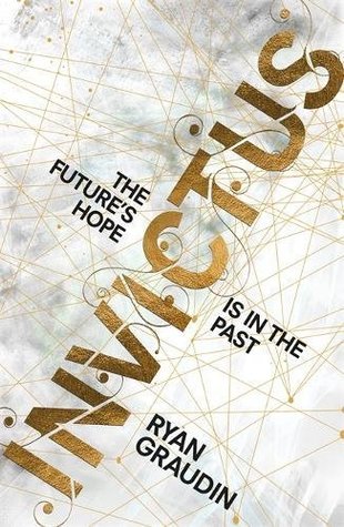
From left to right:
Little, Brown Books for Young Readers (2017) – Hachette Children’s Group (2017)

Italian Edition (2018) – Czech Edition (2019)
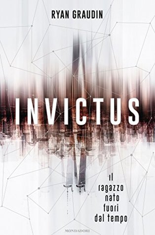

Winner:
See, the thing with text-only covers is that they can be kind of bland. I’m not crazy about any of the covers this week, but I do have to say I like the blurred effects of the city skyline and reflection in the Italian edition. The Czech edition is interesting too, but the problem is that it also looks kind of steampunk, and I really don’t see how that has anything to do with the story.
But what do you think? Which one is your favorite?


Sounds like an interesting story, one with a lot of potential paths it could go down. And I agree with your cover choice. I was immediately drawn to the blurry effects of the Italian cover and how they help the superimposed text stand out.
LikeLike
Agreed, I like the effects and thought it was pretty well balanced 😀
LikeLike
Good choice: at first sight one does not even notice the city’s skyline and sees only the words and the splash of color at the center… 🙂
LikeLike
Exactly, it’s the kind of cover that the longer the look, the more you can appreciate 🙂
LikeLike
The Italian edition is definitely the best😁 I did a spread of “word” books and I completely forgot about this one!
LikeLike
The words are definitely splashed across this one!
LikeLike
I had never seen that edition but it’s my favorite!
LikeLike
It’s quite striking!
LikeLike
Oh yes, the Italian version is definitely the best for me – I like that the reflection is more clear cut than the city it is depicting.
Lynn 😀
LikeLike
I think that was a great touch!
LikeLike
I love the colours in the Little Brown one!
LikeLike
The colors are indeed pretty!
LikeLike
I think I must go Czech, but it could have been done better
LikeLike
I agree, plus it didn’t really fit.
LikeLike
I like most of the covers for this, but definitely agree with your pick!
LikeLike
Thanks!
LikeLike
Nice choice. I do think out of these that your pick is the best of them.
LikeLike
Yeah, it was the first one that stood out!
LikeLiked by 1 person
Great pick this week!
LikeLike
Thanks!
LikeLike