Friday Face-Off: Holding An Object
Welcome to The Friday Face-Off, a weekly meme created by Books by Proxy! Each Friday, we will pit cover against cover while also taking the opportunity to showcase gorgeous artwork and feature some of our favorite book covers. If you want to join the fun, simply choose a book each Friday that fits that week’s predetermined theme, post and compare two or more different covers available for that book, then name your favorite. A list of future weeks’ themes are available at Lynn’s Book Blog.
This week’s theme is:
HOLDING AN OBJECT
Mogsy’s Pick:
City of Lies by Sam Hawke
City of Lies might not have completely won over my heart, but I do have to give it credit for a most intriguing opening line: “I was seven years old the first time my uncle poisoned me,” begins our protagonist Jovan, whose family the Oromanis have long been entrusted to serve a sacred duty. Their job can be likened to that of Secret Service, keeping Chancellor Caslav and his nephew Tain safe from unseen threats, though recognizing signs of poison is their specialty. From a young age, both Jovan and his sister Kalina have been trained by their uncle, the spymaster Etan, to identify all kinds of harmful substances, which sometimes involved being poisoned themselves in order to learn and become inured to their effects. But one day, the unthinkable happens. Caslav falls to a powerful poison, one that is unknown even to Jovan and his extensive records of poisonous substances. Tain is called upon to take up his uncle’s mantle, despite the heir being young and untried. The Oromani siblings subsequently pledge to become his protectors, all three of them stepping dutifully into their new roles.
Only two covers to go head-to-head today, but both feature an object being held:
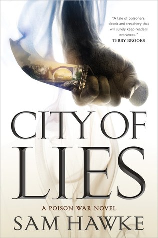
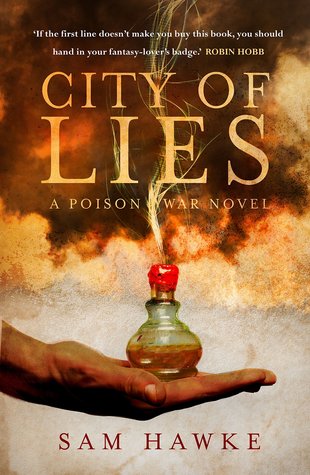
Tor Books (2018) vs. Bantam Press (2018)
Winner:
I’m going with the Bantam Press edition for this one. The Tor edition is nice too, but it’s also pretty generic, as “holding a weapon” covers are pretty ubiquitous in fantasy. In my opinion, the Bantam Press cover also has more to do with the story, what with the focus on poisons and all, plus the colors are just so rich and gorgeous I can’t help but be drawn to it.
But what do you think? Which one is your favorite?


At first glance, I was with your choice. Color saturated, poison, check. But then, I took a second look at the first option.
Poison here is represented by the smoke drifting from the tip of the blade and whisping all over the cover, ever more fading. One nearly chokes, and that is more dangerous than that overt offering of the second cover.
While daggers are generic, I liked the curve of this one and the visible tight grip.
I zoomed into the dagger, and, behold, a whole city unfolded. The second cover hasn’t got anything comparable in opening up to the setting.
Lastly, I prefer clean, white covers.
LikeLike
Haaaa that one will be easier! And I agree with your choice!
LikeLike
Pingback: The Friday Face-Off: Just as it Seems – Books by Proxy
Ooh this one is lovely! I think I agree with you… except that little city reflected in the blade of the first cover is wonderful! I love that. So really I am divided… I would be happy with either one on my bookshelf!
LikeLike
It wasn’t until I was reading the other comments that I realized the first cover was showcasing a dagger. I was wracking my brain to figure out what was going on. In my defense, it is early and “because”. But I like that second cover too. While I’m usually a minimalist, if a cover hits it just right, i’m all about the colors and shapes 😀
LikeLike
Well, with that “Poison War” series title, your choice is nothing short of perfect! 🙂
LikeLike
I love the second one too! The Tor Books edition is just a little generic😁
LikeLike
I like both of these. Probably the first one more though.
LikeLike
Oh, it has to be the second one! The colours are gorgeous and I think that dagger with the hidden city is trying to be a bit too clever for its own good – and isn’t it INTERESTING how this choice has divided your visitors??? I love this meme! Thank you for presenting us with two such excellent choices:))
LikeLike
This is a tough one. I think the Bantam cover more directly brings to mind poison, and it’s a beautifully designed cover. But I lean towards the Tor cover, likely because I’ve always been drawn to the aesthetics of beautifully crafted edged weapons and the interesting contrast between their form and function. If it were a more generic blade I might not be as drawn to it, but this one I find interesting.
LikeLike
I guess I will go with the dagger
LikeLike
Great pick. I like both of these covers but there is something about the UK one that I really love.
LikeLike
Definitely the second one for me too. That little bottle looks quite fascinating.
Lynn 😀
LikeLike