Friday Face-Off: Time
Welcome to The Friday Face-Off, a weekly meme created by Books by Proxy! Each Friday, we will pit cover against cover while also taking the opportunity to showcase gorgeous artwork and feature some of our favorite book covers. If you want to join the fun, simply choose a book each Friday that fits that week’s predetermined theme, post and compare two or more different covers available for that book, then name your favorite. A list of future weeks’ themes are available at Lynn’s Book Blog.
This week’s theme is:
“Time waits for no one”
~ a cover featuring TIME
Mogsy’s Pick:
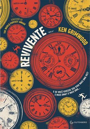
Replay by Ken Grimwood
This is a book that’s been around since the late 1980s, which is amazing to me, as aside from the references to the dates, it has aged extraordinarily well for a sci-fi time travel novel. The story begins with the death of 43-year-old Jeff Winston, who inexplicably awakens back in 1963 as his 18-year-old self. With his memories of his previous life intact, Jeff thus begins to “replay” his life again. Like a time-loop, this happens again and again, with Jeff dying at 43 each time, but awakening later and later in his life, losing more time each cycle. Each of Jeff’s replays become vastly different, due to his attempts to change events.
It’s really a fascinating book, and over the years there have been many editions. In fact, there are too many covers to show them all here, so I’ve only selected a handful of the most interesting to feature:
From left to right:
Grafton (1987) – Thorndike Press (1986) – William Morrow (1998)


Gollancz (2019) – Polish Edition (2002) – Japanese Edition (1990)


Portuguese Edition (2014) – French Edition (1988) – French Edition B (1997)


Indonesian Edition (2010) – Bulgarian Edition (2018) – Chinese Edition (2014)


Winner:
Notice I said “most interesting” and not the “best”, because I’m not really in love with any of the covers this week. But I’m always drawn to a splash of color. I really like the combination of bright reds and yellows on the Portuguese edition, and I confess it was one of the few that stood out to me.
But what do you think? Which one is your favorite?


Yours is my favorite too!!!
LikeLike
I think it’s the one that stands out the most 🙂
LikeLike
Yes!!! I like the Portuguese one the best, and quite like the Chinese one as well. The rest… not so much 🙈
LikeLike
Haha, yeah there were only a few standouts in this batch.
LikeLiked by 1 person
Same! I was thinking about another clock one too but this one was the best one
LikeLike
I do love the imagery of the clock covers!
LikeLike
the 1990 japanese cover is the one that appealed to me.
LikeLike
That one looks like a movie poster, I dig it!
LikeLiked by 1 person
That’s my choice, too. The red and yellow stand out.
LikeLike
That’s what I thought too, the colors really make the difference 🙂
LikeLiked by 1 person
🙂
LikeLike
What a fascinating concept!!! This is the first time I’ve heard of this book, and now I *want* to read it 🙂
Good choice of cover – the French edition B is good as well, with that pause & play symbol on the man’s figure…
LikeLike
It’s a really good book! The awesome thing is that it predates a lot of the popular time travel stories like it that are famous, and yet hardly anyone knows about this one!
LikeLike
I don’t know if I know about this title
LikeLike
I wish more people knew about it 🙂
LikeLike
Great choice and that red and yellow cover definitely does jump out at you. Strangely I’m drawn to the rather quirky Grafton cover with the olde worlde guy stood on the clock face.
Lynn 😀
LikeLike
Haha, the imagery on that one does draw the eye, I agree!
LikeLike
My choice probably isn’t popular, but I love the Polish edition. There’s something about a bunch of vintage watches that just makes me happy😁
LikeLike
It’s definitely got that old-timey feel down (no pun intended) 😀
LikeLike
They are an interesting collection of covers, Mogsy. I haven’t read this one, or encountered it, before – because I’m a sucker for timey-wimey stuff… My favourite by a long country mile is that beautiful Japanese cover. The colours are lovely – and I love the fact that you have an older and younger version of the same face – clever and well done.
LikeLike
The Japanese cover doesn’t get enough love 🙂 It reminds me of a movie poster, so I do kind of like it!
LikeLiked by 1 person
Before I scrolled to the bottom I was like ‘I really love that Portuguese edition’ lol. 🙂
LikeLike
The colors do catch the eye don’t they 🙂
LikeLiked by 1 person
I lean towards the French Edition B. Not sure how well it fits the theme, but I like the cover.
LikeLike
That’s an interesting one, I find it interesting how it’s so different from the other French cover!
LikeLike