Friday Face-Off: Feathers
Welcome to The Friday Face-Off, a weekly meme created by Books by Proxy! Each Friday, we will pit cover against cover while also taking the opportunity to showcase gorgeous artwork and feature some of our favorite book covers. If you want to join the fun, simply choose a book each Friday that fits that week’s predetermined theme, post and compare two or more different covers available for that book, then name your favorite. A list of future weeks’ themes are available at Lynn’s Book Blog.
This week’s theme is:
“The haft of the arrow had been feathered with one of the eagles own plumes.”
~ a cover that features FEATHERS
Mogsy’s Pick:
Antigoddess by Kendare Blake
After the plethora of options we’ve had to choose from for the past few weeks, I thought it would be a relief to go with a good old fashioned head-to-head today. That and I really couldn’t think of many books with “feather” covers, so this week we get Antigoddess by Kendare Blake, the first book of a Greek mythology inspired trilogy about ancient gods who walk among us–except now, they are dying. One by one, they are losing their immortality, meeting their ends in the most bizarre ways. Our protagonist Athena, for example, is experiencing her impending death by way of random feathers sprouting in her body like a form of aggressive cancer. This is making all the gods terrified, and in their desperation, some of are driven to insanity.
Now let’s take a look at the covers:
Tor Books Hardcover (2013) vs. Tor Books Paperback (2014)
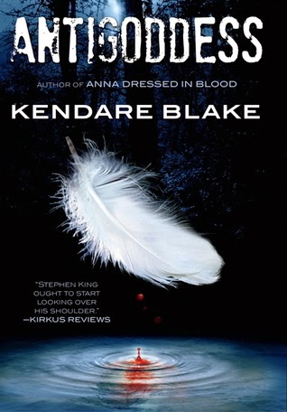
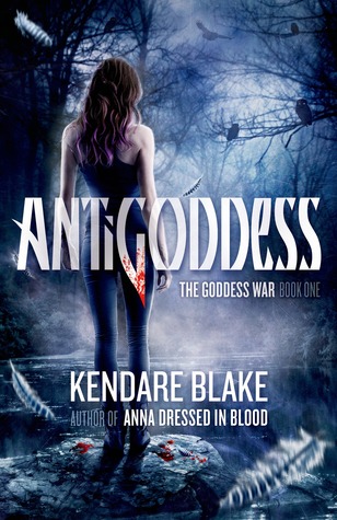
While both covers feature feathers, the original Tor Books cover shows a single white plume front and center, and after I read the book and found out about Athena’s plight, its significance certainly took on a more disturbing meaning. But I’ve never really liked this cover; it’s always seemed a bit plain to me. Maybe that’s why when Tor reissued the book in paperback they also gave it a brand spanking new cover. It screams “YA fantasy”, but I do still prefer it a lot more over the original.
But what do you think? Which one is your favorite?


Yes I prefer the cover you chose as it is more interesting and visually appealing.
LikeLike
I liked that it was more complex 🙂
LikeLike
Ooo… what a fabulous premise! Having just finished listening to Stephen Fry’s fabulous Mythos and Heroes, I think this one sounds great. As for the covers – it’s the feather for me – love it with the drop of blood into the water… And a great choice for this week:)
LikeLike
Yes, anything to do with mythology – especially Greek gods – I am so there 🙂
LikeLiked by 1 person
I like the first one which isn’t surprising since I really don’t care much for people on the cover of books. However, I do admit the second one doesn’t bother me much and I can see its appeal.
LikeLike
Haha, maybe it’s because you can see her face! I do like that it’s more lowkey than most “people” covers 🙂
LikeLike
I agree, the Tor paperback is much more interesting, although you’re right, it does have a more YA vibe!
LikeLike
Yes! Both covers are pretty, but the feather one is just too plain for me.
LikeLike
Both covers are quite good, and I feel that the one with the feather and the drop of blood is more dramatic for its starkness. Interesting story too, I must take a peek one of these days… 🙂
LikeLike
Yup, agreed that it’s more dramatic, in its simplicity! I do love the details in the paperback version a lot though 🙂
LikeLike
I like the simplicity of the original cover and it still has a lot of detail with the drops of blood ! So that one is my favorite haha
LikeLike
I agree, the blood’s a nice touch!
LikeLike
Only two?! But yes I like the woman one too
LikeLike
Yes, just two for a change – a simple choice 😀
LikeLike
Ooh I like these covers! I’m actually having a hard time picking between the two of them.
LikeLike
Yes, I agree, both have their individual appeal 😀
LikeLike
Great choice – I don’t really like the cover with the feather, I find it a bit disturbing somehow so the other definitely works better for me – although, on first glance, i think I would be more inclined to think vampires than Greek Gods – because of the font.
Lynn 😀
LikeLike
Haha, I guess it’s a bit disturbing, once you know why the feather is there. I just prefer more complex covers, especially if there are people on them 😀
LikeLike
The first one seems more mysterious and has less UF/YA vibes 😉 Or maybe it’s the font, as Lyn suggests!
LikeLike
I agree, the first one seems more…general? Like, it seems like it can be a cover for a wide range of genres/categories. Whereas the second one screams pure YA to me 🙂
LikeLiked by 1 person