Friday Face-Off: Mystery
Welcome to The Friday Face-Off, a weekly meme created by Books by Proxy! Each Friday, we will pit cover against cover while also taking the opportunity to showcase gorgeous artwork and feature some of our favorite book covers. If you want to join the fun, simply choose a book each Friday that fits that week’s predetermined theme, post and compare two or more different covers available for that book, then name your favorite. A list of future weeks’ themes are available at Lynn’s Book Blog.
This week’s theme is:
“The impossible could not have happened, therefore the impossible must be possible in spite of appearances”
~ a cover for a MYSTERY novel
Mogsy’s Pick:
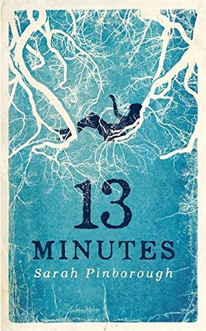
13 Minutes by Sarah Pinborough
This week’s theme is pretty open-ended, allowing for more options and flexibility. I opted to go with one of my favorite Sarah Pinborough books, a mystery surrounding the near-drowning of a prep school student named Natasha Howland. Smart, rich, and beautiful, Tasha was the most popular girl in school. Then one day, in the dark and early hours of a winter morning, her unresponsive body was pulled from the frigid waters of the River Ribble. Paramedics were able to revive her, but doctors say she was technically dead for thirteen minutes.
Upon waking up from her coma, Tasha can remember nothing about the incident except the horrible sensation of drowning. She does, however, have a sick feeling that her best friends Jenny and Hayley might have been involved with why she was in the woods by the river that night, after noticing the strange way the two of them have been acting around her since she regained consciousness at the hospital. Not knowing who to trust, Tasha turns to Becca, her plain and self-deprecating childhood friend with whom she fell out when the girls reached high school. Told through the eyes of these two teenagers, 13 Minutes is the story of how they unravel the events of the night Tasha went into the river.
Let’s take a look at the covers:
From left to right:
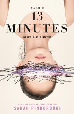
Gollancz (2016) – Flatiron Books Hardover (2017) – Flatiron Books Paperback (2018)

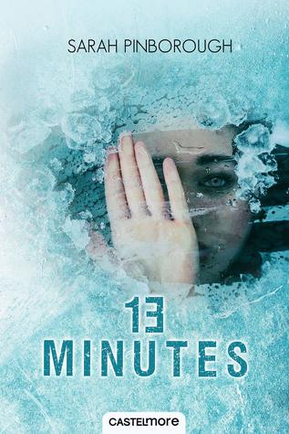
French Edition (2018) – Turkish Edition
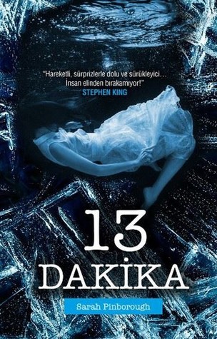
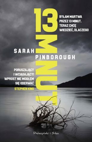
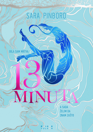
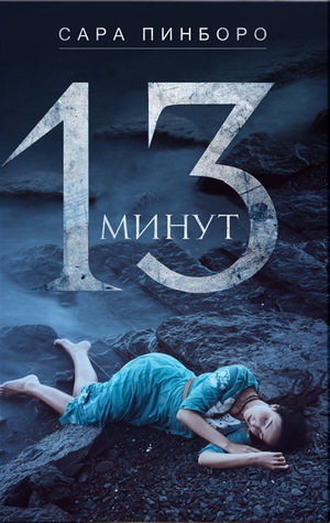
Polish Edition (2018) – Serbian Edition (2018) – Russian Edition (2017)
Winner:
The French edition wins again this week! Just looking at that cover gives me chills.
But what do you think? Which one is your favorite?


I love the Serbian one! It kknd of reminds me of The Shape of Water. And that blurb is really interesting!
LikeLike
The art style is really unique!
LikeLike
The French one for sure. I like the sense that she’s behind (beneath?) ice? The Russian one is okay and I kinda like the Gollancz too…
LikeLike
I think she’s beneath ice in that one, yeah. It makes me feel claustrophobic, haha.
LikeLike
Polish one looks good too. Have you done a review on this yet? My memory aint what it used to be…
LikeLike
Yep! I loved this book. You can see my review here https://bibliosanctum.com/2017/10/02/book-review-13-minutes-by-sarah-pinborough/ 🙂
LikeLiked by 1 person
It was a tough one this week. I do like the French, but then I kept looking at the Turkish so that one wins.
Oh and that Russian one is nice too
LikeLike
Yeah, quite a lot of good ones in this batch!
LikeLike
Nice pick. I also like the Gollancz version as well.
LikeLike
That one’s so beautiful. In fact, I was disappointed when they came out with the US version, and I saw that it wasn’t as nice 🙂
LikeLiked by 1 person
Wow, there are some great choices here this week. For some reason I’m drawn to the Polish edition although I admit I don’t know if the cover ties in with the story that well since I haven’t read it. It seems a lot different than the others shown which makes me feel it may be off base.
LikeLike
The Polish edition does strike me as being the odd one out. I think the others better reflect that it’s a YA novel, whereas that one makes it look like an adult mystery/thriller.
LikeLike
I think the Turkish is my favorite, but I also like the French. This book has great covers!
LikeLike
I agree, I love all the shades of blue!
LikeLike
Agree with your choice!
LikeLike
Cheers!
LikeLiked by 1 person
To be honest I wouldn’t pick any of these off a book shelf in a shop!
LikeLike
To each their own! I quite like a lot of the ones here 🙂
LikeLike
Oooh, i really like the very first one 🙂 I have this book with the second cover, which is pretty much my least favourite 😀
LikeLike
Yeah, the UK Gollancz is beautiful! The US Flatiron edition in comparison was so disappointing to me when it came out, lol!
LikeLiked by 1 person
Ooh, I love the Gollancz edition. I feel like the French and the Turkish editions sold better though, because they show you what kind of books to expect, I guess.
Sounds like an interesting book, by the way!
LikeLike
The Gollancz edition is classically beautiful, I just love the art style and color! But yes, I agree, the French and Turkish covers give you a better idea what a thriller this is 😀
LikeLike
Good choice: there is a definite claustrophobic feeling in that cover that makes me feel short of breath. And the Turkish edition is just as good.
And now I need to push this story higher up on my TBR… 🙂
LikeLike
For real, I feel terrified just thinking about being trapped in the water under ice *shudder*
LikeLike
A great choice of book for this week’s theme – my favourite is the Gollancz because it is also beautiful. While I do like yours, wuss that I am – I find it too disturbing!
LikeLike
Yeah, the Gollancz is beautiful, I love the color scheme (how cold it feels) as well as the art style. Those roots? veins? look so creepy…
LikeLiked by 1 person
Yes… like you, I thought it creepy – but not to the extent that I found it offputting, which is a tricky balance to achieve.
LikeLike
I actually really like the Serbian one. It just really appeals to me.Lynn 😀
LikeLike
It is the most artsy of them, and looks like it could even be in a museum or gallery! 😀
LikeLike