Friday Face-Off: Middle Grade
Welcome to The Friday Face-Off, a weekly meme created by Books by Proxy! Each Friday, we will pit cover against cover while also taking the opportunity to showcase gorgeous artwork and feature some of our favorite book covers. If you want to join the fun, simply choose a book each Friday that fits that week’s predetermined theme, post and compare two or more different covers available for that book, then name your favorite. A list of future weeks’ themes are available at Lynn’s Book Blog.
This week’s theme is:
~ a cover of a MIDDLE GRADE book
Mogsy’s Pick:
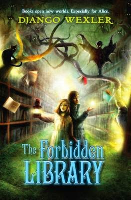
The Forbidden Library by Django Wexler
As an avid bibliophile, it’s hard for me to resist anything to do with libraries or reading about the wonderful books that take us to faraway places. In this case, the metaphor of books as portals to new worlds is actually quite literal. The Forbidden Library follows Alice, a young girl who discovers she has a very special power. Called “Readers”, people like Alice possess the ability to enter the worlds of certain books, which might seem great at first, until you realize these books serve as prisons to nasty creatures and the only way out again is if the Reader can defeat them.
However, if a Reader is successful in defeating and binding a creature, he or she will escape and also have access to its abilities, and by defeating more creatures in “prison books,” they can gain more powers.
Let’s take a look at the covers:
From left to right:
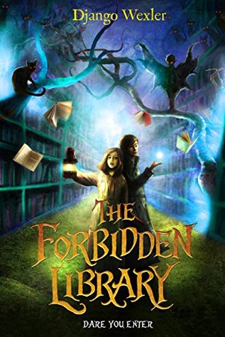
Kathy Dawson Books (2014) – RHCP Digital (2014)
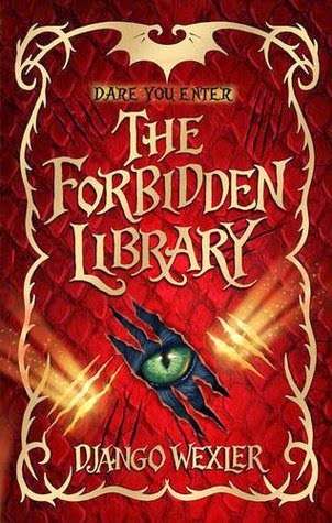
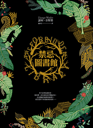
Doubleday Childrens (2014) – Chinese Edition (2016)
Winner:
As you can see, the digital version is a variation of the original Kathy Dawson Books US cover, but I much prefer the changes! The blue color seems to be a better fit, not to mention the figures of the children seem more centered and focused, and the title is in a much nicer font.
But what do you think? Which one is your favorite?


Good choice: the electric blue is perfect for the background.And I also like the Doubleday cover with that eye peeking through 🙂
LikeLike
The eye cover is quite mysterious, I agree!
LikeLike
Yup, I agree, that blue version works really well. It seems to bring the cover to life a little more than the green version.
LikeLike
And the brighter hue of the blue is also very effective!
LikeLike
I agree with your choice, that font is much better. I kind of like the Chinese cover too, from a design standpoint, although it doesn’t say “middle grade” to me😁
LikeLike
I do like that it’s a bit neutral!
LikeLike
Your choice is my favorite, too.
LikeLiked by 1 person
Not a big fan of any, but your pick is the best
LikeLiked by 1 person
I prefer the revamped cover of the two. The blue definitely makes the design more eye catching and the font is great – I also really like the Doubleday which uses the same font and has the eye peeping out at you.
Lynn 😀
LikeLike
Yeah, not only does the blue work a little better, the font really adds character. And that eye cover is quite intriguing, if I saw that on a store shelf it would have attracted me for a closer look.
LikeLike
I had no idea he wrote middle grade!
LikeLike