Friday Face-Off: Magic in the Title
Welcome to The Friday Face-Off, a weekly meme created by Books by Proxy! Each Friday, we will pit cover against cover while also taking the opportunity to showcase gorgeous artwork and feature some of our favorite book covers. If you want to join the fun, simply choose a book each Friday that fits that week’s predetermined theme, post and compare two or more different covers available for that book, then name your favorite. A list of future weeks’ themes are available at Lynn’s Book Blog.
This week’s theme is:
~ a cover with MAGIC IN THE TITLE
Mogsy’s Pick:
Thief’s Magic by Trudi Canavan
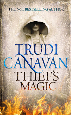
Magic and magicians seem to feature strongly in Trudi Canavan’s books, and this one’s no exception. In Thief’s Magic, we meet Tyen, a young archaeology student (though calling what he and his professor and fellow students do “Archaelogy” might be a bit of stretch…they’re more like tomb robbers) who discovers a sentient book while excavating an ancient tomb. The book can read the minds of anyone with whom it makes physical contact, communicating through text appearing on the pages. Calling herself Vella, the book claims to have once been a sorcerer-woman, until she was transformed into her current form by one of the greatest sorcerers of history. She has been gathering and storing information through the ages ever since. Sensing bad things to come if Vella were to ever fall into the wrong hands, Tyen decides to keep her to himself for now, but as we all know, a secret this big is always bound to come out sooner or later.
Let’s take a look at the covers:
From left to right:
Orbit (2014) – German Edition (2014)

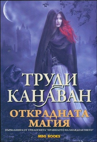
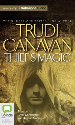
Bulgarian Edition (2014) – Bolinda Audio (2014)
Winner:
Not a single interesting or good looking one in the bunch, if I’m to be honest. I think the fantasy genre as a whole has decided to move on past the “generic hooded figure” design which used to plague so many of its covers, so a lot these already have a dated look despite not being that old. I guess if I had to choose, it would be the Bulgarian edition, because you can at least see more of the person’s face.
But what do you think? Which one is your favorite?


I get what you mean about these looking dated I kind of like the first one though. I like the flames at the bottom of it and the background colour and texture kind of looks like it could be an old book, like described in the blurb.
LikeLike
Yeah! I gotta say I appreciate that old parchment effect!
LikeLiked by 1 person
Well, the cape is one of the essential elements that denote mystery and magic, so it’s not surprising to see them pop up now and then 😉
That said I like both the Orbit and the Bolinda Audio covers because the face of the character is partially obscured by the folds of the hood. As I said, mystery… 😀
LikeLike
There was a time when one hooded figure cover looked like any other, I’m glad there’s so much more variety these days 😀
LikeLike
I like that german edition one. The white on black motif is simple and clean even while the figure isn’t misty or vague.
LikeLike
Yeah, I do like that the figure is sharp and clear, though she retains that apparition-like quality.
LikeLiked by 1 person
That face of your choice is as generic as the figures. I pass.
LikeLike
Yeah, none of these are great. But at least she does have a face! 😀
LikeLiked by 1 person
Sounds like you’re more into photorealism than abstract art 😁
LikeLike
I’d go with the Bulgarian because I like the cover and I’m thinking The Red Woman from Game of Thrones!
LikeLike
Colour, not cover! Jeez Chuckles!
LikeLike
That red hair really does stand out!
LikeLike
I’ve actually always liked the Orbit version, very simple and clean but with some interesting texture to it. It’s what originally drew me to that book, though I’ve still yet to read it. I never knew it was about a sentient book, but that makes each element of the cover make sense to me now, the face embedded in the burning page. And I’ve always loved the idea of sentient books, I’ll have to read this one.
LikeLike
It was a great book too, and I really enjoyed it. In fact, if the hooded figure wasn’t so generic, it would be a great cover for the story, since the background and overall layout really puts one in mind of an old tome or worn-out page.
LikeLike
I really love the Orbit cover! I agree, these are sort of ho hum but the first one works best for me.
LikeLike
Yeah, it’s too bad because this book deserves a more interesting cover!
LikeLike
I like the one you chose and the first one.
LikeLiked by 1 person
I hadn’t heard of this one! Of course, I haven’t read any Trudi Canavan books for years (probably the 90s) so that makes sense that I didn’t keep up with things. I agree with Tammy, love the Orbit cover.
LikeLike
Yes, there was that old series of hers…Magician something! This Millennium trilogy here might be the last thing I know from her, I wonder if she’s still writing these days?
LikeLiked by 1 person
I will go Russian too, but as always, the font!
LikeLike
OMG I agree! It’s blocky and awful!
LikeLike
Yeah, none of these really knock me out. I’m familiar with the Orbit cover but I’m drawn to your choice because it’s so different and I like the colour – the font though!
Lynn 😀
LikeLike