Friday Face-Off: “Moon” In The Title
Welcome to The Friday Face-Off, a weekly meme created by Books by Proxy! Each Friday, we will pit cover against cover while also taking the opportunity to showcase gorgeous artwork and feature some of our favorite book covers. If you want to join the fun, simply choose a book each Friday that fits that week’s predetermined theme, post and compare two or more different covers available for that book, then name your favorite. A list of future weeks’ themes are available at Lynn’s Book Blog.
This week’s theme is:
~ a cover of a book with “MOON” IN THE TITLE
Mogsy’s Pick:
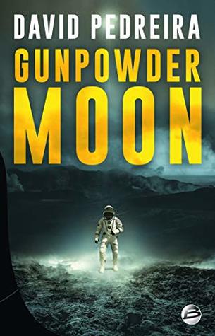
Gunpowder Moon by David Pedreira
Gunpowder Moon is not just another one of your simple murder mysteries, and the main protagonist is not your typical detective. It is the year 2072, and Caden Dechert is a former Marine heading up a US mining operation on moon. When an explosion occurs, killing one of his young miners, no one believes it to be an accident, and sure enough, an investigation finds clear signs of sabotage. There are plenty of suspects to go around, but the top brass arriving from Earth are quick to point fingers at the Chinese, who run a rival mining company near the Americans’ base of operations on the edge of the Sea of Serenity. Dechert, however, is not so sure. He knows tensions between the countries are already on edge, with both sides itching for a fight. Unwilling to jump to conclusions—and hoping to avoid an all-out war—he launches his own investigation in search for evidence.
Let’s take a look at the covers:
From left to right:
HarperVoyager (2018) – German Edition (2018)


Russian Edition (2019) – French Edition (2019)

Winner
So glad to see more covers for this book now since the last time I checked, but in spite of that, my favorite is still the US Harper Voyager edition, the one that I own. It’s just so ominous, especially when the more you look, the more details you spot, like the reflection in the cracked visor.
But what do you think? Which one is your favorite?


I agree with your choice, not only because it’s the cover I’m familiar with, but because the absence of color – except for the small red band on the helmet – reflects perfectly the absolute bleakness of the environment. 🙂
LikeLiked by 1 person
I honestly think this book works better with a cover that has less color as well!
LikeLike
I agree, that HarperVoyager cover is killer (sorry, could help the pun). 🙂 And I love maddalena’s comment about the absence of color, that’s a great point.
LikeLiked by 1 person
Yes, sometimes a lack of color on a cover actually says a lot more than a colorful one!
LikeLike
I like the Harper Voyager edition too, but I also love the German edition, maybe because its so colorful🤣
LikeLike
Yeah, the colors are really bright! It almost makes the book seem upbeat! 😛
LikeLike
Agree with your choice — the German editions add a more modern scifi look (suited for 2072?), and the greyish background adds to the “gunpowder” effect.
My own pick was Wodehouse’s Full Moon (https://lexlingua.co/friday-face-off-2-moon-in-title/), a funny one involving pigs, painters and castles. Happy FFO
LikeLike
Great choice! And thank you for stopping by!
LikeLike
Oh, I think the one you went with was by far the best out of these choices. 🙂
LikeLike
Thanks, glad you think so too 😀
LikeLiked by 1 person
I am going bck and forth between the first two, but maybe yours
LikeLike
They’re both great covers, but I do have an attachment to the US cover.
LikeLike
Such fascinating covers! I love that Russian one for some reason.
P.S. Hope you had a fantastic New Year and that you are doing well, Mogsy! 😀
LikeLike
Thank you! And I can see why the Russian edition would catch your eye – it’s so full of color!
LikeLiked by 1 person
The Russian cover is great, too, but I agree with you.
LikeLike
Yeah, the splash of color is definitely eye catching!
LikeLike
I love your choice – and I hadn’t even picked up the reflection – creepy!
Lynn 😀
LikeLike
Yeah, it’s so subtle! But I love little details like that.
LikeLike