Friday Face-Off: Minimalist
Welcome to The Friday Face-Off, a weekly meme created by Books by Proxy! Each Friday, we will pit cover against cover while also taking the opportunity to showcase gorgeous artwork and feature some of our favorite book covers. If you want to join the fun, simply choose a book each Friday that fits that week’s predetermined theme, post and compare two or more different covers available for that book, then name your favorite. A list of future weeks’ themes are available at Lynn’s Book Blog.
This week’s theme is:
~ a MINIMALIST cover
Mogsy’s Pick:
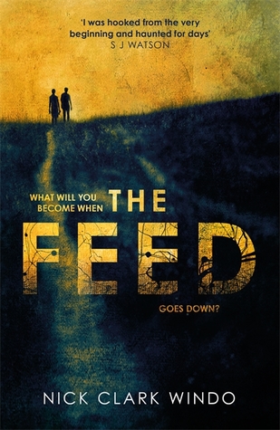
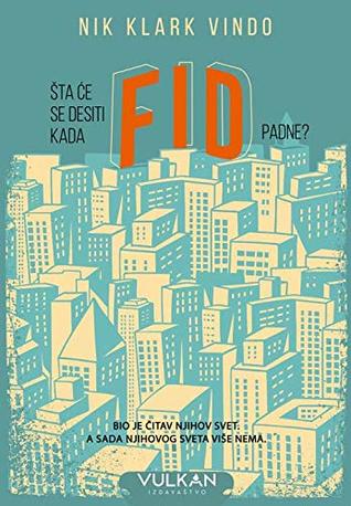
The Feed by Nick Clark Windo
We’ve all heard the cautionary tales involving social media, about the dangers of being constantly plugged in. Nick Clark Windo’s dark thriller debut takes this idea even further, imagining a future where people are permanently connected via implants so that access to everything is instantaneous as well as continuous. This is “the Feed” that the novel’s title is referring to—a new tech that humans have become so dependent on, and so addicted to, that society can no longer function without it. And so, when the Feed collapses one day, the results are predictably catastrophic. Some of the most basic skills and knowledge are lost to the digital abyss as everyone must now learn how to survive offline and fend for themselves in this Feed-less new world. Now the minimalism of some of these covers is starting to make a bit more sense.
From left to right:
William Morrow (2018) – Headline (2018)

Portuguese Edition (2018) – Serbian Edition (2018)

Winner:
My favorite this week was definitely the Portuguese edition because I just love that style of art!
But what do you think? Which one is your favorite?


I like the Headline cover – though to me it gives horror vibes more than something about technological addiction 🙂
LikeLike
Yes, fits the theme of a post apocalyptic setting too!
LikeLiked by 1 person
I agree with your choice Mogsy!
LikeLike
I’m so glad 😀
LikeLike
Awwwww, I was hoping it would be another “bugs take over the world” kind of book…
LikeLike
No, unfortunately… 😛
LikeLiked by 1 person
I like the William Morrow cover: all those broken lines in the grid exemplify the core concept very well 🙂
LikeLike
I love the color contrast too!
LikeLike
I like the Headline cover but also really like the Portuguese cover – difficult to decide between the two given they’re so very different in style.
Lynn 😀
LikeLike
Yes, both different but very attractive!
LikeLiked by 1 person
That’s an interesting premise, one that to some extent happens to also play into the book I’m currently reading, The Prefect by Alastair Reynolds. As for the covers, I like the Headline edition. Not sure how well it portrays the story, but it has an interesting feel to it.
LikeLike
That’s one I haven’t heard o before, but I do want to read more Alastair Reynolds!
LikeLike
This is tough, there are some good covers for this book! I think my favorite is the Serbian edition, it’s very moody:-)
LikeLike
I love how all of these have a great mood to them!
LikeLike
I really love the blue one even though it’s not super minimalist. 🙂
LikeLike
Yeah, that one’s a bit cluttered, but I love the style!
LikeLiked by 1 person
For me, it’s the Headline (2018) cover. It’s not the type I typically go for, but I like the colors lol.
LikeLike
I love the apocalyptic, sort of horror feel to it!
LikeLike
Headline is creepy, so yes
LikeLike
Gotta love creepy!
LikeLike
Love your pick!
LikeLike