Friday Face-Off: Pattern
Welcome to The Friday Face-Off, a weekly meme created by Books by Proxy! Each Friday, we will pit cover against cover while also taking the opportunity to showcase gorgeous artwork and feature some of our favorite book covers. If you want to join the fun, simply choose a book each Friday that fits that week’s predetermined theme, post and compare two or more different covers available for that book, then name your favorite. A list of future weeks’ themes are available at Lynn’s Book Blog.
This week’s theme is:
~ a cover with a PATTERN
Mogsy’s Pick:
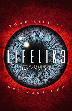
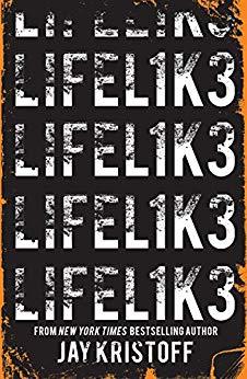
LIFEL1K3 by Jay Kristoff
While LIFEL1K3 may have fallen short for me (probably the only thing Jay Kristoff’s done that has), I’ve always thought the premise was really cool. I guess that’s also why I’m surprised there weren’t more interesting covers for this book, but I thought a couple of them worked well for this theme.
From left to right:
Knopf Books for Young Readers (2018) – HarperCollins (2018)

Allen and Unwin (2018) – Harper Voyager (2018)

Winner:
Seeing as I’m not a big fan of “just text” covers, it was tougher to judge this week. I would have gone with the HarperCollins 2018 edition, but it kind of creeps me out with the way it’s made to look like a bloody eye. So, I guess I was left with just one option – can’t say I love it, but it’s solid.
But what do you think? Which one is your favorite?


The cover with the eye caught me instantly. So it is that one.
LikeLike
Haha, I did figure that one would be popular this week 😀
LikeLiked by 1 person
Oh no – I don’t like the eye cover, well, that is, it gives me the creeps a little, so much like you I would go with the fourth cover by Harper ‘voyager.
Lynn 😀
LikeLike
Thank you, good to know I’m not the only one that’s creeped out by the eye cover, lol!
LikeLike
I like the Harper Collins 2018 cover: that eye is nothing short of mesmerizing… 😉
LikeLike
Everyone seems to like the eye cover 🙂
LikeLike
No my favorite is the UK paperback cover LOL
LikeLike
Is that the “eye” cover?
LikeLike
Definately the HarperCollins cover, love the creepy eye. 🙂
LikeLike
That one’s very popular this week!
LikeLike
I like the first two! Although the bee hive design freaks me out, since I have that weird thing where patterns with lots of holes literally gives me chills, lol.
LikeLike
I kinda like the beehive pattern! Though I find it to be a bit plain for the story’s theme
LikeLike
Oh, nice pick. I do like the one you went with in the end out of all of these, it pleases the eye the most for me. 🙂
LikeLike
Same here!
LikeLiked by 1 person
I chose this book, too! Nice pick!
LikeLike
Great minds!
LikeLiked by 1 person
🙂
LikeLike
I like the Harper Collins 2018 one but then I’m always drawn to red on the cover!
LikeLike
It does stand out 🙂
LikeLike
I kind of like the eye, but I would say none of them is truly amazing
LikeLike