Friday Face-Off: White
Welcome to The Friday Face-Off, a weekly meme created by Books by Proxy! Each Friday, we will pit cover against cover while also taking the opportunity to showcase gorgeous artwork and feature some of our favorite book covers. If you want to join the fun, simply choose a book each Friday that fits that week’s predetermined theme, post and compare two or more different covers available for that book, then name your favorite. A list of future weeks’ themes are available at Lynn’s Book Blog.
This week’s theme is:
~ a cover that is predominantly WHITE
Mogsy’s Pick:
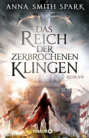
The Court of Broken Knives by Anna Smith Spark
The Court of Broken Knives is unlikely to shatter any molds in the grimdark genre, but I do have to give it credit for its gritty elegance. Also, the writing is exquisite, and so incredibly polished and well done. I think the same can be said about the book’s covers, which are more on the plain and simple side at first glance, but a closer look reveals more.
From left to right:
Orbit (2017) – HarperCollins (2017) – German Edition (2019)


Winner:
I had a hard time choosing a favorite this week, because I’m not generally a fan of covers with a lot of white space. Also, they all seemed pretty generic – at least at first. However, the HarperCollins edition redeemed itself somewhat, after I examined it a bit more closely and noticed some details I had missed, so that’s the one I’m going with.
But what do you think? Which one is your favorite?


I agree with your choice!
LikeLike
I second that!
LikeLike
Yay! 😀
LikeLike
Pingback: The Friday Face-Off: White – Books by Proxy
I really must read this book! I completely agree with your choice – beautiful! 😀
LikeLike
Haha, and I need to catch up with the sequel 😀
LikeLiked by 1 person
Great choice for this week’s theme – it’s a book I haven’t read, however, not being a grimdark fan. But the cover that gets my vote is the right-hand one. I just love the detail of the cityscape and the stance of the girl standing facing it.
LikeLike
I think that one’s really nice too, especially if you’re into details 🙂
LikeLiked by 1 person
Since I have a penchant for ancient swords in the foreground, I can totally agree with your choice… 🙂
LikeLike
Yeah, I think sword wielding characters on fantasy covers is a bit of a cliche, but I do like the interesting way this particular one went with the concept 🙂
LikeLike
I agree, I love the Harper Collins cover. The Orbit cover is just too bland for me😁
LikeLike
Same, there’s just too much white space!
LikeLike
Great pick!
LikeLike
Glad you enjoy it too! 😀
LikeLike
Each one actually has elements I really like. I like the simplicity and cleanness of the Orbit version. I like those suble almost hidden elements of the HarperCollins version. But this time around I’m going to pick the German version, where I just like the overall design.
LikeLike
I agree, each cover has its own strengths. For simple elegance, the Orbit cover definitely wins, whereas with the German cover the details reign supreme. For the middle ground I chose the HarperCollins whose details are subtle but the design is still very clean and simple. Thanks for your insights! 😀
LikeLike
Nice pick! I love the cover you went with too, I think that’s my favorite out of these by far.
LikeLike
I have to go German, a bit busy but still
LikeLike
I’ve always liked the Orbit covers for this – but, at the same time it is very generic isn’t it. I can’t help it though – a lonely figure in a cloak – I’m a sucker for such things.
Lynn 😀
LikeLike