Friday Face-Off: Temple/Religious Icon
Welcome to The Friday Face-Off, a weekly meme created by Books by Proxy! Each Friday, we will pit cover against cover while also taking the opportunity to showcase gorgeous artwork and feature some of our favorite book covers. If you want to join the fun, simply choose a book each Friday that fits that week’s predetermined theme, post and compare two or more different covers available for that book, then name your favorite. A list of future weeks’ themes are available at Lynn’s Book Blog.
This week’s theme is:
~ a cover that features a TEMPLE/RELIGIOUS ICON
Mogsy’s Pick:
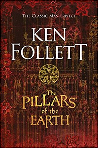
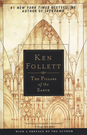
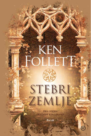
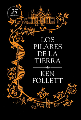
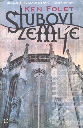
The Pillars of the Earth by Ken Follett
I had a really tough time coming up with a book for this week’s topic, so I had to look outside SFF to historical fiction for any depictions of temples or churches and the like. While I didn’t really care for this book, I figured, surely a novel about building a cathedral would have some covers that featured one on the cover, right?! Well, I wasn’t wrong about that, but I have to say the good choices were somewhat limited considering how many editions exist for this book. Here’s a small selection of those that I thought were the nicest and most interesting:
From left to right:
Pan Books (2017) – NAL Trade (2002) – Pan Mass Market (2019)

Slovenian Edition (2017) – Spanish Edition A (2010) – Spanish Edition B (2014)

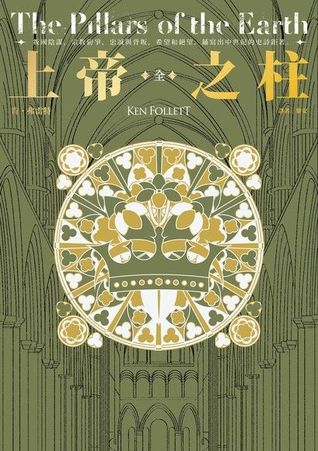
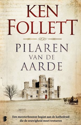
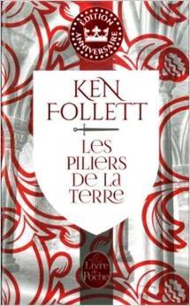
Chinese Edition (2018) – Dutch Edition (2015) – French Edition (2014)
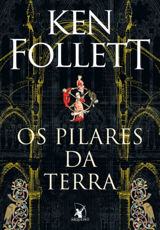
Polish Edition (2018) – Portuguese Edition (2016) – Serbian Edition (2005)

Winner:
There were a few this week that caught my eye, the Spanish Edition B and Chinese Edition among them, but ultimately I felt I had to go with my first instincts. I have a thing for Gothic style architectural drawings, so I think I’m going to have to go with the NAL cover.
But what do you think? Which one is your favorite?


I like that Pan Books edition, and the French one too I think!
LikeLike
Yeah I love the patterns on the French one, even though it does’t show much, lol.
LikeLike
I agree, that’s the cover I like as well – probably because it’s the cover I read, and I tend to get attached. LOL
LikeLike
Same here! I think that was the edition I read too, come to think of it.
LikeLike
Great choice and I really like the Spanish edition. Several of the others are appealing as well.
LikeLike
I agree, both the Spanish editions above are very strong, I can’t choose which one I like better.
LikeLike
There are some good covers here! I really like the first Pan edition. Yeah, I almost didn’t participate this week, I couldn’t come up with anything! But finally did last night.
LikeLike
Yeah I really had to rack my brain for this one! I had a few choices, but definitely none of them were SFF!
LikeLike
What a great choice for this week – and yes, I ended up with historical fiction, as well, given that it was tricky finding a suitable cover… I can’t quite make up my mind between the Pan cover or the Chinese offering, so I’m going to call it a tie:).
LikeLike
Haha, historical fiction seems perfect for this topic – I had a couple other options, and one was actually Angels and Demons by Dan Brown. But I went with this one because of the more interesting covers and many of them were more “artistic” 🙂
LikeLiked by 1 person
And now that’s just showing off! I was scrabbling to find ONE candidate:)))
LikeLike
Great pick! I really like the one you picked but also that black one with the gold lettering is appealing to me too.
LikeLike
Do you mean the Portuguese edition? That one’s definitely pretty!
LikeLiked by 1 person
Yes!
LikeLike
Well I did care for that book LOL. And I agree with you on the cover Mogsy!
LikeLike
Haha, the book was overly long for me and I had a tough time getting into the author’s style. But I’m glad you enjoyed it!
LikeLike
Good choice! I also like the one next to it – the Pan 2019 edition: the fog and that sunrise (?) light combine into a very pleasant effect.
LikeLike
Oh yes, that’s a pretty effect – very heavenly 😀
LikeLike
I am going with Spanish A, but the title should be changed to fit the cover better
LikeLike
Is it like a literal translation? Can’t read Spanish over here, so I’ll take your word for it haha! 😀
LikeLike
I’ve been curious about this book, but so far not curious enough to try it. I like the image from the Pan Mass Market edition (I guess the photographer in me is drawn to the light), but overall I prefer the design of the Spanish Edition A, with that rising column.
LikeLike
I read it a while ago, because I was curious what all the fuss was about, and this was even before the adaptation and everything. I don’t know, I just didn’t really click with it. The book was a real tome and honestly, I thought it was longer than it had to be and the author’s style also felt very awkward to me. But who knows, if you ever get to try it, maybe it’ll work better for you! 😀
LikeLike
I love your selection as well. This is one book I have been curious about but never actually figured out if it was something I’d enjoy or not hahah
LikeLike
I think it’s definitely more geared towards historical fiction readers, though I think fantasy fans will find the multi-pov and epic scope appealing. Quite honestly though, I thought it was much too long and there were parts where I got quite bored with it 😛
LikeLiked by 1 person
Haha, I really struggled with this one too – the I switched tactics in my head and was thinking more of graveyards with churches in the background – which didn’t entirely help because a couple of the books I had in mind didn’t have alternate covers! Anyhow – I really like your choice but there are some others on here that are really nice, I like the Serbian and the Spanish editions.
Lynn 😀
LikeLike
Hehe, I was going to go with graveyards as a last resort 😛 This week’s was definitely HARD!
LikeLike
Really like your pick!
LikeLike
My favourites the red one. I feel like maybe it would have been the Slovenian Edition if it wasn’t for the border. I really like the centre of that cover though.
LikeLike