#SciFiMonth Friday Face-Off: Explosion

Welcome to The Friday Face-Off, a weekly meme created by Books by Proxy! Each Friday, we will pit cover against cover while also taking the opportunity to showcase gorgeous artwork and feature some of our favorite book covers. If you want to join the fun, simply choose a book each Friday that fits that week’s predetermined theme, post and compare two or more different covers available for that book, then name your favorite. A list of future weeks’ themes are available at Lynn’s Book Blog.
This week’s theme is:
“Big badda boom”
~ a cover featuring an EXPLOSION
Mogsy’s Pick:
Calamity by Brandon Sanderson
It’s Sci-Fi November! To celebrate, I’ll be featuring science fiction titles on Friday Face-Off for the full month. Up next, we’re shining the spotlight on the third and final book of Sanderson’s super-villain trilogy, The Reckoners. And how apt that this week’s theme is all about explosions, because this book sure end things with a bang. Let’s take a look at some of the covers:
From left to right:
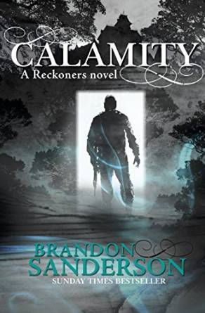
Delacorte Press (2016) – Gollancz (2016)

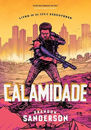
Portuguese Edition (2018) – Polish Edition (2017) – Dutch Edition (2017)


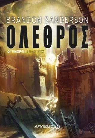
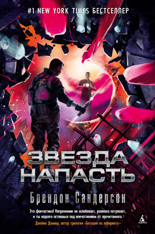
Greek Edition (2017) – French Edition (2018) – Russian Edition (2018)

Czech Edition (2016) – Bulgarian Edition (2016) – Danish Edition (2017)

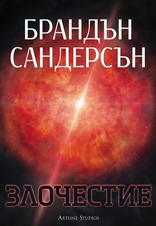

Winner:
So many colors! I found it hard to choose a favorite this week, because there were quite a few that stood out, including the Portuguese edition with its comic book art style, the Gollancz edition with its monochromatic theme and silhouette, and of course the Delacorte hardcover with its vibrant pinks and purples. And then there’s the Russian edition, which is like a marriage of all three, so that’s the one I’m going to have to go with.
But what do you think? Which one is your favorite?


This time they are all eerily alike… I think I’d choose the Bulgarian one as it looks most SF for me 🙂
LikeLike
There are definitely echoes of the same theme – but I love all the different colors!
LikeLiked by 1 person
Portuguese is really eye-catching.
LikeLike
That’s probably a close second 🙂
LikeLike
I agree, there are so many colourful covers here. I think my favourite is the first one, purely because I love the colours so much. The one that you’ve picked is my second favourite though and I also quite like the green cover.
LikeLike
I agree, I love bright pink and magenta of the first cover!
LikeLiked by 1 person
I think the Dutch edition has to be my fave. Love the way it looks. There are a couple here that are quite close. After visiting you and Tammy, I’ve decided this week that Portuguese covers, which are usually my favorites, have issues with sci-fi books maybe.
LikeLike
I’ve never really noticed that, I think I’ll have to pay more attention in the future!
LikeLike
I LOVE all the bright colors! The two that jumped out as my favorites are the Czech and Portuguese editions, especially the Portuguese one, I also love the graphic novel vibe!
LikeLike
Me too, I think that one is a close second. I just love the comic art style.
LikeLike
That was really fun. I like the Dutch, Greek, and Bulgarian covers the best. But what I’m most excited about is a finished trilogy from Sanderson. I like to wait until a series is finished so I can binge. Perfect for December. 🙂
LikeLike
Haha, yeah he’s got a lot of series going, but at least he does manage to finish them eventually, in most cases. He does seem to have issues with endings though, I haven’t always been a fan of the way he closes out his series 😛
LikeLiked by 1 person
Interesting point there. I have the same reaction to his endings, and never really thought about it. I’m a big fan of his magic systems. In that regard he’s a master and I try to emulate him.
LikeLike
That is a great choice this week-the colours and design are great!
LikeLike
There are definitely a lot of strong contenders this week!
LikeLike
I like both your choice and the Gollancz edition: they portray a sort of portal – and even without knowledge of the story’s theme, I find it intriguing 🙂
LikeLike
Yeah I Think both the US and UK versions are quite strong!
LikeLike
Your choice is my favorite, too. 🙂
LikeLike
Glad you thought so too!
LikeLiked by 1 person
🙂
LikeLike
Russian too, though I must say that for a Sanderson these do not pop like his others
LikeLike
True, he’s been blessed with some truly astounding covers, especially for his epic fantasy!
LikeLike
Well I do agree with your winner Mogsy!!!
LikeLike
Glad you agree!
LikeLike
I really like the Portuguese edition, and the Gollancz – there are some great choices to be fair so it’s difficult to choose.
Lynn 😀
LikeLike
Yeah, a lot of great ones here, and I love all the different colors!
LikeLike
I like Portuguese Edition (2018) best, but like you said, it is very comic book esque and if I didn’t know better I would think it was a cover for a graphic novel. So I think I would have to choose your favorite!
LikeLike
Yeah on the one hand it makes it look like a graphic novel, but on the other, I think it fits the comic villain very well! Ah, choices choices 🙂
LikeLike
I lean towards the Delacorte Press and Russian editions, but this was a tough one. I really enjoyed that series.
LikeLike
Haha, the pinks/purples are quite eye catching, aren’t they!
LikeLike
Hmmm… I’m not sure about these. Maybe the Russian edition for me too, I think I like that one the best.
LikeLike
It’s the bright color that really stood out for me with that one!
LikeLike
My favourite is the Delacorte Press edition, though your choice comes a very close second. What a great choice for this week’s theme:)).
LikeLike
Thanks! When I saw the topic I thought of this book immediately!
LikeLiked by 1 person
It’s always brilliant when a book jumps into your head like that, after looking at the up-coming theme…
LikeLike
Pingback: #SciFiMonth Mission Status: week two
Nice pick! You know, I actually love most of these covers, hard to pick for me!
LikeLike
Love your pick!!
LikeLike
I liked the Russian Edition too!
LikeLike