Friday Face-Off: Autumn/Fall
Welcome to The Friday Face-Off, a weekly meme created by Books by Proxy! Each Friday, we will pit cover against cover while also taking the opportunity to showcase gorgeous artwork and feature some of our favorite book covers. If you want to join the fun, simply choose a book each Friday that fits that week’s predetermined theme, post and compare two or more different covers available for that book, then name your favorite. A list of future weeks’ themes are available at Lynn’s Book Blog.
This week’s theme is:
“Warm September brings the fruit”
~ a cover that is seasonal for AUTUMN/FALL
Mogsy’s Pick:
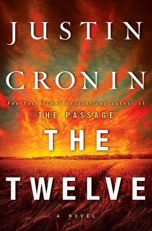
The Twelve by Justin Cronin
Well, I’ve officially run out of books I’ve read with covers featuring color-changing foliage and falling leaves for this topic, so I’m going to look to another theme for fall: Harvests!
In this second book of The Passage trilogy, the apocalypse continues to unfold as our group of survivors take action to fight back against the virals and their collaborators, and even aim to take down the twelve original infected plague-bearers that started it all. Let’s take a look at the covers:
From left to right:
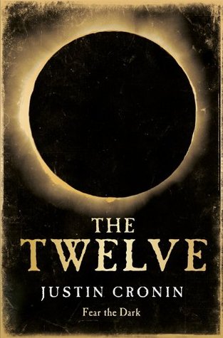
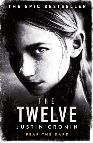
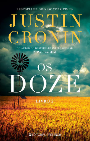
Random House (2012) – Orion Hardcover (2012) – Orion Paperback (2013)
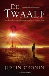
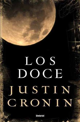
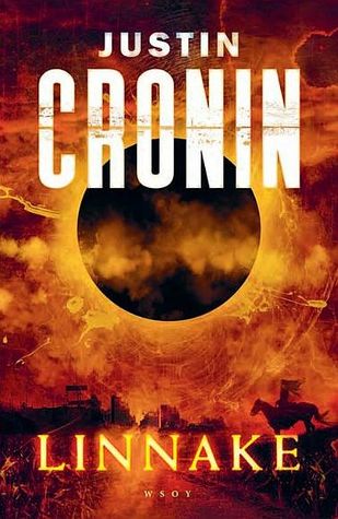
Dutch Edition (2012) – Portuguese Edition (2013) – Spanish Edition (2013)
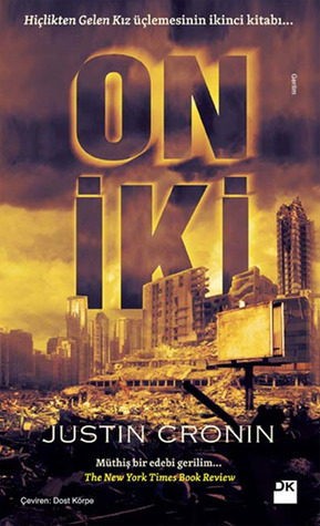
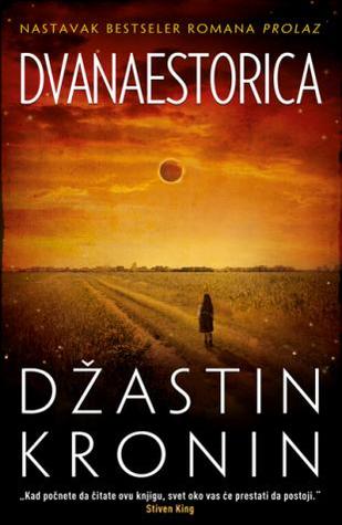
Turkish Edition (2014) – Serbian Edition (2012) – Bulgarian Edition (2013)
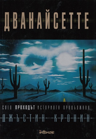
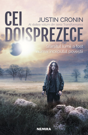
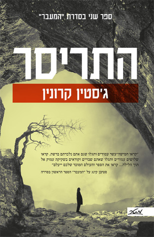
Romanian Edition (2019) – Finnish Edition (2013) – Hebrew Edition (2014)
Winner:
I love a lot of the harvest covers, especially the ones with the gorgeous colors in the sky. Some of these are almost too beautiful for a bleak apocalyptic novel like this. My favorite is the Portuguese edition this week, because of the brilliant contrast between the fields and sky.
But what do you think? Which one is your favorite?


Ooo… what a cool choice – a book depicting the autumn of humanity’s sojourn on Earth as it struggles to acclimatise to the new sub-species…:). I’m a sucker for all those rich, orange autumnal colours so I’m going with the Random House offering this week, Mosgy:)
LikeLike
I too considered that the fall themed covers could be symbolic, and that was my thinking as well! 🙂
LikeLiked by 1 person
Many different covers there and I didn’t know about this title
LikeLike
It was pretty big, but I guess you would have do know the genre 😀
LikeLike
You just had to go remind me that I need to finish this series. The Passage was my first read this year and as you know, it took forever. I do have the other two though and do want to continue. I think I like the Random House one the best. It’s the one I own as well.
LikeLike
I gave up, lol. I didn’t fall in love with the Passage, and pretty much had to force myself to finish The Twelve, so I’m done, haha!
LikeLike
This was a great idea! I feel like I used this book for another prompt but heck if I remember which one. I love a lot of these, but I think I’m partial to the original Random House cover.
LikeLike
Yeah, the original cover would be my second choice!
LikeLike
What a good choice! I like the detail about the warm color being in the wheat field, while there is a cloudy, menacing sky above… 🙂
LikeLike
Yes, it makes very good use of complimentary colors!
LikeLike
I haven’t read any of this series yet, but I really like the cover of the Dutch edition with the light rays shining down, and the person facing the windmill. No clue if it fits the story, but I like the artwork.
LikeLike
To be honest, it’s been so long I have no clue either if that was a scene in the book 😛 I do like that one too, but it does seem a bit too hopeful for a book like this 😀
LikeLike
These covers look really cool all together! My favorite is the Dutch Edition (2012) one
LikeLike
Ah yes, that one’s quite popular this week!
LikeLike
I am going with Hebrew cos it looks so sad
LikeLike
Oof, I typically don’t like sad. That one’s too desolate for me! 😀
LikeLike
I think I like the Orion hardcover edition and the Portuguese ones the best, but the Spanish one kinda jumps out at me with the moon, and the Bulgarian one I even kinda like.
LikeLike
A couple of these “moon” covers this week are pretty, I agree!
LikeLike
A few nice covers this week! I like your choice plus the Random House cover. I can’t pick between the two. Also like the Dutch and Turkish editions.
LikeLike
Yeah, my choice and the Random House are my top two as well. It was a close call!
LikeLike
That’s my fav of the bunch too. I like the contrasting colors. They look well together.
LikeLike
Agreed, it makes good use of complementary colors! 😀
LikeLike
Yes, that’s the cover that I chose – and the Orion Hardcover. Great idea to go for harvests.
Lynn 😀
LikeLike
Thanks, I really struggled to come up with something this week 😀
LikeLike
Oh, nice pick, that definitely feels very Fall. 🙂
LikeLike
Yeah, I racked my brain for this week, I figured “harvest” was a good fall theme 😛
LikeLiked by 1 person
I agree with you about the contrast being striking. I think my favourite is the first one though; the colours are just so beautiful. And I’m quite drawn to the Dutch one too for the same reason.
LikeLike
Cool pick!
LikeLike