Friday Face-Off: Movie Tie-In
Welcome to The Friday Face-Off, a weekly meme created by Books by Proxy! Each Friday, we will pit cover against cover while also taking the opportunity to showcase gorgeous artwork and feature some of our favorite book covers. If you want to join the fun, simply choose a book each Friday that fits that week’s predetermined theme, post and compare two or more different covers available for that book, then name your favorite. A list of future weeks’ themes are available at Lynn’s Book Blog.
This week’s theme is:
~ a cover that is a MOVIE TIE-IN
Mogsy’s Pick:
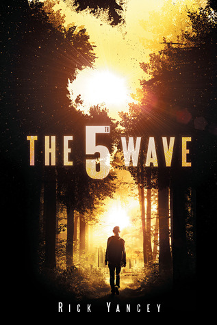
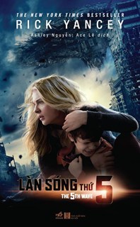
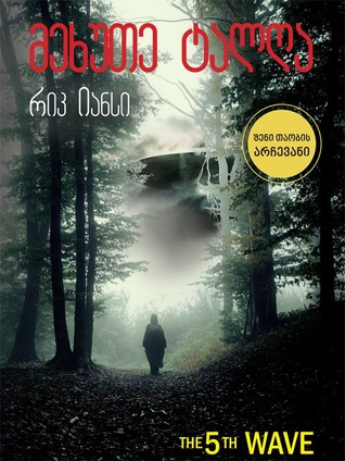
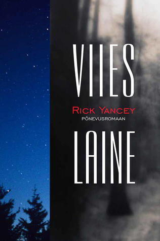
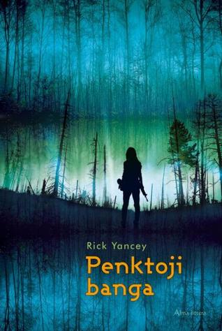
The 5th Wave by Rick Yancey
The 5th Wave tells the story of an alien invasion, happening over a period of time in a series of planned attacks called “waves”. The 1st wave was an electromagnetic pulse-like burst that knocked out electricity and almost everything that runs on power. The 2nd wave wiped out all cities on the world’s coastlines. The 3rd wave was a plague that decimated the human population. The 4th wave made those still alive mistrust and turn on each other. Cassie is one of the few lucky (unlucky?) survivors, believing that striking out alone is the only way to stay alive. Those that are left now prepare for the worst, because they know “the Others” aren’t done with humans yet, and a 5th wave is on the horizon.
I confess, I never watched the movie, so I can’t really tell you whether or not it was a good adaptation. To tell the truth, I thought the book was okay but I didn’t actually love it enough to continue the series, so I’m not feeling in any rush either way. Still, let’s move on and take a look at the covers:
From left to right:
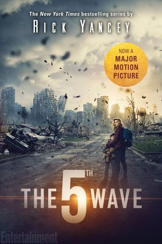
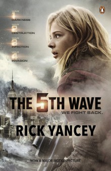
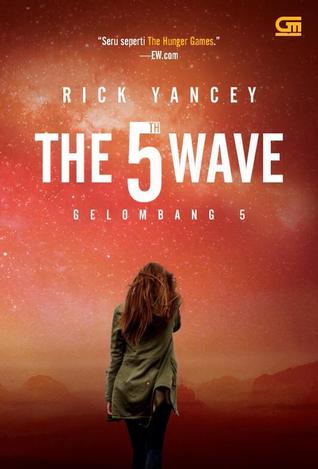
G.P. Putnam’s Sons BYR (2013) – Speak (2015) – Penguin UK (2010)
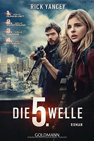
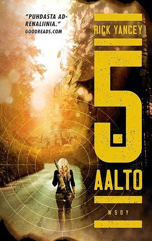
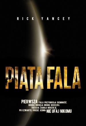
German Edition (2016) – Finnish Edition (2013) – Polish Edition (2013)
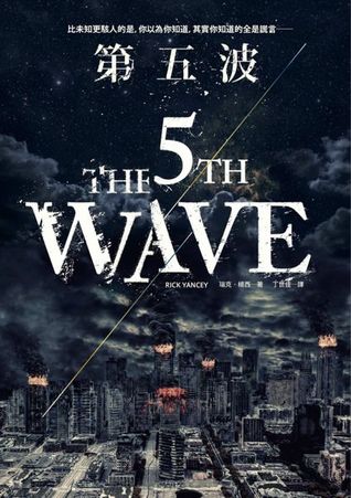
Indonesian Edition (2013) – Chinese Edition (2015) – Vietnamese Edition (2016)
Georgian Edition (2015) – Estonian Edition (2014) – Lithuanian Edition (2014)
Winner:
A big reason I chose The 5th Wave to feature this week is the surprising number of movie tie-in covers it has, and surprisingly, they’re all pretty good! Most of the time, we just see the same movie poster used over and over. But although it’s tempting for me to go with a version that features a person on it, in fact I think the most dramatic cover is one that doesn’t. I’m going to have to pick the Chinese edition this week because it just screams “Oh shit.”
But what do you think? Which one is your favorite?


I had the opposite experience from you; only saw the movie (hated it), never picked up the book. The Chinese cover is pretty tight – I like the Lithuanian one best though. Weirdly, it doesn’t fit the movie particularly well, but it makes me want to read the book.
LikeLike
Hmm, now that I’ve gotten a better look at the Lithuanian edition, I agree it has that special something. Almost makes it look like a horror novel!
LikeLike
After the Monstrumologist debacle, I haven’t picked up a Yancey book since. And the chance of me watching a movie based on a YA book are getting slimmer every year 😀
Personally, I like the 2013 Indonesian cover. Something about the orange fogginess looks like it is hiding something terrible 🙂
LikeLike
I don’t want YA novel adaptations either. I think the last ones I watched were the Hunger Games movies…and that was a looong time ago!
LikeLike
Blimey, Mogsy – didn’t you do well with this one?? I only managed two movie tie-ins and only one took scenes from the film… I’m not remotely tempted to watch this one, given I’m slightly allergic to watching the world being blown apart – or read the book for that matter. But while I do like your choice – how dramatic! – my favourite is the Speak 2015 edition in the top row. Though, as you say, it is debatable whether surviving that little lot is actually worth it:)).
LikeLike
I guess I got lucky! There were a few on my list of options, but when I was going through this one I saw all the movie covers and knew this was it! 😀
LikeLiked by 1 person
Yes I like that Chinese cover a lot! I also like the Speak cover as a second choice. I DNFed the book years back though I don’t remember why and I’m in two minds about whether or not to watch the film!
LikeLike
This book wasn’t Yancey’s best – I did manage to finish the book but never continued with the series 😛
LikeLike
I prefer the first original cover! I loved the books but hated the ending and I liked the movie.
LikeLike
I never finished the series! Sorry to hear the ending wasn’t great 😦
LikeLiked by 1 person
Haha – I love it – that cover really does scream ‘oh shit’.
Excellent choice
Lynn 😀
LikeLike
I know, right? I love a bit of drama in my covers 😀
LikeLike
For some reason I’m liking the Georgian edition. Maybe because the red is such a stark contrast to the darker colors of so many of the others. I did read this book and couldn’t stand it. It was super hyped when I read it and I was one of the few that basically had nothing good to say about it. However, the movie, once I was able to disconnect it from the book, was actually decent. So now I just forget about the book altogether.
LikeLike
Do you mean the Indonesian edition? I agree with you on the red, it gives the impression that the whole world is burning! Which it probably was 😛
LikeLike
Wow, there are so many good choices! My favorite is the Speak edition, which would have been perfect if they hadn’t put the stupid movie sticker on it!
LikeLike
Oh my goodness, yes I agree! Don’t you just hate that?!
LikeLike
Def the Speak one for me
LikeLike
That one seems to be a popular one this week!
LikeLike
Many different ones! I know that in French we took the US one
LikeLike
It’s a classic for sure 🙂
LikeLike
The Chinese cover does indeed portray both the aftermath of a disaster and the sense of impending doom of another one looming on the horizon. The Speak cover (middle of first row) is not bad either, although it does have a Walking-Dead-poster quality that’s less original… 🙂
LikeLike
Yeah, I find that to be an issue with a lot of movie tie-in covers. One apocalyptic cover looks like another 😀
LikeLike
I like the second cover a lot, which looks like it might be really influenced by the movie (and I usually hate tie-in covers) but for some reason that one’s working for me- must be the post apocalyptic feel.
LikeLike
Yep, I think that’s one of the movie posters – which is better than most I’ve seen!
LikeLike
Oh this is a fun one, I like a lot of these. I think the Speak 2015 cover is pretty cool.
LikeLike
I agree, out of the “movie character” covers, I think that’s my favorite. The others are close-up, but the zoomed out angle of this one makes it look more dramatic, imo.
LikeLiked by 1 person
I really like the colors of the Lithuanian Edition (2014) but I don’t like the rest of it haha I think I like the G.P. Putnam’s Sons BYR (2013) best
LikeLike
Yeah, the original US cover (that GP Putnams BYR one) is probably my second favorite. I do love how eye catching it is!
LikeLike