Friday Face-Off: White Noise
Welcome to The Friday Face-Off, a weekly meme created by Books by Proxy! Each Friday, we will pit cover against cover while also taking the opportunity to showcase gorgeous artwork and feature some of our favorite book covers. If you want to join the fun, simply choose a book each Friday that fits that week’s predetermined theme, post and compare two or more different covers available for that book, then name your favorite. A list of future weeks’ themes are available at Lynn’s Book Blog.
This week’s theme is:
“You can’t choose between life and death when we’re dealing with what is in between.”
~ a cover featuring WHITE NOISE
Mogsy’s Pick:
Dreamfall by Amy Plum
So I couldn’t really find a cover among the books I’ve read that features a grainy or static effect for this week’s theme, but I did come across one that looked somewhat digitally distorted. Close enough! Dreamfall follows a group of teenagers who are signed up for an experimental study to help treat their individual sleep disorders. However, the equipment hooked up to the teens ends up malfunctioning during the trial and the seven of them seemingly fall into comas. In reality though, they’re all dreaming, trapped inside a nightmare together. Worse, they’re being hunted by their deepest fears come to life, and in this dream, you’ll never wake up if you die.
Let’s take a look at the covers:
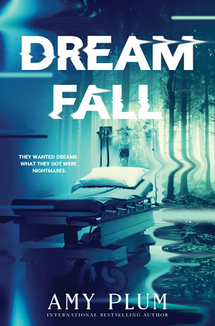
HarperTeen (2017)
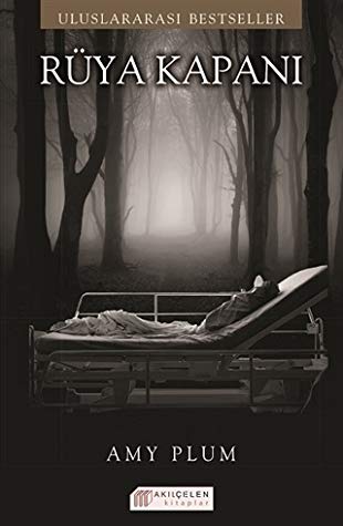
Turkish Edition (2017)
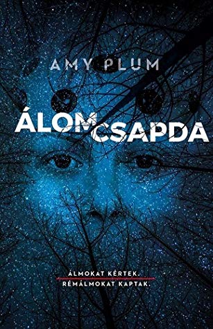
Hungarian Edition (2018)
Winner:
So I didn’t exactly love this book which might be biasing me against these covers, because I’m not really crazy about any of them. If I had to choose my favorite, however, I have to say I’m a bit intrigued by the HarperTeen edition because of the whole watery, melting effect giving it a weird Salvador Dali kind of vibe to it.
But what do you think? Which one is your favorite?


I guess the first, but that is cos the rest were bad
LikeLike
It was a tough choice this week.
LikeLike
I’d have to pick the same one you do. I think I was interested in reading this book ages ago and then it fell off my radar. I don’t think it’s one I’d ever go back and read though. And I thought I was the only one struggling with the topic this week!
LikeLike
Nope, it was a hard topic this week! I had nothing!
LikeLike
I love the HarperTeen cover as well, and if I remember correctly, the sequel is similar and also has a distorted image.
LikeLike
Yeah, I saw the cover to the sequel while looking this one up! They do have cool covers!
LikeLike
Good choice! The distortions in the title and the trees reinforce the idea of a nightmarish landscape…
LikeLike
I agree, it’s strange and beautiful and terrifying at the same time!
LikeLike
Well the Hungarian was my favorite today Mogsy..
LikeLike
I don’t know how I feel about that one, the eyes are a bit creepy!
LikeLike
Seems like I came up with a tough topic this week! Whoops. I like your choice of cover – it looks like the picture is literally melting into a puddle. Not see this book before – I’m sure I’ve read this author. Must check.
Lynn 😀
LikeLike
Haha, yep, you definitely got us struggling this week, but it was fun! I do love the challenge of the hunt for the perfect cover 🙂
LikeLike
Hmmm, the Turkish edition is certainly the worst – similar idea to the Harperteen but looks much cheaper. The harperteen edition is evocative in that it looks like a TV show but I’m not sure if it would induce me to pick up the book. The Hungarian edition is pretty – can’t go wrong with stars – but not keen on that random face.
LikeLike
The one thing I do like about the Turkish cover is the sepia tone, but yeah it is a bit plain and “cheaper” as you say. The Harper Teen one definitely wins hands down, clearly someone put a lot of work into it and I do appreciate the artistic touches 😀
LikeLike
I might need to get this actually, it sounds pretty good! 🙂 I like the HarperTeen cover the most though, definitely.
LikeLike
The concept was good, but I just wish the ideas had been executed better!
LikeLike
Yes I think that first one is an effective cover!
LikeLike
It really is quite atmospheric!
LikeLike
I do like the effect on the cover of this one, looks pretty cool.
LikeLike
I agree, someone clearly took a lot of time to design the concept and develop the feel of the cover, and it definitely paid off! I saw the cover for the sequel too, and it looks really cool as well!
LikeLiked by 1 person
Great pick!!
LikeLike