Friday Face-Off: Striped
Welcome to The Friday Face-Off, a weekly meme created by Books by Proxy! Each Friday, we will pit cover against cover while also taking the opportunity to showcase gorgeous artwork and feature some of our favorite book covers. If you want to join the fun, simply choose a book each Friday that fits that week’s predetermined theme, post and compare two or more different covers available for that book, then name your favorite. A list of future weeks’ themes are available at Lynn’s Book Blog.
This week’s theme is:
“And who decided which people wore the striped pyjamas”
~ a cover featuring STRIPES
Mogsy’s Pick:
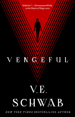
Vengeful by V.E. Schwab
Vengeful was probably the best book I’ve read by Victoria/V.E. Schwab since…well, its predecessor Vicious. I really wish she would write more adult novels like this, because I think letting loose gives her the opportunity to go beyond a lot of the usual story clichés that seem to plague the YA fantasy genre, allowing her to develop a more nuanced and mature approach to the personal voices in her stories.
Anyway, speaking of nuanced, let’s check out the various covers for this book, which I think are all quite expressive and striking.
From left to right:
Tor Books (2018) – Titan (2018)

Spanish Edition (2019) – Russian Edition (2019) – German Edition (2020)


Winner:
All the covers this week are pretty nice, and I actually waffled between the two English editions (the German edition also had promise, but begone, evil yellow sticker, begone!) before settling on my favorite. In the end, I went with the Tor cover. It’s the version I own, and it’s also beautiful in real life.
But what do you think? Which one is your favorite?


None really speak to me, but maybe the Spanish or RUssian one
LikeLike
Those are nice, but maybe a bit too “busy” for me 🙂
LikeLike
Oh I really like the Spanish cover!! But your choice is also really cool. Schwab has such gorgeous cover everywhere, can’t wait to see what the French cover will look like!
LikeLike
I do love her book covers! And she lucks out with all her international editions too 🙂
LikeLike
I’m going to be the odd one probably but I kind of like the Russian cover. Don’t know a thing about the cover and can’t read one iota but I think it’s pretty – and sometimes that all I need to buy a book anyway!
LikeLike
I kinda like how it looks blood splattered – it’s an interesting effect 🙂
LikeLike
I really like that Spanish edition! Second choice would be the Russian version.
LikeLike
The Spanish one seems popular today! 😀
LikeLike
I love the Spanish edition, but it doesn’t really “feel” right for this story at all. I guess my favorite would have to be the Titan edition, but it’s hard to choose, I like all of these!
LikeLike
I agree, I feel the same way about the Russian one too, so despite really liking both of those, I ruled them out because I just can’t connect them to the story.
LikeLike
Both the Tor cover and the Titan have a James Bond movie feel about them that I like very much 🙂
LikeLike
You’re right, I never thought about that!
LikeLike
Great choice this week! I can’t believe I didn’t think of Vengeful haha.
I like the Titan (2018) version best!
LikeLike
I got lucky, I was browsing goodreads for “striped” covers on my shelves and I stumbled across this one 😀
LikeLike
This is a hard choice. I really like the Spanish edition but I feel kind of bad saying that because someone pointed out to me that this author has a red, white and black colour scheme for her covers so turning around picking one that isn’t feels wrong :L I do love the first two as well though, possibly the Titan one slightly more as light covers can be really striking sometimes.
LikeLike
Nah, don’t feel bad! I actually think the Spanish edition stands out because of the different color scheme. The author does have the red/white/black thing going but the way I see it, why limit yourself 😀
LikeLiked by 1 person
That’s true (: I actually think the Spanish one reminds me of another book cover that I’ve seen although I honestly can’t remember what /:
LikeLike
That’s true. I actually think the Spanish one reminds me of another book cover that I’ve seen although I really can’t remember which one.
LikeLike
The German one is my fav this week 😉
LikeLike
I like it too, I just hate that big yellow sticker! 😀
LikeLiked by 1 person
I like the first two the best but the Titan cover might be my fave.
LikeLike
I do like it that it has more white space and is “brighter”.
LikeLike
I like the Tor cover, but ooh, the Spanish edition is really cool and spooky!
LikeLike
Haha, nice, I took a closer look at the details after you mentioned spooky, and I can’t believe I missed how it is mostly filled with dead things, lol!
LikeLiked by 1 person
lmao, glad I could highlight that for you! sometimes I’ll see a cover a dozen times and never pick up on something, then when I see it, I’m like ‘am I blind?? how did I miss this!’ like with the cover of ‘You Must Not Miss’, I totally didn’t notice for the longest time that there’s a face screaming in the background!
LikeLike
I have a copy of the cover you picked, but I think I’m more drawn to the Titan edition 🙂
LikeLike
Yeah, I wish I had that edition too, I’ve seen photos and it’s pretty!
LikeLike
I like your cover choice to be honest. I like a couple of the others two but I think that’s the best one. And, as strange as it might sound I never picked up on the ‘V’ shape before – doh!
Lynn 😀
LikeLike
Haha, there’s definitely a V thing going with this series!
LikeLike
I love both of the top two but maybe the Titan edition just a bit more…hard to choose!
LikeLike
I definitely think the Titan cover is more powerful, more menacing…despite the Tor cover being the darker cover and with the sharp angles 😀
LikeLiked by 1 person