Friday Face-Off: Blazing Sun
Welcome to The Friday Face-Off, a weekly meme created by Books by Proxy! Each Friday, we will pit cover against cover while also taking the opportunity to showcase gorgeous artwork and feature some of our favorite book covers. If you want to join the fun, simply choose a book each Friday that fits that week’s predetermined theme, post and compare two or more different covers available for that book, then name your favorite. A list of future weeks’ themes are available at Lynn’s Book Blog.
This week’s theme is:
“The longest day of the year”
~ a cover featuring a BLAZING SUN
Mogsy’s Pick:
Ecopraxia by Peter Watts
So today’s theme is technically “Summer Solstice”, for which we can feature any kind of imagery related to the longest day of the year, including pagan rituals, standing stones, and of course, blazing suns. Since I knew I was going to have a hard time coming up with anything otherwise, I decided to go with the most literal and straightforward interpretation of the last and ended up with Echopraxia by Peter Watts! Which is kind of ironic, considering how un-straightforward and just plain impenetrable this book was. If you’re the kind of reader who struggles with hard sci-fi, I’d recommend staying far away.
But let’s take a look at covers:
From left to right:
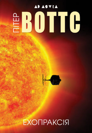
Tor Books (2014) – Head of Zeus (2015) – Russian Edition (2015)


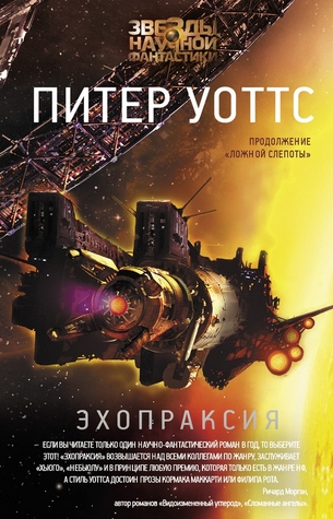
Polish Edition A (2014) – Polish Edition B (2014) – Ukrainian Edition (2015)
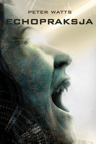

Winner:
It’s rather plain and simple, but I love the Head of Zeus edition. Something about the intensity of the colors just does it for me. It somewhat suits the underlying themes of the book too, which touch upon some philosophical questions and debates about the human condition.
But what do you think? Which one is your favorite?


I think I will go with Tor, but yours was really nice too
LikeLike
Tor is great too, once you look at all the details 🙂
LikeLike
Nice selection for this week, Mogsy:). I also like the Head of Zeus cover, which – as you say – is nicely restrained. If it wasn’t that one, then I would have gone for the Ukranian edition.
LikeLike
Yes, restrained is the perfect description! I don’t like it when covers are too flashy 🙂
LikeLiked by 1 person
It’s a balance, isn’t it? You want your cover to stand out in amongst a bunch of others, but be both genre-appropriate and a tad tasteful… No wonder so many people get it wrong!
LikeLike
I actually like the Ukrainian edition for some reason. Let’s of fiery covers for this one!
LikeLike
Thanks, that was the idea 😀
LikeLike
Wow, there are quite a few covers for this book! I have to say I love the Tor edition the best, but it’s tough because all of these are really good. I even like the Polish A edition!
LikeLike
I was surprised how many covers I found, though I guess it’s been a few years 🙂
LikeLike
Even though I don’t know the idea at the core of this novel, the cover you choose gives off a not-so-faint air of mystery and menace, and as such I like it. The Russian edition comes a close second… 🙂
LikeLike
The story is a bit weird and I found it a bit hard to follow with so much stuff going on. But now that I’m more familiar with the genre, I don’t know what I would think if I read it today. I think you’d it enjoy it 🙂
LikeLike
This is a really cool post! Your favorite stood out most to me, too.
LikeLike
Yay, glad to hear! 😀
LikeLiked by 1 person
I think I’d pick the same one as you; it was what I went for initially then I started questioning myself :L I do love the background on the Russian edition though.
LikeLike
The Russian edition seems quite popular today! 😀
LikeLiked by 1 person
These are my favorite blog posts, I love the comparisons over cover art.
LikeLike
I enjoy doing these Friday Face-Off posts very much too 🙂
LikeLike
Yes! That one is absolutely stunning!!!
LikeLike
I thought so too! 🙂
LikeLike
I think I might like the first one- the TOR- the best, since the guy is out in space and it looks like a blazing sun in the background- kinda neat. 🙂
LikeLike
Yeah, I didn’t notice the guy at first glance, but when I zoomed into the cover, I saw him. It’s a very awe-inspiring scene 🙂
LikeLike
I like your pick and the Russian book has a good cover too.
LikeLike
Nice, another vote for the Russian edition! 😀
LikeLike
I like your choice for this one – it immediately stood out for me but I was unable to put my finger on exactly why. Maybe, like you said, it’s the intensity of the colour. I also like the Russian cover – which is kind of funny and also shows how tastes change – if I’d seen that cover just a few years ago I would have run a mile.
Lynn 😀
LikeLike
Haha, I don’t think the Russian edition is that bad – I like it, and it seems quite popular this week too! 😀
LikeLike
I love the Ukrainian one, though Head of Zeus is a close second 🙂
LikeLike
The Ukrainian would have been my second choice – it’s very eye-catching!
LikeLiked by 1 person
I agree with your choice! I love the red and oranges with the black and how they made the o part of the design
LikeLike
I actually like most of these, minus the Polish version A – I’d be too scared to look at that on my bookshelf. 😂 But yes, your pick is great! I also like the Russian edition, as well as the asymmetry of the Tor version!
LikeLike
I think the one you picked is my favorite too. I love when they incorporate the picture into the text like this.
LikeLike
Brilliant pick!!
LikeLike