Friday Face-Off: Sunrise/Sunset
Welcome to The Friday Face-Off, a weekly meme created by Books by Proxy! Each Friday, we will pit cover against cover while also taking the opportunity to showcase gorgeous artwork and feature some of our favorite book covers. If you want to join the fun, simply choose a book each Friday that fits that week’s predetermined theme, post and compare two or more different covers available for that book, then name your favorite. A list of future weeks’ themes are available at Lynn’s Book Blog.
This week’s theme is:
“The sunrise was the colour of bad blood.”
~ a cover featuring a SUNRISE OR SUNSET
Mogsy’s Pick:
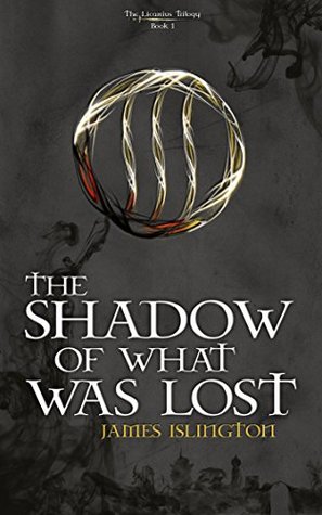
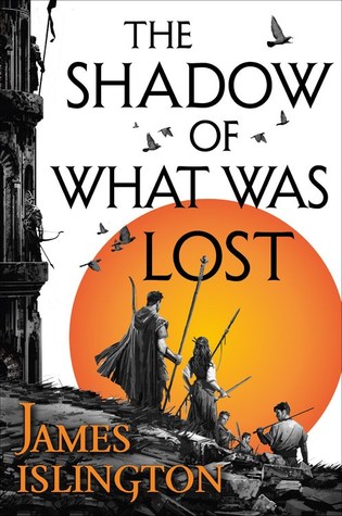
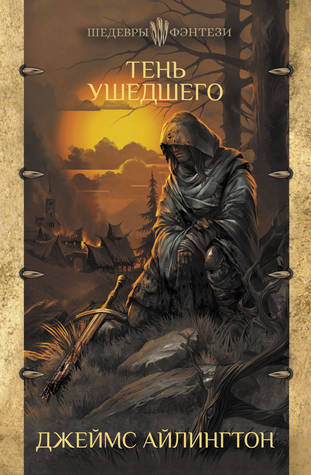
The Shadow of What Was Lost by James Islington
Whenever I hear about an indie fantasy that makes the jump to a traditional publishing house, it always piques my curiosity, and of course, The Shadow of What Was Lost was no exception. While I didn’t think it revolutionized epic fantasy in any way, I nevertheless found it to be an engaging series-opener. Let’s take a look at the covers:
From left to right, top to bottom:
Smashwords (2014) – Orbit (2016)
German Edition A (2017) – German Edition B (2018)


Czech Edition (2018) – Russian Edition (2019)

Winner:
I’m going to have to go with the Orbit edition for this one. I love the art style and the way the monochromatic parts of the image make the orange of the sun really pop.
But what do you think? Which one is your favorite?


Agree with your choice! Though, to be frank, this time it is much smaller 😉 The Orbit cover brings to mind the covers of various Sanderson’s books – and though I’m not a fan, the covers are good 😀
LikeLiked by 1 person
Yeah, I have to pick books with fewer options more often! It gets easier to choose 😛
LikeLiked by 1 person
That big orange sun always caught my attention every time I saw this book mentioned – that and the flight of birds… 🙂
LikeLiked by 1 person
The big orange sun is definitely eye-catching!
LikeLike
I agree with you choice but I am kind of curious why the Russian and the Czech editions went with the same cover but different colors. I tend to think of warm colors, not cool ones when I read the title.
LikeLiked by 1 person
The two different colors but same image intrigued me too. Maybe one was hardcover, and the other was the paperback release.
LikeLike
I love the Orbit edition, but I also like the Russian cover!
LikeLiked by 1 person
The Russian one is pretty – very classic fantasy!
LikeLike
That cover you went with is really striking. The contrast between the sun and the background and foreground is just fantastic. Great pick!
LikeLiked by 1 person
Yes, it’s the contrast I like! Good call!
LikeLiked by 1 person
Yup, the Orbit cover is pretty sweet. None of the others particularly jump out at me!
LikeLiked by 1 person
I agree, it’s the only one that stood out, even though I really like the Russian edition too.
LikeLike
I think with different colors then the Russian one would have worked great, but now…yours
LikeLiked by 1 person
Yeah, I like the Russian is nice, but it might just be a tad too dark for my tastes.
LikeLike
I just want the 3rd book to finally come out 🙂
ps,
did you change anything with your comment section? I have to fill out info OR login and I always used to be auto-recognized through wordpress.
LikeLiked by 1 person
Now that I left that previous comment, everything appears as normal. Hmmm, weird.
LikeLiked by 1 person
That’s happened to me with a lot of WordPress blogs lately. I find that a refresh fixes the problem!
LikeLiked by 1 person
I like the Orbit edition as well. It’s just got that epic fantasy going-on-a-quest type vibe haha.
LikeLiked by 1 person
Yup, that’s the vibe I get from it too!
LikeLike
Agreed 🙂
LikeLiked by 1 person
Sweet! 😀
LikeLike
It is a very effective cover. I also like the blue German one.
LikeLiked by 1 person
I also prefer the blue German edition over the silver/grey one 😀
LikeLike
That is my favorite as well, I like the pop of color in the background
LikeLiked by 1 person
Yeah that is a really nice design choice!
LikeLike
This is a great choice of book and I love the cover you’ve chosen to it. It’s got a real impact with the dramatic colours.
Lynn 😀
LikeLiked by 1 person
Yeah this book definitely didn’t revolutionise fantasy, but I loved it for what it was! And really like your cover pick!
LikeLike