Friday Face-Off: King
Welcome to The Friday Face-Off, a weekly meme created by Books by Proxy! Each Friday, we will pit cover against cover while also taking the opportunity to showcase gorgeous artwork and feature some of our favorite book covers. If you want to join the fun, simply choose a book each Friday that fits that week’s predetermined theme, post and compare two or more different covers available for that book, then name your favorite. A list of future weeks’ themes are available at Lynn’s Book Blog.
This week’s theme is:
“A horse, a horse, my kingdom for a horse.”
~ a cover featuring a KING
Mogsy’s Pick:
Dragon’s Child by M.K. Hume
Dragon’s Child is the story of King Arthur (known here as Artorex) and his journey from a humble childhood to become the High King of the Britons. Artorex is presented to us as the reluctant hero, whose personal choice would have been to raise a family on his foster family’s farm and live out the rest of his days as a simple steward. Fate, however, has set him on a different path.
Like many, I’ve read my fair share of retellings and interpretations of the King Arthur mythos, but I am most definitely not well-versed in the historical details. This made me curious as to how M.K. Hume, a leading academic expert on Arthurian literature, would tackle the legend from more of a historical perspective than a fantasy or mythological one. It’s been a few years since I read this one, and in that time, more editions of the book have been published. Let’s take a look at some of the covers:
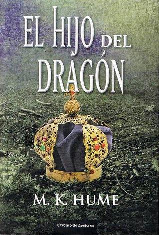
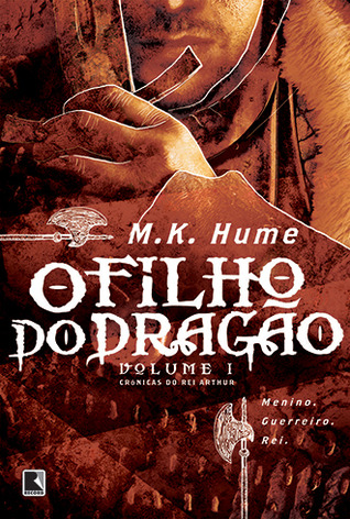
From left to right, top to bottom:
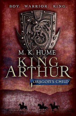
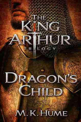
Headline (2009) – Atria (2013)
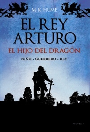
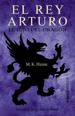
Spanish Edition A (2011) – Spanish Edition B (2013) – Spanish Edition C (2015)
Portuguese Edition A (2010) – Portuguese Edition B (2012)

Winner:
My favorite cover this week is the Portuguese Edition B (2012); I just love how the whole thing is laid out as well as the cool highlight effect of the white lines, almost like the entire image has been put through an illustration filter. Plus, the typeface is also very pleasing.
But what do you think? Which one is your favorite?


I like your choice – the font is really good and I also like the cover next to it which is also Portuguese.
That highlight effect is really unusual and unique – I like it.
Lynn 😀
LikeLike
It’s the highlighted lines that really did it for me!
LikeLike
I like your choice too. The rest seem rather bland and generic, like they could fit just about any book in a fantasy setting…
LikeLike
I agree, and I’m not a big fan in general of “symbol” covers. I’m not that crazy for the “let’s just zoom in one some piece of armor/weapon” covers either, but hey, at least the one I chose had some interesting artistic flairs.
LikeLiked by 1 person
I like the Spanish edition B but I’m sure it’s just because of the color purple. So many awesome covers today.
LikeLike
That is a gorgeous shade of purple! I just wish the image had been more interesting!
LikeLike
I was thinking the same thing, about it looking like a filter. I love your choice, and I also love the Headline cover😁
LikeLike
Yeah, the illustrated style/type of filter definitely gave it the edge over the others!
LikeLike
I like the Spanish edition with the dragon!
LikeLike
Very heraldic!
LikeLike
Yes! That’s my favourite too 😀
LikeLike
Yay! 😀
LikeLike
Your choice stands out mostly because of the color scheme, and I find it quite effective. The left-hand cover in the first row is also very intriguing: that shield with the dragon seems to come out of the page! 🙂
LikeLike
Yeah, I love the bright warm colors! It’s why I also really liked the Atria edition, only the image itself is not quite as interesting as my choice 😀
LikeLike
Headline 2009 is my favorite. Love the shield over the shadows below.
LikeLike
Yeah, I considered that one too, because i really liked the nice touch with the riders!
LikeLiked by 1 person
I kind of want to pick none!
LikeLike
Haha, I agree, none of these are really all that phenomenal. But they could be worse!
LikeLike
Tough one this week Mogsy as none really appeals to me! But I would go with yours 😉
LikeLike
No worries, I agree none of them are really all that interesting! I am not really a big fan of armor/weapon and symbol covers.
LikeLike
I like both Portuguese editions as well as the Spanish one!
LikeLike
The first Portuguese is nice, I like that it is sort of a variation on the Headline cover!
LikeLike
What a great choice of book for this week’s theme! My favourite is the Atria 2013 version – I love the colours and the design. While I do like the Portuguese edition, that white outline draws my attention away from the artwork.
LikeLike
Haha, I hear ya! I actually like the white outlines because it gives the cover a more “painted” look, and for that reason I chose it over the more photo-realistic Atria cover, which would be my second choice 🙂
LikeLiked by 1 person
:))
LikeLike
I like the one you chose best and the Spanish Edition B second best! Great choice!
LikeLike
That Spanish purple cover is quite popular this week 😀
LikeLike
Great pick! I like the one you went with, it kind of feels like the new movie, hah. 😀
LikeLike
Nice pick! That’s the one I chose myself, although I did contemplate the Portuguese cover as well (I liked the dual color scheme) 😊
LikeLike