Friday Face-Off: Eyes
Welcome to The Friday Face-Off, a weekly meme created by Books by Proxy! Each Friday, we will pit cover against cover while also taking the opportunity to showcase gorgeous artwork and feature some of our favorite book covers. If you want to join the fun, simply choose a book each Friday that fits that week’s predetermined theme, post and compare two or more different covers available for that book, then name your favorite. A list of future weeks’ themes are available at Lynn’s Book Blog.
This week’s theme is:
“Eyes wide shut”
~ a cover featuring EYES
Mogsy’s Pick:
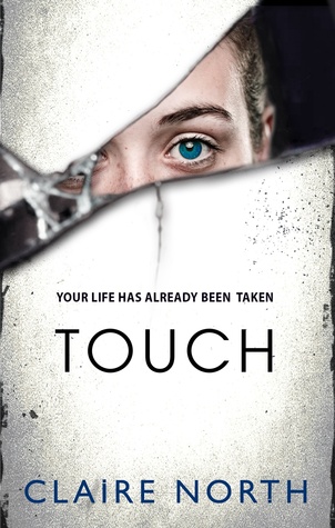
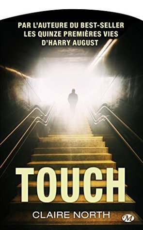
Touch by Claire North
Touch was, in a word, fascinating. I’ll never look at the term “losing time” the same way again. Imagine, if you will, a group of near-immortal individuals (who call themselves “Ghosts”) that can jump from body to body, taking over their hosts and seeing through their eyes, feeling what they feel. They can choose to be anyone they want, live any life they want. All it takes is a single touch.
Whether a possession lasts for two seconds, two days, or two decades, the hosts won’t remember this time after the Ghost jumps away to another body. Have you ever looked at your cellphone and see a call you don’t remember making? Or found yourself in the middle of doing something, without remembering why? Have you ever lost time?
Like I said, a fascinating, amazing book. But let’s see how the covers measure up:
From left to right:
Orbit Hardcover (2015) – Orbit Paperback (2015) – Redhook (2015)


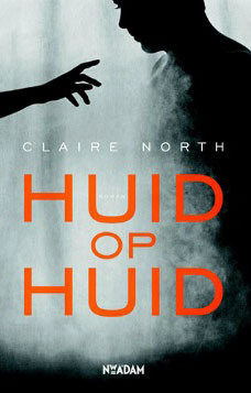
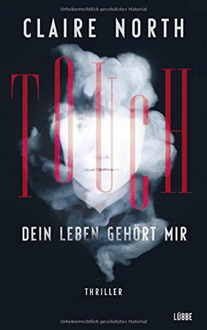
Dutch Edition (2015) – Polish Edition (2016) – German Edition (2016)

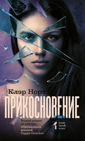
Russian Edition (2017) – French Edition (2015) – French Edition (2016)

Winner:
It was interesting to see so many different covers for this book, each with their own special touch (oh I slay myself). Notice, for example, the reflection you see in many of the eyes, which I thought was pretty damn cool. However, my favorite is probably the Russian cover because it takes the shattered mirror idea you see in the Orbit editions and takes it even further, depicting the concept of a Ghost’s multiple identities.
But what do you think? Which one is your favorite?


I’d pick the Dutch version. It has something^^ Even though it’s not an eye.
I can’t look at the Russian one, it has too much glass on it. Broken glass + eyes makes me think all horrible things. 😀
LikeLike
Oh, the Dutch version is a creepy one! It actually makes the book seem like Horror 🙂
LikeLiked by 1 person
Ooh eyes can be freaky on a cover! I like the Orbit paperback probably the best, although the Polish one has that freaky vibe to it! The Russian one is nice though too and makes good use of the glass shards effect!
LikeLike
Yes, I love the second identity that was shown in those shards!
LikeLike
It’s interesting how different some of these are while also being similar. Love the one you picked but I think I also like the 2015 Orbit paperback edition as well.
LikeLike
Yeah, it’s funny how that happens. I suspect a lot of the artists for the international editions all draw inspiration from each other!
LikeLiked by 1 person
I like the cover of the French edition but with it not really matching the plot I’d go with the Polish one.
LikeLike
The close up of that eye in the Polish edition freaks me out! It’s a good one!
LikeLike
I like the first cover – I don’t know if that’s just because it’s the one I’m most familiar with or not, then I’d go for your pick – which is so very different isn’t it.
Lynn 😀
LikeLike
It’s got the “classic” feel. It’s the one I’m most familiar with too, so I know what you mean 🙂
LikeLike
I love the one you picked, and also the German edition. This was a great idea!
LikeLike
When I saw the theme, I knew this book was the perfect one for it 🙂
LikeLike
I’d have to agree with you there. There’s something about the shattered mirror effect that really grabs me.
LikeLike
I also like the purple 😉
LikeLike
Pingback: Friday Face Off : Eyes wide shut | Books and travelling with Lynn
Those eyes are pretty dull, but yes the Russian for me too
LikeLike
Yeah, the other ones have more expression.
LikeLike
The RedHook cover seems to summarize the core concept of the story quite well… 🙂
LikeLike
I like the stone cold gaze too 🙂
LikeLike
I agree with your choice! That is really cool how they did that cover!
LikeLike
It seemed to take the best from all the covers up there 🙂
LikeLike
The Polish Edition first caught my eye (pun intended) but your cover has a nice touch lol with the shards of glass. Ouchie. The concept sounds very cool.
LikeLike
It’s a great book! I imagine it was tough coming up with a cover for it, so I think all of them did a good job, considering.
LikeLike