Friday Face-Off: Mask
Welcome to The Friday Face-Off, a weekly meme created by Books by Proxy! Each Friday, we will pit cover against cover while also taking the opportunity to showcase gorgeous artwork and feature some of our favorite book covers. If you want to join the fun, simply choose a book each Friday that fits that week’s predetermined theme, post and compare two or more different covers available for that book, then name your favorite. A list of future weeks’ themes are available at Lynn’s Book Blog.
This week’s theme is:
“…Christine, who have torn off my mask and who therefore can never leave me again!”
~ a cover featuring a MASK
Mogsy’s Pick:
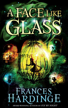
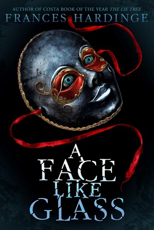
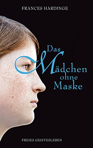
A Face Like Glass by Frances Hardinge
Sitting in that much-needed place between Middle Grade and Young Adult, A Face Like Glass is a coming-of-age novel about a younger protagonist, but the challenges she must deal with are no less difficult or complex. Neverfell was just a child when she was found, practically half-drowned, in a vat of curds by Caverna’s foremost cheesemaker. But as soon as he cleaned off the little girl and took one look at her face, he knew something was terribly wrong. From that moment on, Neverfell was always instructed to wear a mask in public, though she was never told why, leading her to believe that she is hideously disfigured.
For years afterward, Neverfell trains with the cheesemaker as his apprentice, learning all about the ways of Caverna, an underground city made up of tunnels. Skilled craftsmen create all sorts of magical goods to sell to the royal court. Among the most respected of these artisans are the Facesmiths, for unlike the people who live in the world above, citizens of Caverna are born with blank faces and no natural instinct to form facial expressions. This is where a Facesmith comes in, developing and teaching new expressions to those who can afford his or her services. The richer you are, the more facial expressions you can learn, while the poor are only taught a few to get them through a life of servitude.
Everything about this novel is pure imagination and magic, and needless to say, I loved every moment. But how do its covers fare? Let’s take a look at them now:
From left to right:
Pan Macmillan Children’s HC (2012) – Pan Macmillan Children’s PB (2013) – Amulet Books HC (2017)
Amulet Books digital (2017) – Macmillan UK (2016) – Pan Macmillan PB (2017) – German Edition (2014)


Winner:
The version I own is the Amulet Books hardcover, and I’ve always disliked it for how creepy it looks. I much prefer the Pan Macmillan Children’s 2012 edition, which perfectly encapsulates the magical and whimsical nature of the story. It is also my favorite of the bunch.
But what you do think? Which one is your favorite?


I had a hard time deciding between that one and book 2, but I will go for the second one 🙂 I like the mirror
LikeLiked by 1 person
That was my second choice. I almost couldn’t decide between them, they are both beautiful.
LikeLike
This is kind of a tough one! I think I like the Pan MacMillan paperback version the best… I agree the third one is a bit creepy.
LikeLiked by 1 person
Yeah, can’t go wrong with either of the first two!
LikeLike
I was stuck between your choice and the first Amulet book cover! I like them both!
LikeLike
The Amulet version might have been better without the red around the mask’s eyes – I think that’s what I found most disturbing 😀
LikeLike
oh many different ones! I agree with you!
LikeLike
Thanks for your input!
LikeLike
Oh wow, I really wanted to read this book at one point, but it fell off my radar at some point. The synopsis sounds really fascinating!
Also, I absolutely agree with your pick. The sense of light and magic seems to be bouncing off the cover, and it’s just so lovely. ❤
LikeLike
It was my first book by the author, and I was completely blown away. A lot of YA these days are disappointing because of the way they employ cliches and recycle tropes, but this was amazingly unique and the world was just so imaginative!
LikeLiked by 1 person
That’s awesome to hear! I’m really excited to read it now! 😀
LikeLike
I found the second one, the pan macmillian paperback to be the most evocative.
That german one though, what were they thinking?
LikeLike
I really like the second one too, probably just as much as the first one. And yeah, the German one is pretty drab in comparison, like little to no effort was put into it.
LikeLiked by 1 person
I have to agree with your pick on this one. The color is so striking.
LikeLike
Yes, just the right balance of light and shadows!
LikeLiked by 1 person
Wow, what pretty covers but yep, I was drawn to the same one you were!
LikeLike
I loved the splashes of different color.
LikeLike
I’m not so keen on the masks – i love the top two.
LikeLike
Yeah, the masks designs are…disturbing 😛
LikeLike
I have to agree with your choice. And I’ve also been disturbed by the Amulet edition but I didn’t know why until you called it creepy😁
LikeLike
It’s the red around the eyes that give me the willies. I don’t like those covers at all!
LikeLike
The Amulet edition is indeed disturbing – even more so if you consider the intended target for the story! I like your choice, and also the one right next to it: both show some warm colors I find quite appealing 🙂
LikeLike
Ironically the story is actually pretty innocent, by YA standards at least – but yeah, the cover is pretty off-putting and made me wary the first time I saw it!
LikeLike
I like the one you chose best! It is really pretty! The Amulet edition is super creepy! Like, Adult horror book creepy, not middle grade/young adult.
LikeLike
Exactly! that cover totally gave me the wrong idea of the story when the book first showed up!
LikeLike
They are all great covers but I totally agree with the one you chose!
LikeLike
Awesome, thanks for checking out my post!
LikeLike
My first thought scrolling down was what on earth were those creepy covers about – and, then I read your comment!! I love your choice, the colours are just lovely.
Lynn 😀
LikeLike
Yeah, I do not like those Amulet masks covers. Glad I’m not the only one who finds them creepy!
LikeLike