Friday Face-Off: Starry Sky
Welcome to The Friday Face-Off, a weekly meme created by Books by Proxy! Each Friday, we will pit cover against cover while also taking the opportunity to showcase gorgeous artwork and feature some of our favorite book covers. If you want to join the fun, simply choose a book each Friday that fits that week’s predetermined theme, post and compare two or more different covers available for that book, then name your favorite. A list of future weeks’ themes are available at Lynn’s Book Blog.
This week’s theme is:
“Moonlight drowns out all but the brightest stars.”
~ a cover featuring a STARRY SKY
Mogsy’s Pick:
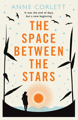
The Space Between the Stars by Anne Corlett
The Space Between the Stars is a novel about one woman’s journey through a desolate galaxy after much of humanity has been wiped out by a deadly plague. One in a million. That was the purported survival rate of the virus that ravaged through every world inhabited by humans. Stationed on a remote planet, Jamie Allenby was able to escape the worst of the virus’s effects, though her isolation has left her cut off from the rest of civilization. Now she is desperate to locate her long-term partner Daniel, from whom she had separated after the loss of their unborn child. Jamie has no idea if Daniel is even still alive, but an unknown transmission received on her communicator gives her hope. Recalling an old conversation they had about meeting up in Northumberland in the event of an apocalypse scenario, Jamie sets her sights on returning to Earth.
Can’t say I loved this book, but it fits this week’s theme well. Ironically, the novel is inherently light on the science fiction, despite its post-apocalyptic premise, space traveling narrative, and star-speckled covers. Let’s take a look at them now:
From left to right:
Berkley (2017) – Pan Macmillan (2017)
Thorndike Press (2017) – Italian Edition (2017)


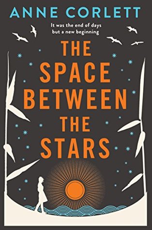
Bonus: two more covers that are variations of the ones featured above, but recolored:
Berkley Paperback (2018) – Pan Paperback (2018)

Winner:
I decided I just had to feature the recolored paperback versions this week, even though they are so similar to their hardcover counterparts. It’s amazing what a difference a color change makes, because I actually like them both better than the originals. Needless to say, deeper hues make for better “starry sky” covers. I’m going to have to go with the Pan Paperback edition as my favorite this time, but the Berkley Paperback comes very close. Depending on my mood, I think it could go either way.
But what do you think? Which one is your favorite?


The premise sounded so interesting, but you mentioned that you didn’t like it? In what way is the sci fi element too light? 🤔😊😊
LikeLike
Basically this entire story could have taken place on Earth, within the borders of the same country even. It felt like the author threw in the planets and spaceships just to take advantage of the popularity of books like Station Eleven, while compensating for the mediocre plot line. That is to say, there were sci-fi elements but they felt tacked on, and it didn’t feel as though the story was built around it. Hope that makes sense 😀
LikeLiked by 1 person
Thanks for explaining! 🙂
LikeLike
Yup, I can go either way on these two. I like the same two. Maybe the Berkley one a smidgen more, I like the blue, but yeah they’re both nice.
LikeLike
Yeah the blues and purples are gorgeous in that one!
LikeLike
I can’t say I love any of them, but Pan Mcmillian is the one I like
LikeLike
That one’s pretty too, though it does make this book seem like a beach read. And it’s definitely too depressing to be a beach read 😉
LikeLike
“Spaceships” does not Science Fiction make 😦
LikeLike
Agreed 100%! And pretty much nails what was wrong with this book.
LikeLiked by 1 person
Yep, I very nearly choose this cover this week too – that would have been too funny. But, like you I wasn’t completely won over by this story – I mean, it wasn’t bad and I didn’t hate it but the sci fi elements were too skimpy. Covers – I love your choice, I hadn’t spotted the recoloured version and the dark background is so much more dramatic. For some reason I also like the Italian version – can’t help thinking of a polar bear sat on an ice cap though – odd.
Lynn 😀
LikeLike
Yeah, skimpy sci-fi elements, and I couldn’t connect with the protagonist. Beautiful covers, but the story was not my cup of tea at all.
LikeLike
I like the Pan paperback but I have to admit that the other Pan one seems much too bright and vibrant to have a title including stars. It looks like daylight and last time I checked, not too many visible stars during the day. Of course I’m still seeing what looks to me like a sun on both versions. Okay, now that I’ve thought about it, I don’t favor any – haha!
LikeLike
Yeah, I also found both the original Berkley and the Pan too be too bright, which kind of washes out the starry sky.
LikeLike
I’m really underwhelmed by all these, BUT the Berkley paperback is definitely my favorite. You’re right, deeper colors are much more eye popping😁
LikeLike
Yep, they make the stars stand out so much more!
LikeLike
I’m afraid none of these would make me pick the book up to read the blurb!
LikeLike
Fair enough 🙂
LikeLike
I like your pick here. I also like the Berkley cover because I’m partial to the colors. I actually kind of enjoyed this book. I think it was a lot more introspective than I was expecting, but something about that worked for me.
LikeLike
I know what you mean, it definitely was more of an “introspective” type/personal journey kind of book. I had a hard time finding the protagonist likable too, so perhaps that was a bit issue for me as well.
LikeLiked by 1 person
Oh, I could see that for sure. I don’t know as I really found them likable either which is usually a huge negative for me. This was one of those weird books that I should have disliked based on a lot of things but….maybe was the right book at the right time or something. 🙂
LikeLike
I like the Berkley (2017)
LikeLike
The colors are a little too light for me, but I do agree the layout is gorgeous!
LikeLike
I like the Thorndike Press edition: that point of light in the dark background is very compelling…
LikeLike
Interesting! Thanks for sharing your thoughts, since that one tends to get overlooked!
LikeLike
I like the two re-colored ones best overall! And the Berkley better of the two! Great Choice!
LikeLike
The recolored Berkley one really is quite beautiful, I just love the deep purples and blues.
LikeLike
Oh, I would have picked that cover as well! But I like the mostly white one more, that looks really neat
LikeLike
Yeah, I think that might be my third favorite, after the recolored Pan and Berkley covers!
LikeLiked by 1 person
lol… SNAP! And I hadn’t noticed the recoloured Berkley cover – how bad is that?? Because that would have definitely been my choice. I seem to be the exception in that I really enjoyed the book. While I take your point that the sci fi aspect wasn’t particularly emphasised, I also found myself identifying with the protagonist. I don’t think I’d be very likeable after everyone I knew and cared about died, either…
LikeLike
Yeah, I think my main issue with the story was the character and the fact I just couldn’t connect with her. Being able to relate to a protagonist can make a huge difference so I am glad you were able to identify with her and that you enjoyed the book! 😀
LikeLiked by 1 person
Yes… I’ve recently had the same issue with a book that a lot of folks are raving about – I simply couldn’t care about ANY of the characters.
LikeLike
I agree, the change in colors definitely makes a difference! I’d personally go with the Berkeley paperback just because I’d like more detail on the Pan edition, but they’re both lovely. 🙂
LikeLike