Friday Face-Off: Medieval
Welcome to The Friday Face-Off, a weekly meme created by Books by Proxy! Each Friday, we will pit cover against cover while also taking the opportunity to showcase gorgeous artwork and feature some of our favorite book covers. If you want to join the fun, simply choose a book each Friday that fits that week’s predetermined theme, post and compare two or more different covers available for that book, then name your favorite. A list of future weeks’ themes are available at Lynn’s Book Blog.
This week’s theme is:
“Those darling byegone times… with their delicious fortresses, and their dear old dungeons, and their delightful places of torture”
~ a cover that is MEDIEVAL
Mogsy’s Pick:
The Curse of Chalion by Lois McMaster Bujold
I can’t help it; when I think of the Medieval period, I also always think castles. Hence, this week I decided to feature The Curse of Chalion (one of my favorite books ever), whose covers seem to be chock-full of these symbols of the Middle Ages.
Not surprisingly, since it’s also considered one of Bujold’s most celebrated fantasy novels, there are a LOT of editions. While I’ve already weeded out some of the more unappealing covers, we’re still left with a bunch this week. Here they are:
From left to right, top to bottom:
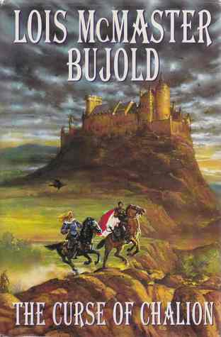
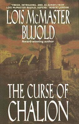
Eos (2001) – Eos (2006) – Voyager (2003)


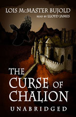
HarperTorch (2002) – Blackstone Audio (2004) –Italian Edition (2003)

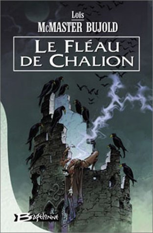
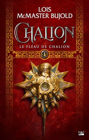
Bulgarian Edition (2003) – French Edition (2003) – French Edition (2016)

Spanish Edition (2003) – Spanish Edition (2005) – German Edition (2005)


Czech Edition (2005) – Chinese Edition (2007) – Croatian Edition (2013)


Winner:
There are quite a few covers here I hadn’t seen before, and there are several of them I like a lot. But then I wondered, how much of this is because of the novelty? Sure, I may enjoy the art style of the French (2003) edition, or the surrealism of the Croatian (2013) cover. But at the end of the day? While it may be seen as the “safe” choice, there’s no denying that timelessness and classic styles reign supreme.
But what do you think? Which one is your favorite?


These are all gorgeous, but I think I lean towards Voyager; love the tone of it, and that bird amidst the dusty yellow really caught my eye right off the bat!
LikeLike
And yellow being somewhat of a rare color used for covers…whenever I see one that’s predominantly that color, I take notice 🙂
LikeLiked by 1 person
Yes! And yellow’s my favorite color, so… 😉
LikeLike
I think the Eos edition is my favorite- I like the castle in the background, with the cloudy sky and the riders in the foreground. The 2001 Eos, I should say, although I like the other one too, actually. And then the Voyager edition- again cool castle.
I kinda like the french one too- that one’s kinda dark and very different! And maybe even the Spanish ed. a little bit…
LikeLike
The 2001 is totally classic. That’s actually the version I own! Though I usually prefer having people on my covers though, something about the placement of them just didn’t really work for me though.
LikeLike
I couldn’t get past my dislike for the book, so there was no winner for me 😦
LikeLike
“You must be mindful of your feelings, Padawan! You cannot not let them control you!” Yeah I probably mangled that quote, but whatever 😀
LikeLiked by 1 person
😀
LikeLike
I like yours and the Bulgarian so….going with the guy. but omg some are just so NO
LikeLike
Oh if you thought some of the ones here were bad, you should have seen the ones I already cut!
LikeLike
I didn’t even know about this novel
LikeLike
It’s pretty big, but I think mostly among fantasy readers 🙂
LikeLike
That’s the one I would pick too although the Bulgarian version comes in a close second. I’ve always been fascinated by castles and would love to live in one – although I wouldn’t want to heat one, I always imagine they are pretty cold and drafty.
LikeLike
The Bulgarian edition seems quite popular this week. Very dark and gloomy!
LikeLike
I really like the Eos cover, although the one you picked also has a great blend of elements. I also like the Croatian cover because of the animals😊
LikeLike
Yeah, even though it was kind of surreal, I do like the Croatian cover for its uniqueness, and I guess symbolism 😀
LikeLike
The Eos and Voyager covers were my favorites and I would be hard-pressed to choose between them: the crow (?) depicted there – one in flight, the other at rest – draws my attention like a magnet 🙂
LikeLike
Yeah, the crow seems to be a common motif in these covers, but I’m surprised so few actually show one in flight!
LikeLike
The Voyager cover caught my eye and tbh I thought it was going to be my favourite before scrolling down – and it remained the case.
Lynn 😀
LikeLike
It’s just so classic, isn’t it! 😀
LikeLike
Lots to choose from here! Though my favorite is the same as yours
LikeLike
Yeah, it’s definitely pretty!
LikeLike
My favourite is definitely the Croatian one–I mean, it has a cheetah casually lounging on a throne! (Though I’m not sure how representative of the story it is) Also, this book has been sitting on my shelf glaring at me for the past couple of years, so I should probably get to it. 🙂
LikeLike
Yeah, I’m digging through my brain to see if I can remember any scene of a leopard or cheetah thing, haha! I can’t, so I’m guessing it’s a symbolism thing. I think the leopard might have been the symbol for the royal family/throne.
LikeLike
Ahh!! It’s one of my favorites too!! I totally need to continue with the series.
My fav is the first one, that Eos 2001 cover, but I think your winner matches the story best.
LikeLike
You’ll be in for a treat if you continue the series! Paladin of Souls is another amazing book!
LikeLike
Can’t wait! I want to read it this year, so I’ll most likely pick it up in the summer.
LikeLike
I like the same one that you picked-I love any member of the crow family starring on a cover!
LikeLike
Yes! Go corvids! 😀
LikeLike
Pingback: The Second Annual Book Blogger Awards | My Nominations – meltotheany