Friday Face-Off: Family
Welcome to The Friday Face-Off, a weekly meme created by Books by Proxy! Each Friday, we will pit cover against cover while also taking the opportunity to showcase gorgeous artwork and feature some of our favorite book covers. If you want to join the fun, simply choose a book each Friday that fits that week’s predetermined theme, post and compare two or more different covers available for that book, then name your favorite. A list of future weeks’ themes are available at Lynn’s Book Blog.
This week’s theme is:
“After a good dinner one can forgive anybody, even one’s own relations.”
~ a cover featuring a FAMILY
Mogsy’s Pick:
Spoonbenders by Daryl Gregory
What do you get when you mix clairvoyance and psychokinesis with Cold War secret agents, the Chicago mob, shady con artists, and a dysfunctional family undergoing a crisis of zany proportions? You get Spoonbenders, a wildly original, humorous, and unexpectedly heartwarming tale of paranormal drama.
For a book that has everything though, the covers are surprisingly unimaginative, even if they are bright and colorful. Let’s take a look at them now:
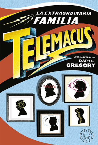
From left to right, top to bottom:
Knopf Publishing Group (2017) – riverrun (2017)
Spanish Edition (2018) – German Edition (2018) – Polish Edition (2018)


Winner:
I’m really not crazy for the “pictures on the wall” theme here, so naturally, my choice would have to be the riverrun edition. In spite of myself, I’m also enjoying the cheesy retro vibe I get from this cover; of all the choices here, it’s probably the one that best fits the quirky tone of the story.
But what do you think? Which one is your favorite?


I’ll go with that one too, it’s my favorite. The Knopf one is okay, and I don’t hate the German one but I don’t like the orange.
LikeLike
Yeah, orange is a very bold color and strikes me as risky to use on a cover, especially when it’s the predominant hue 🙂
LikeLike
I like the Polish one, but I wouyuld have tpo read the book to see which one fits
LikeLike
I just don’t really care for the “pictures on the wall” theme.
LikeLike
I can’t say I like any of them really! It’s not a cover that would entice me to pick up the book!
LikeLike
Yeah, the covers are really tame, and it’s such a pity because it’s a great book!
LikeLike
Yeah, none of those are really eye-catching.
LikeLike
Yeah, I don’t know what the “perfect” cover for this book would look like, but it’s certainly not any of those.
LikeLiked by 1 person
You and Tammy are on the same wavelength this week. I think I like the boldness of the Spanish one, which is surprising because I’m usually drawn to any cover with a dog. I think it’s because the dog is so small I can barely see him.
LikeLike
Haha, true! I didn’t even notice the dog until you mentioned it!
LikeLike
Yes, this immediately jumped to mind when I heard the theme, probably because it was fresh in my mind! I actually like the framed pictures idea, and I like it MUCH better than the boring US cover😁
LikeLike
Same here, it wasn’t that long ago since I read it, and it was such a great story. It was definitely still on my mind 🙂
LikeLike
A difficult theme this week! But you came through with flying colors 🙂
The cover with the TV is indeed the best, followed closely by the middle one in the second row.
LikeLike
It was just too perfect, I had to choose this book!
LikeLike
I don’t like much the first and last covers but wow they all look so fun!!
LikeLike
It really is a fun, quirky book! Yay, at least the covers got that part of it across 🙂
LikeLike
Such an odd bunch of covers. I find myself drawn to the Spanish one – it feels almost like something out of a comic book.
Lynn 😀
LikeLike