Friday Face-Off: Sun
Welcome to The Friday Face-Off, a weekly meme created by Books by Proxy! Each Friday, we will pit cover against cover while also taking the opportunity to showcase gorgeous artwork and feature some of our favorite book covers. If you want to join the fun, simply choose a book each Friday that fits that week’s predetermined theme, post and compare two or more different covers available for that book, then name your favorite. A list of future weeks’ themes are available at Lynn’s Book Blog.
This week’s theme is:
“…but Icarus flew too close”
~ a cover featuring the SUN
Mogsy’s Pick:
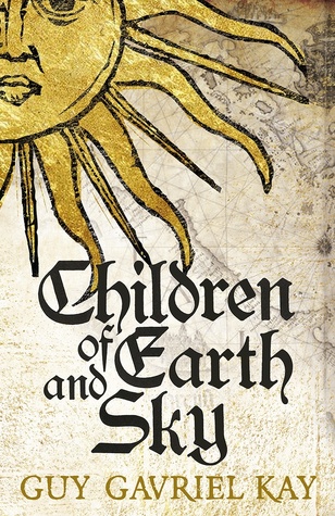
Children of Earth and Sky by Guy Gavriel Kay
Like many of Kay’s stories that feature fictional analogs of real places in history, this novel is said to be inspired by the conflicts and intrigues of Renaissance Europe. Readers who are knowledgeable in the era will probably recognize historical elements from the fifteenth to sixteenth century. For instance, the Ottoman Empire has been re-imagined as the Osmanli Empire, and the most Serene Republic of Venice or la Serenissima Repubblica di Venezia has become the Republic of Seressa. Using this vibrant setting as a backdrop, Kay chronicles the lives of a disparate group of characters whose fates are all interwoven and connected like the threads of a tapestry.
Now let’s take a look at the covers:
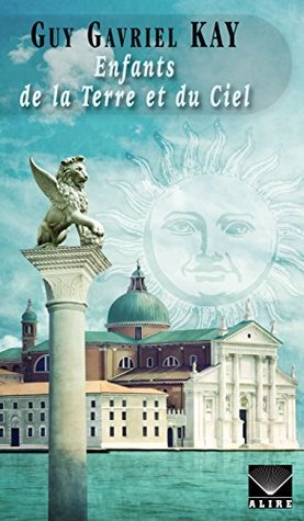
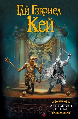
From left to right, top to bottom:
NAL (2016) – Hodder & Stoughton (2016)
French Edition (2017) – Russian Edition (2016)

Winner:
I’m going to have to go with the edition I own here, the NAL cover from 2016. I love the gilded effect, which gives this cover an extra touch of class.
What do you think? Which one is your favorite?


I like the Russian one it’s more complex and detailed 🙂
LikeLike
I agree, I think artistically that might be the best one. It didn’t really fit the book though, which is probably the only reason it turned me off 😀
LikeLiked by 1 person
I have not read it which is probably why I didn’t take this into account 😉
LikeLike
I think that they’re all quite interesting there
LikeLike
I agree! Not a bad selection!
LikeLike
I definitely like the NAL edition the best.
LikeLike
I’m with you there 😀
LikeLike
I also like the NAL edition best (also the one I own). Interesting range to the covers, though.
LikeLike
Agreed, a lot of interesting and strong covers this week. I like the NAL best because it’s the one I own but also because I think it fits the tone of the story best.
LikeLike
Yep, I have to agree with you on this one. It’s also the only cover here which might prompt me to pick up the book.
LikeLike
I would pick up both the NAL and the H&S, but yeah, that’s about it 🙂
LikeLike
These are all really good covers. I’m drawn to the H & S edition, but they all work well in various ways.
LikeLike
Yeah, a good variety of styles here, each with their own strengths!
LikeLike
Gotta go with the Russian version myself…
LikeLike
That’s a very pretty cover. The only reason I didn’t choose it is because I don’t think it really fits the story…
LikeLiked by 1 person
I figured 🙂
LikeLike
A few of them grabbed my interest, but if I had to pick one I would say the Russian one as well.
LikeLike
That one is very popular this week! 😀
LikeLiked by 1 person
I think I actually prefer the slightly simpler one on the top right, but not by much to the one you picked
LikeLike
I do like the aged effect on it.
LikeLike
I guess NAL, but not a single one speaks to me
LikeLike
I just wish I could have found more covers!
LikeLike
Still my favorite thing during the week. I love Cover fight
LikeLike
Good choice, it’s my favorite as well: I love how the darker color on the left side slowly blends and morphs into the lighter one on the right side.
LikeLike
Yes, me too! I’m glad someone else noticed that cool gradient effect! 😀
LikeLike
I really like the Hodder and Stoughton version. Great choice.
Lynn 😀
LikeLike
I actually like it a lot too, it looks like it could be part of an old map!
LikeLike
The one to the right of your choice. I love that style of art when it comes to the sun and moon. It reminds me of something in my childhood that I can’t for the life of me remember exactly what. Is it possible to post a photo here? I wanted to show you my t-shirt inspired by The Wicker Man (original, not the Nic Cage…”Not the bees!”). The style is similar.
LikeLike
Yes, I like that style too! As I was saying, it reminds me of a piece of an old map, and I also like the font the title is done in, which matches the art very well!
LikeLike
Pingback: The Friday Face-Off: …But Icarus Flew Too Close – Books by Proxy
I’m afraid I don’t really like any of them!
LikeLike
Fair enough! 🙂
LikeLike
I like the H&S one best … I think because it looks old, and I really like the typeface that’s been used. 🙂
LikeLike
Yeah, I said the same thing in a previous comment – love the old style of the H&S cover, and that typeface is great!
LikeLike
Mortified!!! I just keep repeating stuff you’ve already said!!! Argh! I’m so sorry … 😦 (*laughing at self*)
LikeLike
Oh no, you’re fine! You couldn’t have known. I was doing bulk replies and I had responded to a previous comment with a similar answer, and I didn’t want you to think I was just copying my reply to you 😀
LikeLiked by 1 person
Your choice is gorgeous! 😀 But I think my favourite is the Hodder & Stoughton one! I love the lettering and the richness of that gold 😀
LikeLike