Friday Face-Off: Staircase
Welcome to The Friday Face-Off, a weekly meme created by Books by Proxy! Each Friday, we will pit cover against cover while also taking the opportunity to showcase gorgeous artwork and feature some of our favorite book covers. If you want to join the fun, simply choose a book each Friday that fits that week’s predetermined theme, post and compare two or more different covers available for that book, then name your favorite. A list of future weeks’ themes are available at Lynn’s Book Blog.
This week’s theme is:
“There are too many steps in this castle, and it seems to me they add a few every night, just to vex me”
~ a cover featuring a STAIRCASE
Mogsy’s Pick:
The Slow Regard of Silent Things by Patrick Rothfuss
The Slow Regard of Silent Things is side novella about Auri, a secondary character from the Kingkiller Chronicle by Patrick Rothfuss. It’s a gorgeously written novel, both haunting and whimsical at once if such a thing is possible. It also offers an incredibly detailed exploration into one of series’ most fascinating and mysterious characters as she makes her way through the ancient and labyrinthine halls of the Underthing. But this story wont’ be for everyone; like all magic, the charm of Auri’s unique way of viewing even the most mundane objects around her as special and amazing will eventually wear off. Hers is a silent and lonely world that, while not completely devoid of color or life, loses its allure after a while.
Opinions of this polarizing novella aside though, we’re here to look at the different covers it has to offer, so let’s bring them out now:
From left to right, top to bottom:
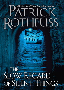
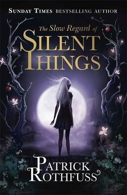
DAW (2014) – Gollancz (2014)
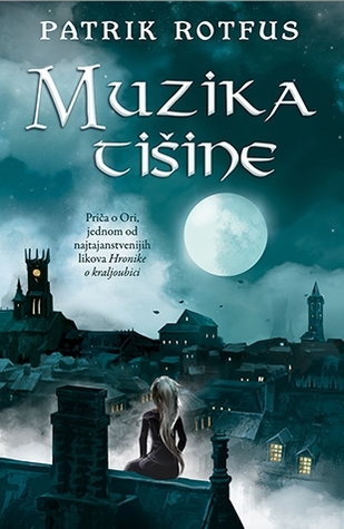
Portuguese Edition (2015) – Bulgarian Edition (2015) – Serbian Edition (2015)
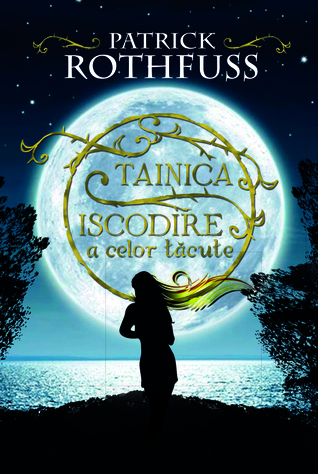
German Edition (2015) – Russian Edition (2015) – Romanian Edition (2017)


Winner:
Cool colors like grey-blues and pale purples are clearly the dominant theme this week, and the result are some gorgeously atmospheric and moody covers. As you can see though, it can also be a little claustrophobic, especially in the images that depict tight stairways. Personally, I prefer a cover that visually opens up the space, like those that show Auri looking out over the city. As such, I’m going to have to go with the Serbian Edition for my winner.
But what do you think? Which one is your favorite?


Ooh some nice covers here. I like the serbian one the best too, easily. Such a cool visual, looking over the city. I like the Gollancz cover for it’s almost fae-like ambience, and the Portuguese one is nice too- again looking over the city. Finally I kinda like the Romanian one too, with the ocean.
LikeLike
They’re all very nice. I think it’s because most of them used colors like blues and purples to great effect.
LikeLike
My favorite is the second one which is the one I own. 🙂
LikeLike
That one is so pretty! Between the UK and US versions, I prefer the UK cover too (Gollancz).
LikeLike
It was a tough one today, but I think the Portuguese. Kind of nice there on that tree
LikeLike
That Portuguese publisher always puts out strong covers!
LikeLike
i like the 2nd one the most, it matches the art style i have already for the name of the wind / wise man’s fear ❤
LikeLike
In general I prefer the Gollancz covers/editions for this series too! The US versions are okay, but they don’t do much for me.
LikeLiked by 1 person
I’m in love with the Gollancz (2014)
LikeLike
It’s gorgeous!
LikeLike
Pingback: The Friday Face-Off: The Staircase – Books by Proxy
I actually like the Gollancz one but I will admit, it’s probably the colors. Not sure I’m that impressed with the girl on the cover. There are lots of good ones today!
LikeLike
I understand! When the color purple is used well, it can make for some very striking covers!
LikeLike
I haven’t read this, but I’m drawn to the Russian edition for some reason. Maybe my mood today?
LikeLike
To be honest, I thought the book was kind of blah 😀 The covers make it look a lot better, imo! Haha!
LikeLike
All beautiful covers. I’d probably go with the second, but you can’t go wrong with any of them.
LikeLike
The Gollancz cover seems to be getting the most votes today 😀
LikeLiked by 1 person
Great choice. I’m torn between the cover you choose and the first one on the same row. I like both.
Lynn 😀
LikeLike
Yeah, I guess like Bookwraiths said, you really can’t go wrong with any of them 😀
LikeLike
Gosh. I am actually stuck! I am BIG fan of the almost realistic photos covers for DAW and Russia – but it feels like it just one thing missing from each of them? I am liking the scene of looking over the town with your choice – but I’m not 100% a fan of that type of coloring technique. Now, I am writing this out. I am going pick Gollancz. That purple mist over the moon, center with trees, and gold title color. Fancy font for Rothfuss’s name too 🙂
LikeLike
I didn’t even really pay attention to the font until you pointed it out. That’s a good observation! Such a tiny detail on the letters, but it makes it look a lot more elegant 🙂
LikeLike
What gorgeous covers! I love that first one though, it really draws my eye and I just can’t stop looking at it!! 😀 It also makes me a little sad because I found this book so very disappointing 😦
LikeLike
Oh I know! I didn’t really like the book either. 😦
LikeLiked by 1 person
Beautiful choice! The DAW cover is a great one as well, it possesses a haunted quality that’s impossible to ignore…
LikeLike
Exactly! I think all of them do a pretty good job of capturing that haunted atmosphere, but that one stands out.
LikeLike
I agree with your assessment. The staircase covers a little closed in. My favourite is the one with Auri standing in the tree, but i your choice is great too.
LikeLike
Yeah, though my favorite is the Serbian edition cover, I think the one with Auri on the tree deserves a lot more love than it’s been getting 😀
LikeLike
I loved this book, it was absolutely beautiful. Fascinating selection of covers. My favorite is the DAW edition, with my second favorite being the Russian edition. I like the idea of showing her perspective as she steps out from the comforting confines of the Underthing. I love the blue tones of the DAW edition, perfect for moon light and that certain ambiance that seems to fit the novel. I might be biased, though, as that’s the edition I own.
LikeLike
So glad to hear you enjoyed it! I know it was a love-or-hate book for many readers. I didn’t like it quite so much, unfortunately, but Rothfuss did warn his readers that not everyone is going to like the style and tone of the story. I guess it just wasn’t meant to me for me 🙂
LikeLike
I like the Portuguese and Serbian covers-lovely scenic views.
LikeLike
I like those for the same reason 😀
LikeLike