Friday Face-Off: Under the Sea
Welcome to The Friday Face-Off, a weekly meme created by Books by Proxy! Each Friday, we will pit cover against cover while also taking the opportunity to showcase gorgeous artwork and feature some of our favorite book covers. If you want to join the fun, simply choose a book each Friday that fits that week’s predetermined theme, post and compare two or more different covers available for that book, then name your favorite. A list of future weeks’ themes are available at Lynn’s Book Blog.
This week’s theme is:
“The seaweed is always greener, in somebody else’s lake.”
~ a cover UNDER THE SEA
Mogsy’s Pick:
Jaws by Peter Benchley
Most people hear “under the sea” and immediately think of singing crabs with Jamaican accents, but today I’m going to go with giant man-eating great white sharks. This is a novel that needs no introduction, I’m sure. Thanks to the Spielberg movie based on it, we’ll always have reason to fear the ocean.
Let’s take a look at some covers…
From left to right, top to bottom:
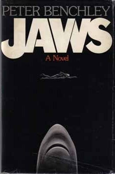
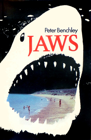
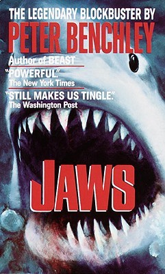
Doubleday Books (1974) – Pan Publishing (1975) – Ballantine Books (2013)
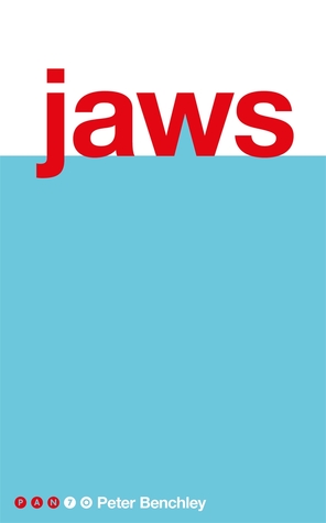
André Deutsch (1974) – Turtleback Books (1991) – Pan (2017)
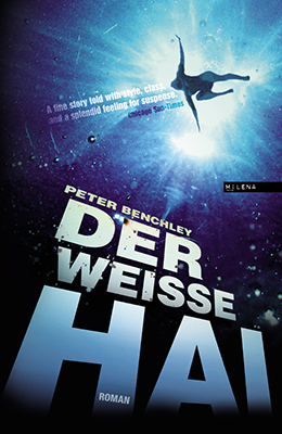
German Edition (2013) – Spanish Edition (1974) – Portuguese Edition (2015)
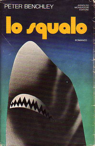
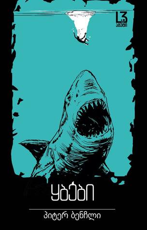
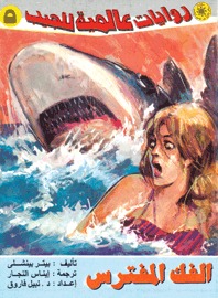
Italian Edition (1975) – Georgian Edition (2016) – Arabic Edition (1993)


Winner:
We have an interesting case here, with lots of covers but not so much in terms of variety. I suspect this is in no small part due to the popularity of the original 1974 Doubleday image, which exploits our fear of the unknown by depicting an unsuspecting swimmer about to meet her doom by way of rows of razor sharp teeth (though I find it amusing how the shark gets progressively bigger and closer to its victim with each subsequent edition). The cover for the 1975 paperback is also the image used in the poster for the film adaptation, which keeps the same concept. While I don’t usually go for “movie covers”, I think I’ll make an exception in this case because it’s just too iconic to be anything but the winner.


Definitely an iconic cover, and a true classic. My favorite one too, although I do kinda like the Pan 2017 cover and the Spanish edition. The German one has a nice “below” perspective as well. But yeah the ’75 one is awesome.
LikeLike
Yes, an absolute classic! Now I want to watch the movie again … 😀
LikeLike
Agree with your choice 🙂
LikeLike
Thanks, it was the only possible winner for me 🙂
LikeLiked by 1 person
Brilliant. Definitely iconic and I have to go for your choice. Strangely enough I watched the film again over Christmas – we all love that film in our family – I can’t deny that it’s a bit dated and the shark doesn’t look convincing – but it still gets to me every time. Plus, the music – that cover and the music.
Lynn 😀
LikeLike
Hahaha, yeah, shark’s fake as hell, but as a child, I was terrified of it! The atmosphere was done so well, and I guess back then with the lack of special effects, you had to pull out all the stops and get creative 🙂
LikeLike
I think that shark’s mommy forgot to get him braces when he was a kid!
LikeLiked by 1 person
You can tell each subsequent cover designer was probably thinking “Teeth! Teeth! Needs more teeth! Must have more teeth!” 😀
LikeLiked by 1 person
Great choice for the theme this week. I I have to agree, it’s hard for me to envision any cover other that the iconic classic/movie poster one. Although I am horrified by the Portguese cover!
LikeLike
Yeah, the Portuguese cover would give me nightmares if I lived anywhere near the ocean. The last thing you want to see when you’re swimming in open water!
LikeLike
I agree…that image is iconic and the best for the book. I totally love the film but didn’t like the book at all.
LikeLike
Agreed, the book was quite messed up!
LikeLike
I think my fave is the tubarao one! thanks for sharing!
LikeLike
Gah, you like that scary one! 😀
LikeLike
The 2013 Ballantine edition, while keeping to the same theme, looks a little more scary: I guess it’s the uniformity of color, that reminds me of the sea’s depths, and that makes me feel even more the impending danger… 😉
LikeLike
Not to mention that shark looks gigantic! Scary! 😀
LikeLike
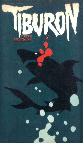
I own the 2013 Ballatine book copy and I guess I have to say that’s my favorite. Although I’m also drawn to Tiberon – but because it used to be a make of car and I used to want a blue one I could name Jaws – I would even have a vanity plate and all. Okay, off topic. Great covers this week all around.
LikeLike
LOL, no, that was actually a great story! It made me smile, thanks for sharing 😀
LikeLike
HA! Okay yes, I did think of a singing crab when I saw this prompt. I like your choice the best too, but the typographical cover is a close second. It’s just so…unusual for this kind of story!
LikeLike
Yes, I agree! You’d think all the designers would want to feature the shark, but here’s one that’s just text. Though I like the subtle suggestion of the fin!
LikeLike
Both Pan covers are pretty spectacular with the
minimal aesthetic (2017) . Design done Right.
LikeLike
I agree, though the 2017 might be just a tad too minimalistic for the book, but it’s very appealing 🙂
LikeLike
Definitely the best choice!!
LikeLike
Totally iconic!
LikeLiked by 1 person