Friday Face-Off: Fancy Font
Welcome to The Friday Face-Off, a weekly meme created by Books by Proxy! Each Friday, we will pit cover against cover while also taking the opportunity to showcase gorgeous artwork and feature some of our favorite book covers. If you want to join the fun, simply choose a book each Friday that fits that week’s predetermined theme, post and compare two or more different covers available for that book, then name your favorite. A list of future weeks’ themes are available at Lynn’s Book Blog.
This week’s theme is:
“The pen is mightier than the sword”
~ a cover featuring a FANCY FONT
Mogsy’s Pick:
Caraval by Stephanie Garber
YA book covers always seem have the prettiest typeface. Hence, this week I went with a book about a pair of teen sisters who live on a secluded island under the eye of their cruel, abusive father. Ever since they were little, Scarlett and Tella have both dreamed of Caraval, a legendary performance held only once a year in a far-away land. For years, Scarlett has written to Legend, the mysterious ringmaster behind Caraval, begging him to bring his show to their lonely island, but never once has she received a reply…until now.
Unfortunately, Legend’s invitation couldn’t have come at a more inconvenient time. Scarlett has all but given up on seeing Caraval, and there’s no way she can travel there now, with the marriage her father had arranged for her happening in about week. While she has never met her fiancé, Scarlett could hardly care; all she wants to do is leave her island for good, taking Tella with her so that they can escape their horrible father forever. What she didn’t count on, however, was her sister having different plans. On her own, Tella had made the acquaintance of a handsome sailor named Julian and arranged for her and Scarlett’s passage on his ship to attend Caraval, unwilling to let this once-in-a-lifetime opportunity slip through their fingers.
What follows is a whimsical dark adventure, steeped in trickery, mystery, and magic. Do the covers live up to the atmosphere? Why don’t we take a look and see…
From left to right, top to bottom:
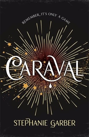
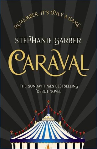
Flatiron Books (2017) – Hodder & Stoughton (2017a) – Hodder & Stoughton (2017b)
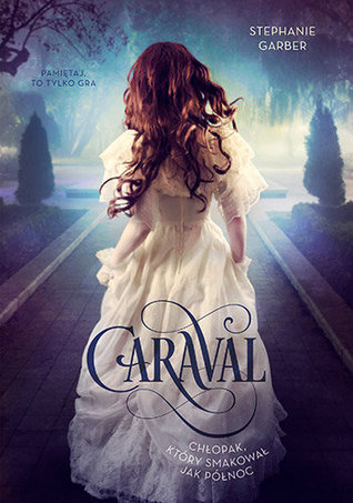
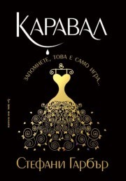
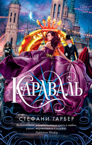
Polish (2017) – Bulgarian (2017) – Dutch (2016) – Russian (2017)
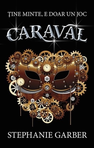
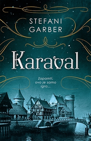
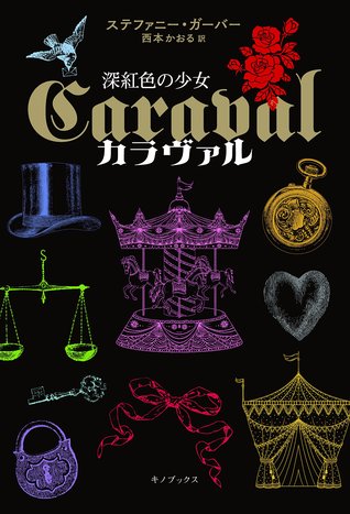
Romanian (2017) – Persian (2017) – Serbian (2017) – Japanese (2017)


Winner:
I am amazed at how many beautiful covers there are for this book; I’m having a hard time picking just one. After going back and forth between several, I’m going to have to settle on the Russian edition. The bright splashes of color might be just shy of being gaudy, but it also fits the madcap, fever dream mood of the story which is full of twists and turns. There’s also something very “Disney Princess” about this image, and I love the purple dress.
Anyway, this was a tough week but I think we have a winner. But what do you think? Which one is your favorite?


Hey Mogsy!
Excuse me, my English is not so good … But I follow your posts for a long time and I look forward to each one! When selecting the cover, I can only agree with you. I really like the Russian version! Greetings, Jill
LikeLike
Thank you so much for stopping by! The Russian version is very beautiful, isn’t it? And I think your English is very good 🙂
LikeLike
I did like the one you picked but it was sooo busy. SO I go for Serbian. There were other nice ones, but they needed a bit more
LikeLike
I agree, it’s very busy. I love the colors though 🙂
LikeLike
Oh nice! well in French we kept the first one.
LikeLike
It’s quite classic 🙂
LikeLike
Wow. Caraval has lucked out with some beautiful covers. I haven’t read the book (lost interest in a while ago, to be honest), but my favorite cover is the one you picked. Purple dresses will always win the day! *lol*
LikeLike
Yes, the purple dress for the win!
And I know what you mean about losing interest over time, and tbh I wasn’t crazy about the book, so it might be for the best 😛
LikeLiked by 1 person
So I’m not huge on flashy covers but you know, I was immediately drawn to the Russian one as well. There’s just something about it. And like you, I almost can’t believe this book has so many darn covers!
LikeLike
I couldn’t believe it either, and I was also surprised to see such a high percentage of “good” covers 🙂
LikeLike
This was not my favorite book, however, it has been one of the luckiest books in the world, because the cover treatments are amazing! For some reason I’m drawn to the Japanese cover. It’s actually sort of a mess design-wise, but maybe it’s the colors?
LikeLike
It wasn’t my favorite book either (it really aggravated me, tbh) but yes it’s definitely been blessed by the cover gods!
LikeLike
The Disney Princess reference is spot on! The cover you choose makes me think exactly of that, and as such I don’t find it gaudy but rather… eye catching 🙂
LikeLike
Yep, as soon as I looked at it, I said, “This could be a poster to a Disney movie!”
LikeLike
Excellent pick- definitely agree with it!!
LikeLike
It is quite lovely isn’t it? 🙂
LikeLiked by 1 person
Yes!!
LikeLike
While I don’t…… like……. this book, I have to say the covers it got are gorgeous!! My favourite remains the Hodder & Stoughton one, I have the “a”, and find the “b” very nice also.
The Persian one is really nice and tries to step away from the US/UK design and I admire that! (While the Japanese one is… not my taste hahah)
LikeLike
LOL, I didn’t really like the book either (couldn’t STAND the characters!) but I do love its covers! 😀
LikeLiked by 1 person
That’s the only thing keeping me from getting rid of the book hahah!
LikeLike
I nearly picked this book this week – or Six of Crows – but I never realised there were all these covers. Wow. Some of these are really nice – I’m drawn to the Romanian cover.
Lynn 😀
LikeLike
Haha, I considered another one of Leigh Bardugo’s books as well, but it was with Shadow and Bone!
LikeLike
Ooh lots of good choices! I actually like the Flatiron 2017 edition (maybe just because I’m so used to see it) but I also like the Polish version (although that might be becasue the actual font looks pretty identical) and the Russian one IS nice too.
LikeLike
The Polish one caught my eye as well! And I own the Flatiron edition, so while I didn’t choose it as my favorite, it has a special place in my heart 🙂
LikeLike
I’m with you on the winning cover…that is gorgeous!
LikeLike
It does seem to be a popular one this week 🙂
LikeLike
What a superb choice of book! And what a lovely display of covers:). My favourite is the middle one in the top line – I think it’s fabulous!
LikeLike
I agree, that one’s very pretty. I think that’s the UK edition. I’ve heard that there are actually four versions of that, each with a different image inside the front cover, which I think is pretty cool 🙂
LikeLiked by 1 person
Ooo… that IS a great idea:))
LikeLike
Didn’t like the book but it has some great covers. I like them all.
LikeLike
Pingback: Friday Face-Off: Stormy Sky | The BiblioSanctum
do yourself a favor and look at the chinese versions of the covers for this series
https://www.goodreads.com/book/show/40337983
and then the second book
https://www.goodreads.com/book/show/41057389
those are my favourite covers hands down.
Of the US/Uk ones though, i like the UK ones, cuz they have a secret simple gold foil impression that makes a cover image on the black bindings underneath the dust jacket on the hardcover copies of the UK editions
LikeLike