Friday Face-Off: Key
Welcome to The Friday Face-Off, a weekly meme created by Books by Proxy! Each Friday, we will pit cover against cover while also taking the opportunity to showcase gorgeous artwork and feature some of our favorite book covers. If you want to join the fun, simply choose a book each Friday that fits that week’s predetermined theme, post and compare two or more different covers available for that book, then name your favorite. A list of future weeks’ themes are available at Lynn’s Book Blog.
This week’s theme is:
“Zip it, lock it and throw away the key”
~ a cover featuring a KEY
Mogsy’s Pick:
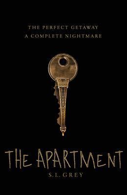
The Apartment by S.L. Grey
My pick for today was still fresh on my mind because I had just featured it on Halloween in a post about haunted houses. The story follows Mark and Steph Sebastian, a happily married couple despite their financial troubles. However, that was before their home was violently invaded by three masked men, who threatened husband and wife at knife point before robbing them of their already meager possessions. While they managed to survive that attack physically unharmed, Mark and Steph are unable to return to their normal lives because of the psychological trauma, so when a friend refers them to a house-swapping website and suggests that they take a nice relaxing vacation, the two of them are intrigued by this money-saving option.
Almost right away, Steph connects with the owners of a charming little apartment in Paris, and they decide to take the leap. After all, who can resist the city of light and love? However, once they arrive at the French capital, their dream vacation quickly turns into a living nightmare, and instead of rest and romance, all they find is darkness and terror in their borrowed apartment which is nothing like advertised.
Now that we know the basics of the story, let’s take a look at the covers to see how well they stack up against each other
From left to right, top to bottom: Anchor (2016) – Pan Macmillan (2016) – Pan Macmillan (2017)
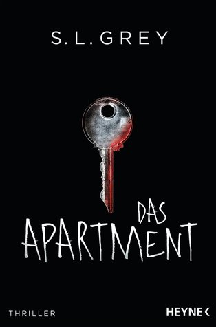
German Edition (2017) – Hungarian Edition (2017)


Winner:
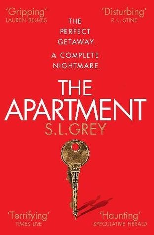
Compared to the “key” covers, the US Anchor Books edition looks quite plain, doesn’t it? So, that one’s out. But while I dig the devilish design on the key in the Hungarian edition, I also just can’t quite get over the darkly clever and ominous symbolism of the upside-down Eiffel Tower in the Pan Macmillan covers. They also tie the book to its Paris setting, so I have to give them extra points for that. And ultimately, I’m going to have to give the original black Pan Macmillan cover the edge, not only because it features the key front and center, but also because it doesn’t have distracting text plastered all over it like its red counterpart.
So that’s how I came to my decision this week. But what do you think? Which one is your favorite?


Some intriguing ones. I didn’t know about this novel
LikeLike
The story is quite freaky. Talk about a nightmare vacation!
LikeLike
This sounds like something I wouldn’t mind reading! I chose the same as you, Pan Macmillan (2016), there’s just something a little more authentic and gritty about that one that fits with the darker undertones in the premise. Interesting to see the different designs they’d made for this!
LikeLike
I agree with you completely! And there were more covers than I expected as well.
LikeLike
I sort of like the Hungarian edition but you know, the more I look at the one you chose, it’s hard to decide. The Pan Macmillan one definitely has better font and I like the blood on the German edition key.
LikeLike
Yeah, it was hard to choose. But I knew I liked the “key” coves more 🙂
LikeLike
I like the first one, ANchor, cos of the door
LikeLike
Yeah, that’s the cover I’m most familiar with, since I read the US edition. Maybe I went with a key cover because of the novelty 🙂
LikeLike
I’m not a great fan of any of the keys but the one you chose is quite clever and fits well into the plot.
LikeLike
I did like how clever it was!
LikeLike
I like the first cover although it might arguably be boring. I wouldn’t have even noticed the upside down Eiffel Tower on the Pan MacMillan editions! And the German one is surprisingly creepy for a cover with just a key on it. 🙂
LikeLike
When I first saw the UK cover and noticed the Eiffel Tower on the key, I thought it was brilliant! Admittedly, I probably wouldn’t have understood it if I hadn’t read the book already though 🙂
LikeLike
I like your choice because it’s quite essential, and the less it shows the more it heightens the sensation of impending doom. That’s why I also find the German version (with the trace of blood along the key) quite intriguing…
LikeLike
Yes, that’s why I thought the UK cover was so effective. It shows so little, and yet it contains so much foreboding!
LikeLike
Great pick for book and cover. i also like the German cover.
Lynn 😀
LikeLike
It’s fantastic too, isn’t it! 🙂
LikeLike
I prefer your winner too, but I also don’t mind the German cover because it’s simple and I think it fits the title, though maybe not exactly the story.
LikeLike
The German edition does seem to be a popular one this week! 😀
LikeLike