Friday Face-Off: Dragon
Welcome to The Friday Face-Off, a weekly meme created by Books by Proxy! Each Friday, we will pit cover against cover while also taking the opportunity to showcase gorgeous artwork and feature some of our favorite book covers. If you want to join the fun, simply choose a book each Friday that fits that week’s predetermined theme, post and compare two or more different covers available for that book, then name your favorite. A list of future weeks’ themes are available at Lynn’s Book Blog.
This week’s theme is:
“You have nice manners for a thief, and a LIAR!”
~ a cover featuring a DRAGON
Mogsy’s Pick:
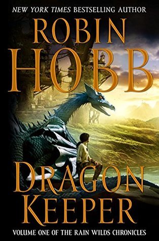
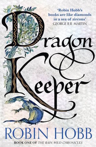
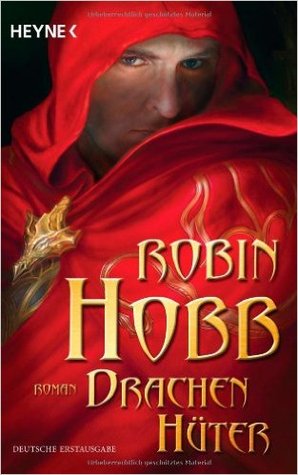
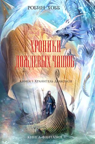
The Dragon Keeper by Robin Hobb
Out of all the different types of dragons I’ve encountered in fantasy, Robin Hobb’s dragons are perhaps some of the most interesting and unique I’ve ever seen. The Dragon Keeper is the first book of The Rain Wild Chronicles, which is a series that takes place in the author’s famous Realm of the Elderlings. The story begins with a group of sea serpents journeying upriver to cocoon themselves so that they might emerge as full-fledged dragons. They are overseen by the dragon Tintaglia, the last known of her kind, with the help of some humans on the Rain Wild Council. Together, the expedition travels along the river in the hopes of finding the legendary Elderling city of Kelsingra.
These, however, are not your typical dragons. Malformed and unable to take care of themselves, these pitiful creatures are as far away from the “magnificent and noble dragon” archetype as you can get. That said, being weak and helpless has not humbled them at all. Take the least flattering stereotypes about cats, and dragons are like that except a thousand times worse–belligerent, arrogant, petty, and squabbly. Still, they felt fresh and different for me, and I liked them a lot for that.
And now, time to look at the covers:
First row, left to right: Voyager (2009) – HarperCollins (2010) – Harper Voyager (2015)
Second row, left to right: German (2012) – Russian (2012) – Dutch (2016)


Winner:
While I do enjoy minimalist covers like the Voyager (2009) or Harper Voyager (2015) editions, my eye also couldn’t help but be drawn to the more colorful ones. Plus, I’m a sucker for the painted style that always makes me think of sweeping fantasy epics, so this week the clear winner is the Russian 2012 edition. It is a poor portrayal of the book, which makes the setting look cold and icy when the story actually takes place in a marshy forest (not to mention the vessels the characters traveled on were liveships, not Viking ships). Still, I really like the cool tones of this cover, and the dragon looks awesome, even though it, too, is a poor representation of the stunted, malformed river dragons in the story.
What do you think, though? Which cover is your favorite?


I like the Voyager one! The font is nice and the image of the dragon is well drawn.
LikeLike
It’s definitely a very classic cover!
LikeLike
I like the Harper Voyager 2015 one the best, and the Russian one second. I agree that even though it doesn’t really convey the book accurately, the Russian one is a fun, epic fantasy style cover. 🙂
LikeLike
Yeah, I’m always torn when it comes to a choice between accurate representation of the book vs. pure aesthetics 🙂
LikeLike
I like the harpercollins one myself.I like the dark brightening into the light…
LikeLike
That one really is quite nice, it always gives me the feeling of looking out from a cave.
LikeLiked by 1 person
I like the 2010 and the Russian covers on this book.
LikeLike
Those are the two best, imo! 🙂
LikeLike
I think i like the Harper Collins cover the best. These dragons are all so cute!
LikeLike
They really are! Though “cute” isn’t exactly the best description for the actual dragons in the book. They can be so grumpy and nasty! 😀
LikeLike
Oh yes it is my fave as well!
LikeLike
It’s gorgeous, right? 🙂
LikeLike
I don’t know that I’ve ever heard anything bad about this series. I might have to eventually check it out. I love dragons! I don’t know why but I love the Dutch version. I think it’s that little eye peeking out. It says “hold me.” Yes, I’m totally weird today!
LikeLike
The eye peeking out lends this cover an air of mystery, I agree!
LikeLike
Lol. Same thoughts here! That Russian cover looks like it belongs to that…dang, what was the second Fool and Fitz series called? When then go to the ice island.
anyway the Russian cover is still the prettiest 😀
LikeLike
LOL, for real! That cover is completely wrong for the book. Good thing it’s so beautiful though 🙂
LikeLike
Good choice! I like that dragon coming out of the cover’s corner: it screams “danger!” quite loudly – and delightfully so 🙂 even though the Harper Collins cover is a great one as well, since it keeps drawing my attention…
LikeLike
Yes, while my favorite might be the Russian edition, the Harper Collins one calls to me as well…probably because that is the version I own 😀
LikeLike
I love the Russian cover too!
Here’s mine:
https://rabbitearsblog.wordpress.com/2017/10/13/the-friday-face-off-6-dragons/
LikeLike
Ooh, good choice of book and winner!
LikeLiked by 1 person
My favorite is the Harper Collins one. It has a classic fantasy feel (not the same style as the Russian one, but… it’s hard to describe otherwise), and I like how there’s a young girl with the dragon. Is the protagonist of that book a girl, too?
LikeLike
Yes! The protagonist of the book is a very charming young girl. Yet another reason why the Russian cover, while beautiful, is such a crappy representation of the novel, lol.
LikeLiked by 1 person
It’s a pity it doesn’t really represent the book because it’s a great cover – look at the detail on that dragon, it’s awesome!
Lynn 😀
LikeLike
I know, even though it was probably done by someone who knew nothing about the book, I couldn’t help but fall in love with the artwork.
LikeLike
The Russian one is gorgeous, if a little misrepresentative of what the Rain Wilds is actually like. I’m super confused by the German one, though. Who the heck is that supposed to be??
LikeLike
Haha, I agree, it’s a bit confusing. It’s…some guy…staring out behind his cloak? It doesn’t tell me anything about the story, but okay! 😀
LikeLike
Never heard of the series, but if it has dragons I want to check it out.
LikeLike
I prefer the darker cover, I think it’s the Harpercollins one. Looks like it’s telling a story.
Can’t wait to get to this series n find out more about the dragons
LikeLike
Can’t believe I missed this post! (while I don’t always find time to comment, I do read almost everything 😉 )
I love the last two, and also the very first!
A recent french one that I LOVE is this one : 9782290141267 !
LikeLike
I just looked it up! Oh, that is so pretty! Looks like a brush painting, almost!
LikeLiked by 1 person