Friday Face-Off: Knife
Welcome to The Friday Face-Off, a weekly meme created by Books by Proxy! Each Friday, we will pit cover against cover while also taking the opportunity to showcase gorgeous artwork and feature some of our favorite book covers. If you want to join the fun, simply choose a book each Friday that fits that week’s predetermined theme, post and compare two or more different covers available for that book, then name your favorite. A list of future weeks’ themes are available at Lynn’s Book Blog.
This week’s theme is:
“The kindest use a knife, because the dead so soon grow cold”
~ a cover featuring a KNIFE
Mogsy’s Pick:
The Falconer by Elizabeth May
Even though I am behind on this trilogy, I loved the first book. And since there are also several editions that fit the theme, I decided The Falconer was the perfect book to feature for my Friday Face-Off post this week. Actually, it’s quite apropos, considering that I was actually first drawn to this book because of its striking cover…
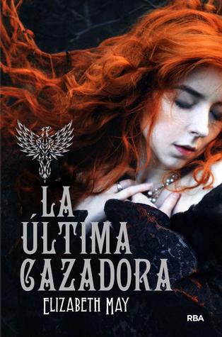
From left to right, top to bottom: UK: Gollancz (2013) – US: Chronicle Books (2014) – German (2015) – Portuguese (2014) – Italian (2014) – Spanish (2014)

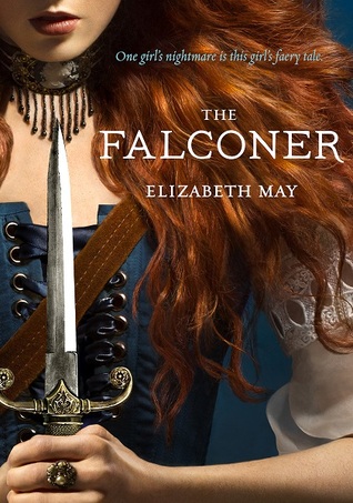


Winner:
That’s quite an impressive gallery of knife-wielding redheads, but I think I’m going to have to go with the Gollancz cover as my favorite. Like I said, it was the cover that initially motivated me to find out more about this book, and it was this edition that I ended up winning in a giveaway hosted by the publisher. When the sequel came out, I even made a special trip to the Book Depository so I could get the UK copy of The Vanishing Throne with the matching cover, because I loved the design so much.
What do you think? Which one is your favorite?


The Gollancz version is defintely my favorite too, it’s just an awesome one. I like the Italian one too although I have a feeling the others might better reflect the story?
LikeLike
The Italian cover does seem to be the odd one out! And no, it doesn’t fit the story at all, lol.
LikeLike
I like your choice too…
LikeLike
It’s very action-y!
LikeLiked by 1 person
The UK one is a good one and I like the Portuguese one too.
LikeLike
Nice choices 🙂
LikeLike
This is a tough one for me, actually. I really like the first four (UK, US, German, and Portuguese) because they best represent Aileana and the story. But… yeah, I think the UK one gets my vote, too. Because explosions made book covers more awesome. 😉
LikeLike
I agree, the last two make the character seem too “soft”. And we all know Aileana is not 🙂
LikeLiked by 1 person
I’m not sure why but I’m loving the German version. But the UK version is right behind it. The Italian version is giving me an A.G. Howard feel and I think it very closely resembles covers from her new series.
LikeLike
The German cover would probably be my second choice, since I prefer covers that show faces!
LikeLike
The second cover from the left is a good one too, and there’s the emphasis on the knife that’s perfect for this week’s meme 🙂
LikeLike
Agreed! That’s the US cover, I think. I love the colors and how they contrast.
LikeLike
Now, you might not believe it but I was going to use this book – but, I think I’ve used it in the past for something similar so I decided not to – which meant I struggled to come up with something. I could come up with books but they didn’t necessarily have different covers. I love the US covers for these but I have to say I like that German cover.
Lynn 😀
LikeLike
I was actually pondering the possibility of us using the same book this week because I know you’ve read it too! I went ahead and used it anyway, though I hadn’t realized that you might have used it before already 🙂
LikeLike
I have to go with your pick too, it fits
LikeLike
I agree. That’s so Aileana.
LikeLike
I love the US one! The red hair, the colors…I would totally pick this one up!
LikeLike
It’s an awesome book! And I agree, I love the color choice for the US cover. The Chronicle covers for the two other books in the trilogy are nice too!
LikeLike
Yup, I love that UK one too. Also like the US cover and the Italian one cause it bluish.
LikeLike
The Italian one is pretty. I might have chosen it, but it didn’t really reflect the story 🙂
LikeLike
Chronicle Books (2014) is my pick. I prefer redheads, plus I liked the fact I can’t see her whole face. Mysterious.
LikeLike
Definitely mysterious. Though I’m the opposite, I’m usually drawn to covers that show faces, so I prefer seeing the whole thing 🙂
LikeLike
I agree with your choice. I think it’s a much better reflection of the character than the others, which are more stylized and symbolic, while she is more action oriented herself.
LikeLike
I agree! I love the background – literally explosive, but it’s still subtle enough that it doesn’t take away from the character in the foreground. She looks so badass there.
LikeLike
These are all great designs! And I like your pick, it really grabs your attention. I think if I had to choose a favourite to put on my shelf though I’d go for the Italian cover – something about the colours appeals to me. Also I think I just like the look of bird cages 🙂
LikeLike