Friday Face-Off: Gold
Welcome to The Friday Face-Off, a weekly meme created by Books by Proxy! Each Friday, we will pit cover against cover while also taking the opportunity to showcase gorgeous artwork and feature some of our favorite book covers. If you want to join the fun, simply choose a book each Friday that fits that week’s predetermined theme, post and compare two or more different covers available for that book, then name your favorite. A list of future weeks’ themes are available at Lynn’s Book Blog.
This week’s theme is:
“All that is gold does not glitter”
~ a cover featuring GOLD
Mogsy’s Pick:
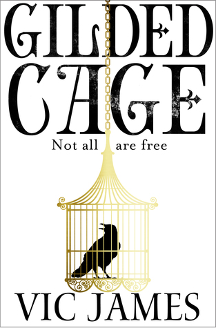
Gilded Cage by Vic James
So this book didn’t really work for me, but I did appreciate a lot of the different covers and some of the fascinating imagery featured on them. And of course, whenever you see anything gilded, you get the color gold. Now let’s take a look at these covers…
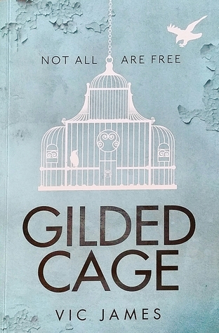
From left to right, top to bottom: Del Rey (Cover A) – Del Rey (Cover B) – Pan Macmillan (Cover B) – Pan Macmillan (Cover B) – La Galera (Spanish) – Nathan (French)


Winner:
Just like last week, the winner I’ve chosen in this face-off looks a lot better in real life than in a 2D image! To see what I mean, here’s a photo I found of the French edition. I make it no secret that I love gold foil on book covers, and it doesn’t hurt that it goes so beautifully well with the intricate wrought iron gate design. It’s simple, stylish, and classy.
What do you think? Which one is your favorite?


I like Cover B and your winning choice. Hard to decide without seeing the winning book in the flesh!
LikeLike
That’s the biggest problem with these face-offs – sometimes the 2D images simply don’t do the real life covers any justice!
LikeLike
I like that Del Rey “b” cover. It looks creepy.
LikeLike
Yeah, I looked at that and wondered, “What’s up with the hand?” I don’t know if it really fits the story, but it’s definitely a powerful image.
LikeLiked by 1 person
Yeah, it certainly would be a contender for “misleading” cover based on what I read in your review…
LikeLike
Ahhh your pick is gorgeous!!! I haven’t seen that one before 😮
LikeLike
That’s why I love this meme. I find all sorts of new covers I’ve never seen before 😀
LikeLiked by 1 person
Some of the foreign covers are amazing and should be used universally in my opinion. I love looking through the cover section on Goodreads.
LikeLike
I actually like EVERY ONE of these covers. I haven’t read the book, but it’s not hard to tell from the imagery what the themes are.
LikeLike
Yeah, I was looking at them and thinking they are all pretty strong, and in fact, the first cover which is the one I’m most familiar with is probably the most unimaginative, lol. But maybe it’s because I’m just so used to seeing it 🙂
LikeLike
I like your choice – but I also like the Spanish cover with the girl trapped in the cage… Something haunting and disturbing about the image, I feel, so that’s my favourite. Thank you for checking out my FF, Mogsy:)
LikeLike
I agree, that one with the girl in the cage is pretty too, and I have a feeling the real life version is also decorated with gold foil, which must look amazing!
LikeLiked by 1 person
Yes – agreed! And that’s the pity of Kindle books, isn’t it? Much as I’m a real fan of my trusty Kindle – you do not have the pleasure of fondling those marvellous covers…
LikeLike
The Del Rey B cover is nothing short of amazing, and a very powerful visual as well!
LikeLike
The image of the hand does leap out at you!
LikeLike
The French edition is definitely gorgeous and I can’t help but be intrigued by the cover with the hand – after reading it, it definitely fits.
LikeLike
Yeah Del Rey cover B seems to be attracting a lot of attention. The hand is very eye-catching!
LikeLike
Yes, we have an accord – that’s my favourite too.
Lynn 😀
LikeLike
It’s just so pretty isn’t it? Thanks for checking out my post 😀
LikeLike
Pingback: The Friday Face-Off: All That Is Gold Does Not Glitter – Books by Proxy
I actually love all these covers! My favourite is proably the Spanish version though. Simple, elegant and beautiful 😀
LikeLike
Yeah, I’m often attracted to the simple yet elegant covers as well. Spanish edition definitely fits the bill!
LikeLike
Del rey the hand is awesome
LikeLike
It’s definitely interesting. Kind of unsettling too, with the gold vines or roots or whatever they are curling around it!
LikeLike
Oh it does look good IRL. I like the Del Rey Cover A and the one that looks like peeling paint; I think that’s the Pan MacMillan Cover B.
LikeLike
Yeah, I love the peeling paint effect too. Plus, it’s a very beautiful shade of blue 😀
LikeLike