Friday Face-Off: Lion
Welcome to The Friday Face-Off, a weekly meme created by Books by Proxy! Each Friday, we will pit cover against cover while also taking the opportunity to showcase gorgeous artwork and feature some of our favorite book covers. If you want to join the fun, simply choose a book each Friday that fits that week’s predetermined theme, post and compare two or more different covers available for that book, then name your favorite. A list of future weeks’ themes are available at Lynn’s Book Blog.
This week’s theme is:
“If you place your head in a lion’s mouth, then you cannot complain one day if he happens to bite it off”
~ a cover featuring a LION
Mogsy’s Pick:
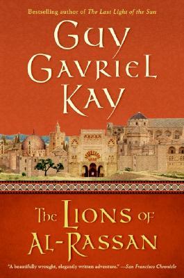
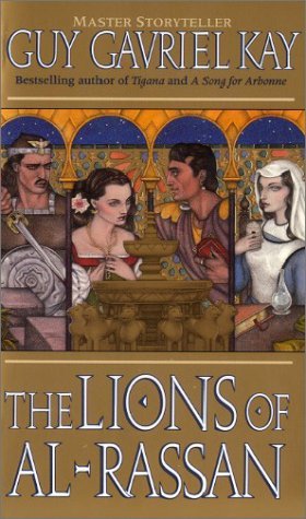
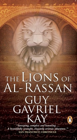
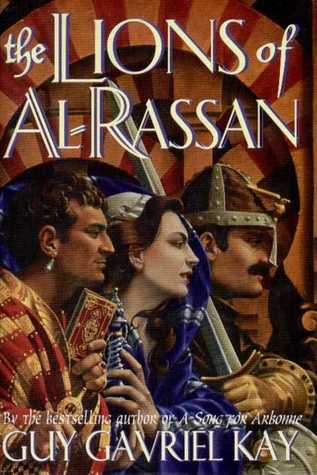
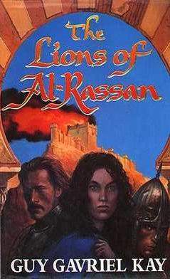
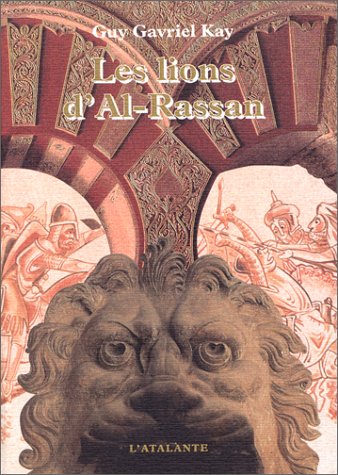
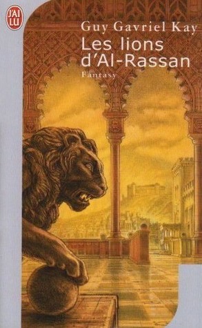
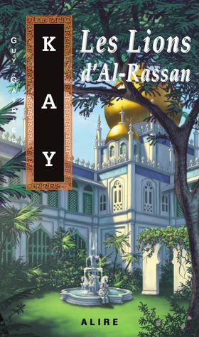
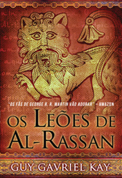
The Lions of Al-Rassan by Guy Gavriel Kay
This is a very special book to me. After all, it was my first experience with Guy Gavriel Kay, and it pretty much made me a fan on the spot. Like a lot of his works, The Lions of Al-Rassan is a historical fantasy. Set in a time and place that recalls the period of Moorish Spain, the novel focuses its attentions on the turbulent relationship between three peoples: the Kindath, the Asharites, and the Jaddites. The story is basically a loose retelling of the Reconquista, compressing centuries into a much shorter time frame.
Of course, while the “Lions” referred to in the title may be metaphorical, that does not mean they do not appear as a frequent theme on the book’s various covers. A great many editions have come out over the years, and here is just a small sampling from around the world:
From left to right, top to bottom: Harper Voyager (2005) – HarperPrism (1995) – Penguin Canada (2010) – HarperCollins UK (1995) – Viking Canada (1995) – Voyager (2012) – Earthlight(1995)


French (1999) – French (2005) – Croatian (2006) – German (1998) – Russian (2003) – Spanish (2009) – French (Quebecois) (1999) – Portuguese (2010)


Winner:
I’m going to go with my heart on this one and choose the Viking Canada edition, because this is the version that graces my beloved copy. Yes, it’s a cop out, but I don’t care 😛
Feel free to tell me how way off base I am though, by letting me know your favorite!


I think my favorite is the HarperPrism one. I like the strange way that the pieces fit together – Are the character inhabiting the same picture/space or is it a collage? Almost a little M C Escher
LikeLike
That’s a very good observation, and looking at the image blown up I actually noticed a lot more details I didn’t see before!
LikeLike
They all kind of sick but I like the Spanish one
LikeLike
There are are few that stood out to me…but yeah, a lot more that aren’t so great.
LikeLike
Voyager 2012 for me, but I do not think the standard of these covers is very high.
LikeLike
I think SFF covers have come a long way in the last couple decades, some of these older ones did not age too well at all.
LikeLike
I think my favorite is the 2010 Penguin Canada one, with the Spanish one as second-favorite. The overall clean appearance and font with the warm-color background does it for me.
LikeLike
A lot of people seem to like the Spanish one! I agree, it’s got a very clean layout and good color palette.
LikeLiked by 1 person
I also prefer the Viking Canada version from 1995, as that’s the one I have ❤
LikeLike
Yes! Nostalgia wins 😀
LikeLike
Your cover of choice seems to expand the focus on the characters from the Harper Prism cover (the one I’m familiar with) and it showcases better the figures at the core of the story, so I believe it’s a good choice. My other favorite would be Voyager 2012 because… well… the lion, of course 😀
LikeLike
I gotta admit, the Voyager 2012 cover stood out to me as well, and I think that one or the Penguin 2010 version would have been my second favorite. Nope, not a coincidence that they both have lions 🙂
LikeLike
What a lot of covers! I quite like the French one although your choice is very interesting.
Lynn 😀
LikeLike
Yes, there were a lot! I wanted to show as many as I could, because there’s such a huge variety!
LikeLike
That is a frick ton of covers lol. I totally hear ya, loving the cover you own…that’s how I feel about my own books, too 😀 But I gotta say, I love the Portuguese 2010 one…something about that lion stands out to me. Makes me wonder what specifically inspired the artwork!
LikeLike
That’s an interesting one for sure! I think it might have been inspired by the artwork of the geographic area and time period analogous to the story’s setting, the stylized lion is very striking!
LikeLiked by 1 person
I don’t know much about the setting, but the cover definitely makes me curious. Thanks for highlighting the book 😀
LikeLike
That is so interesting – so many covers for one book! I new this guy was big, but dang. So many cover reissues. I actually love the seventh cover you featured, with the side-view of the lion! It reminds me of a coat-of-arms or something. 😀 Great post, Mogsy!
Have a fantastic weekend. =)
Alyssa @ The Eater of Books!
LikeLike
LOL yeah, GGK is huge and this book has been around for a while so it’s gotten the cover treatment many times over! I really like that cover with the sideways lion too, with the rich reds and golds 🙂
LikeLike