Friday Face-Off: Bridge

Welcome to The Friday Face-Off, a weekly meme created by Books by Proxy! Each Friday, we will pit cover against cover while also taking the opportunity to showcase gorgeous artwork and feature some of our favorite book covers. If you want to join the fun, simply choose a book each Friday that fits that week’s predetermined theme, post and compare two or more different covers available for that book, then name your favorite. A list of future weeks’ themes are available at Lynn’s Book Blog.
This week’s theme is:
“I demolish my bridges behind me…then there is no choice but to push forward”
~ a cover featuring a BRIDGE
Mogsy’s Pick:
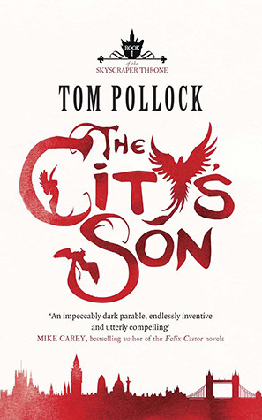
The City’s Son by Tom Pollock
Bridges are a feature of many cities…some of them are more famous than others. But what happens when the city comes alive – quite literally! – and landmarks become more than just another outline on the urbanscape? In some books, the setting itself is part and parcel of the entire whole, so that the city might as well be another character in the story. And in The City’s Son, Tom Pollock presents London to the reader in a way that will completely blow your mind. There’s bringing your city to life, and then there’s bringing your city to life. This book takes personification of urban features to a whole new level, plunging into the realm of the bizarre and uncanny, creating wonders you could never imagine in your wildest dreams.
Not surprisingly, we see a great variation in the covers:
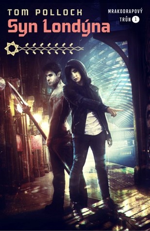
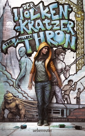
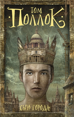
From left to right, top to bottom: Jo Fletcher Books (2012) – Flux (2012)

Czech (2014) – German (2013) – Russian (2016)
Winner:
This week, the challengers are all very strong, even with the shirtless boy wonder in the top right. I knew right away I would be choosing my winner from the foreign editions though, because some of the art styles are so striking, especially for the German and Russian covers. My winner in the end is the one that I think fits the story’s tone best.
What do you think? Which one is your favorite?


I like the first one best… I tend to prefer covers that don’t show characters
LikeLike
I love the simple elegance of it 🙂
LikeLiked by 1 person
Yes, simplicity (and often stylized artwork) is what draws me to non-character covers
LikeLike
I like the first one I think because of the skyline effect and the winged creatures- but I like the Czech and German versions too.
LikeLike
Yeah, the winged creatures in the title is really cool – someone worked hard on that lettering and it paid off!
LikeLike
Tricky, I do like the first one, the second, the graffitti one
LikeLike
They are all very nice in their own way! In the end it came down to which one I felt fit the story best, that was how hard it was to choose! 🙂
LikeLike
I like the Flux one but it is spoiled by having the cliche half naked guy on it which really puts me off. I like the overall design of the German one.
LikeLike
The half-naked guy is so random! I don’t know if it really adds anything, versus if the guy had had a shirt.
LikeLike
Eurgh, a cover with abs on it, barf!🤢😂
LikeLike
LOL! Like I said in a previous comment, I thought it was pretty random. I don’t think it adds much.
LikeLiked by 1 person
To be honest, covers with abs on don’t add anything to anything, vile things!😂
LikeLike
The one you picked is my favorite as well. Next to that, I like the Jo Fletcher version – I’m pretty sure that’s the one on my Kindle. I like the background of the Flux one, but don’t care a lot for the people – I think it’s a very “busy” cover.
LikeLike
“Busy” seems to be a good description for most of these covers, even the one I chose as my winner. That is why I really like the JF version too – it’s beautiful and elegant in its minimalism.
LikeLike
I love the Russian cover, but it looks just like another US book that I can’t think of the title right now.
LikeLike
I’m going to go out on a limb and guess, were you thinking The Goblin Emperor? Because that one came immediately to my mind too when I saw that 😀
LikeLike
Yes that’s it!
LikeLike
ROTFL on the “shirtless wonder”! 😀
I like your choice, although the Czech cover is a good contender, with its play of light and shadow.
LikeLike
I agree! I overlooked that one the first few times because it wasn’t as “colorful” as some of the others, but there is quite a lot of artfulness in use of light and shadows.
LikeLike
I love your choice – I also have a soft spot for the red and white because that’s my copy. I still haven’t read this one yet – did you enjoy it?
LikeLike
I did, even though it wasn’t really my type of book. It was a bit strange and abstract, but I still had fun 🙂
LikeLike
Wow, they’re all so different! I haven’t read the book, so I’ll have to defer to your judgement about the tone- although I do love that cross-processed Czech cover 😍
LikeLike
Glad that Czech cover is getting some love! The more I look at it, the more I appreciate it 🙂
LikeLiked by 1 person