Friday Face-Off: Birds

Welcome to The Friday Face-Off, a weekly meme created by Books by Proxy! Each Friday, we will pit cover against cover while also taking the opportunity to showcase gorgeous artwork and feature some of our favorite book covers. If you want to join the fun, simply choose a book each Friday that fits that week’s predetermined theme, post and compare two or more different covers available for that book, then name your favorite. A list of future weeks’ themes are available at Lynn’s Book Blog.
This week’s theme is:
“Some birds are not meant to be caged, that’s all. Their feathers are too bright, their songs are too sweet and wild”
~ a cover featuring BIRDS
Mogsy’s Pick:
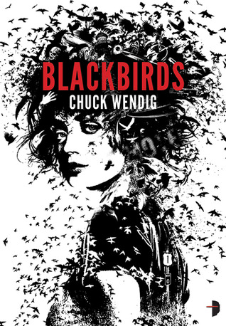
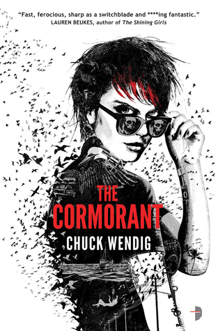
Miriam Black series by Chuck Wendig
That’s right, this week I’ve decided to do something different by featuring the covers to every book in the excellent Miriam Black series! After all, how could I decide on just one when they all fit the theme?
Originally published by Angry Robot, the first three books had covers designed by artist Joey Hi-Fi. When the series was picked up by Saga Press and reissued though, they were also re-branded with a new look. Let’s check them out now:
Blackbirds

Mockingbird


The Cormorant

Thunderbird

Winner:
While the new Saga Press covers are gorgeous and I like them very much, I’m still going to have to go with the old covers for this one. Joey Hi-Fi’s unique style gives them personality, not to mention his designs also feature Miriam who looks totally badass with the birds making up her image and flying all around her.
What do you think? Which ones are your favorite?


I like the Saga cover better for Blackbrids, but the old covers for the others. Not sure why they Saga ones don’t seem to have any cohesion.
LikeLike
I like the “inked” art style of the birds, but yeah I kinda wished all the backgrounds had been the same color.
LikeLike
The new Saga ones look like bird versions of The Expanse covers. 😀 Totally agree the old ones are more distinctive!
LikeLike
Yep, and seeing the actual character on the cover helps with that for me too 🙂
LikeLike
Mockingbird is my fav
LikeLike
I agree, both covers are nice for that one. Plus, I love actual mockingbirds 🙂
LikeLike
Oh yes I love them all!
LikeLike
Amazing the variety of styles, isn’t it?
LikeLike
I agree with you, I think that Miriam looks badass and cool in the original covers! Plus the way that Joey Hi-Fi incorporates the birds into the cover art is really clever.
LikeLike
I agree, and the first time I saw the original cover for Blackbirds I didn’t even notice the birds, I just thought they were random ink splashes to make the art look more “gritty”. It was such an awesome surprise when I looked closer 🙂
LikeLike
Yea, yo! The Joey Hi-Fi ones are way better, in my opinion. I like the disintegrating effect.
LikeLike
Yes, I love the effect! And Joey Hi-Fi makes great art 🙂
LikeLike
This is a perfect choice for this theme! I think this is one of thoses situations, for me, where Wendig got lucky with both sets of covers. I love the new ones, although they don’t really tell you what’s going on with the story. But the original covers are so unique and fit Miriam to a T.
LikeLike
I agree, both sets of covers are lovely. Of the new ones, I think my favorites are The Cormorant and Thunderbird. The one for Cormorant is extra cool because of the upside down orientation, implying the bird is mid-dive. Very neat!
LikeLike
I keep meaning to give this series a try and I agree, I find the original covers the best although the others are good as well. I just mentioned this week on my blog that I’m finding I’m as apt to pick up a book with a bird on the cover as a cover buy just like I do books with tentacles. Maybe someday I’ll figure all my quirks out.
LikeLike
Hahaha, awesome, glad to know I’m not alone with my fascination for tentacles on covers 😀
LikeLike
Even though the first book of this series ended up in the DNF pile for me, I did like the cover and found it was quite evocative: definitely the originals are better!
LikeLike
I know what you mean about evocative! Abd the gaze on her face just draws you in!
LikeLike
The old covers are definitely the most beautiful! But I still very much like the blue and yellow ones. Except I hadn’t realised before they were from the same series hahah.
I really need to read this series, it seems so awesome *o*
LikeLike
yeah, beautiful as they are, my one criticism about the new covers is the lack of cohesiveness. Easy to mistaken the books for not being in the same series!
LikeLike
Exactly!
LikeLike
I love the original covers. Just love them so frankly the new covers would always be hard pressed to top those for me. I just love the little details and they’re so eye catching.
Lynn 😀
LikeLike
Yep, nostalgia plays a huge part for me too when it comes to the original covers 🙂
LikeLike
Definitely agree with you on the more unique style of the original. They have always stood out.
LikeLike
Yes, if I walked into a bookstore and saw them on a shelf I’d definitely stop to get a better look 🙂
LikeLike